Bird & Sunrise photo

Bird & Sunrise photo
Because "someday" is today!

Thursday, December 28, 2017

A Little ShihTzu for Christmas

The last week of November, I received a request for a pet portrait to be given as a Christmas gift. It's really fun to be a part of a Christmas surprise, but I also feel the anxiety of getting a special gift like that just right and ready on time! My strategy; make a detailed list of every step required and when it needed to be completed. It really helped my inner 'fraidy cat to get all that information on paper and out of my head! Here's the final portrait and the journey of how I got there.


"Sophie" 8"x 8"in., oil on gessobord, ©2017 Tina M.Welter  Portrait, Miniature Imperial Shih Tzu dog
"Sophie" 8"x 8"in., oil on gessobord, ©2017

Meet Sophie, a miniature Imperial ShihTzu and beloved work buddy of her owner. Isn't she cute? Out of the five photos that I received, I thought this one expressed her personality the best and featured a soulful expression in her eyes.


"Sophie" photo by Julie Merrill - miniature Imperial Shih Tzu

The portrait size requested was an 8x8 inch square. First step, order the best substrate for the job. I went with Ampersand's gessobord, a cradled hardboard on birch wood that has a smooth surface, already primed and ready to paint. When I work this small, I don't like the texture of canvas interfering with the details.


Next, I adjusted the color tones on the photo, then cropped it down to a square and created a grid to guide me in my drawing.

"Sophie" photo cropped and 8x8 inch grid added in one inch squares.

I forgot to take a photo of my first pencil sketch, lol, but here are the acrylic paint sketches made over that drawing on paper. This is where I worked out the color palette and composition problems.

"Sophie" portrait, 8x8 inch acrylic paint on paper, Sketch test 1 ©2017 Tina M.Welter
"Sophie" portrait, 8x8 inch acrylic paint  on paper, Sketch test 2 ©2017 Tina M.Welter

The  acrylic sketches helped me to decide to change the shadow color I started with and crop the image even tighter.

"Sophie" portrait, 8x8 inch graphite pencil drawing on tracing paper ©2017 Tina M.Welter

Because I changed the composition, I needed to make another detailed pencil drawing. In this photo, I am transferring it to the gessobord using graphite paper.

"Sophie" 8"x 8"in., oil on gessobord, ©2017 Tina M.Welter  Miniature Imperial ShihTzu dog portrait in process

 Finally, I get to the joy of actual painting! I begin working back to front so the layers of painted fur will look like they overlap each other. 

"Sophie" 8"x 8"in., oil on gessobord, ©2017 Tina M.Welter Detail,  Miniature Imperial Shih Tzu dog portrait

The water soluble oil paint I use dries faster than traditional oils, but it stays wet long enough to blend the paint layers with a soft brush and get that nice fur-like texture.

"Sophie" 8"x 8"in., oil on gessobord, ©2017 Tina M.Welter  Miniature Imperial Shih Tzu dog portrait

After finishing the painting, I stained the birch wood sides with a wood stain to match the sienna background and let the whole thing dry for several days before spraying it with Kamar varnish. The painting was delivered on December 23rd and best of all, was hearing the happy exclamations and thank you's I received when they saw Sophie's portrait. Definitely made the season bright for me.

Happy creating to all, and to all, success!

>^-^<
Tina

Wednesday, November 29, 2017

One Golden Moment

"One Golden Moment" ©2017 Tina M.Welter, 4x6 inches acrylic on paper. Single yellow rose in bloom.
"One Golden Moment" 4x6 inch acrylic painting study for November.

Fall colors were on my mind when I chose this rose to practice painting acrylic on paper. I usually use acrylics like watercolor paints, thinning them down to make sheer washes of color, but I envisioned a painting inspired by a favorite photo of mine from Oregon that I thought might look good using acrylic paints in their thicker, more opaque state .

Single gold rose, photo, ©2016 Tina M. Welter
I love this photo. Just the right light, color, shadows and bloom!

Yellow flowers are sometimes challenging for me to paint. They often have shadows that are a mix of either purple, green or orange tones and getting those right without the shadow looking like mud can be tricky.
 
"One Golden Moment" First painting color choices. ©2016 Tina M.Welter Yellow rose, acrylic paint on paper.
"One Golden Moment" The first layers of paint.
 

My first color choices made the shadows look very deep orange to burnt sienna. Eventually, they just didn't look right to me. Plus I made the shadow on the right so dark, the bud didn't look like it connected to the stem!
 
"One Golden Moment" Compare the change in shadow colors from deep sienna to green. ©2016 Tina M. Welter
Compare the shadow change from sienna to green.

 After studying my photo, I repainted the bud shape and added either a yellow or green sheer paint layer over all the deep sienna shadows. Although, I did keep the vibrant orange center as it was. 

Being able to repaint over a mistake is one reason why acrylics are so great to work with. The sienna dot is the color the darkest shadow was before I gave it a healthier green glow make-over.

So my experiment in using just opaque colors resulted in needing to use the sheer layers too. Lesson learned. That is what keeps painting interesting to me, there is always a new problem to solve.

Happy creating!

>^-^<
Tina

Monday, October 30, 2017

Getting On the Grid


Magenta orchids, small acrylic painting in watercolor style.
"Soothe the Day"4.5x6 inch acrylic painting with 3:4 grid

Since I had surgery Oct. 5th on my left hand/wrist to release the ulnar nerve, I wasn't certain what kind of artwork or painting tips I would have ready to share this month. After 3 weeks, I'm glad to say I finally feel up to painting again. Although I am not allowed to put any stress on that hand for another 4 weeks, that's ok, it hurts to do so! I have become fairly creative at doing things one-handed, but I feel very lucky I can ask Jeff for help when I do get stuck! 

My new painting corner!

He kindly reassembled my large easel that has been boxed up and in storage since 2011. Plus he set up and stabilized the big 36''x48'' canvas for me. I'm so thrilled to have some actual studio space again, it's been six years since I last used this easel!

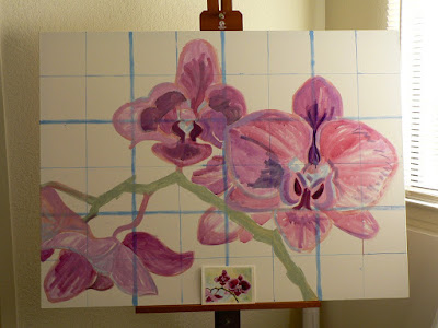
The main grid is made of 12 inch squares.

First order of business, measure and paint a 3:4 grid on the canvas to match the one I drew over the photo of the small test painting. Now I'm all set up for the fun part, sketching my design onto the large canvas.

36" x 48" canvas on easel with grid and orchid sketch, photo ©2017 Tina M.Welter
Wow, almost like magic I have large flowers!

Since the grid helped me to get the flower outlines in their correct places so fast, I played around with filling in the shapes. I wanted to know how the liquid acrylics would look and behave on the canvas. Thank heaven those paint containers have flip-top lids, screw-top lids on anything are really difficult for me to open right now.

I love how easy grids can make the task of enlarging a drawing.
 Original 4.5"x 6" painting and enlarged drawing.

Here's the small original painting to compare with the larger sketch. Some people don't like using grids, but I think they are an incredibly useful tool when I want to enlarge a drawing and get the proportions right. For me, they save a lot of  time and frustration and anything that decreases creative anxiety and boosts my art making confidence is worth the extra effort! 

Happy creating,

>^-^<
Tina

Saturday, September 30, 2017

We Have a Winner!

Thanks everyone for all the helpful comments on my last post! Sometimes some outside input can be really useful in sorting out my own thoughts. I just have to remind myself that it is o.k. to ask other people for help. ;)

The orchid photo won the most "yes" votes.

Red-Violet Orchids photo, testing painting ideas. ©2017 Tina M.Welter

I made a small 4.5"x6" painting of the orchids, this time using the acrylic paints I plan to use on the final large painting. 

"Serenity", 4.5x6" acrylic on paper, ©2017 Tina M.Welter

 Acrylics dry super fast,which doesn't bother me much when painting something small,but I am concerned about working with them on a large 36"x48" canvas. I struggled a bit with this problem on the 20"x16" Blue Iris painting.

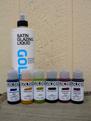
To solve this issue, I bought some liquid acrylics and a medium designed to mix with the paints to slow the drying time down a bit. I can also mix the medium with my tube acrylic paints to slow them down too.

Color palette for "Serenity", Golden brand acrylics

I am often surprised by how different the character of a photographed image changes when I translate it into a painting. I do like the direction this artwork is going.

"Serenity" orchid painting, test photo for bedroom. ©2017 Tina M.Welter

Plus, all these little steps have helped me feel so much more confident and excited to get painting! 

Unfortunately I have another hurdle to overcome. I am scheduled to have surgery to release a pinched nerve in my left hand/wrist on October 5th. I will be glad to have the feeling and normal movement back in my pinky and ring fingers again since they have been numb and uncomfortable since July 2nd. The recovery is supposed take six weeks. It will be interesting to see what artwork I will be able to complete in time for next month's blog.

>^-^<
Tina


Wednesday, August 30, 2017

Thinking Big

One of the best concepts I learned when I was in art school was that if a design works well small, it will most likely look good large too. It is also much easier and less costly to test out design ideas in a small scale first.

After years of moving around and being compelled to make small paintings, 8 x 10 inches or smaller, I finally have the opportunity to break out the big brushes and test my skills at painting larger artwork.

Since I have a couple of blank walls that are calling out for paintings and I found a great deal on two canvases that are 36 x 48 inches, I decided to take on the challenge.

Sure, attempting something new like this does make me a bit anxious, but my strategy is to start with what I know, which is to design small.   

I did three watercolor paintings of roses in the 3:4 ratio (3x12=36 4x12=48) I really liked this one, it is 5x7 inches, but I trimmed it down to 4.5 x 6 inches to match the canvas ratio.


Classic Pink Rose, watercolor on paper ©2017 Tina M.Welter

Next, I took a photo of the wall in the bedroom where I want one of the paintings to hang and combined the two photos using the Pixelmator program on my Mac.

Classic Pink Rose, painting for the bedroom, ©2017 Tina M.Welter

Hmmm...it looks pretty good, but not exactly what I had in mind. I feel like the colors aren't quite right. They are not capturing the "restful" mood I wanted, somehow the rose feels busy to me.

Here's a different rose design...

Fire and Ice Rose, watercolor on paper, ©2017 Tina M.Welter, painting for the bedroom

the simpler bud and warmer colors are nice, but I think I want to try some other flowers. Perhaps roses are not the answer after all!

I searched through my photos and found a couple promising ones. Photos don't have the same feel as a painting, but they could point me in the right direction. 


Soft Light Orchid, photograph ©2017 Tina M.Welter, painting idea for the bedroom

 I like how the vertical stems of the irises echo the headboard of the bed and the arch of the orchid blooms is really elegant. Shifting the color palette to subdued purples instead pink could be a better solution. 

Now I have some more small painting designs to explore! I have also decided that it would be wiser to use the acrylic colors I intend to use in the final painting instead of the watercolor paints. 

It's ok that my first idea wasn't a perfect fit. I think I am closer to solving the puzzle now. Hopefully more small designs and consistent small steps will yield big results.

>^-^<
Tina

p.s. Which one do you like?


Saturday, July 29, 2017

Testing the Palette


Glowing Poppies ©2016 Tina M.Welter, photo of scarlet poppies with green background.

Last summer I was inspired by the gorgeous poppies in the neighborhood. They were just glowing with color and I wanted to bring some of that vivid scarlet intensity into our apartment. I envisioned a painting of these beauties hanging on the wall over the tv. 

Plus, I thought the poppies would fit really well into the color scheme of the apartment. This Kandisky print hangs over the dining area.

"Color study, Squares with Concentric Circles" Print over the dining room table, ©1913 Kandinsky
"Color study, Squares with Concentric Circles" Print, ©1913 Wassily Kandinsky
Colors on the chairs and curtains in the living room.
I also wanted to attempt documenting my whole process of painting the poppies for a video to share. Setting up for recording the video over time was trickier than I thought it would be, but that was nothing compared to all the editing needed after shooting the video. Yikes, I was intimidated! I filed away all that footage and hoped for increased courage and more time to deal with it in the future.

Well, surprise, almost a year later I did get the rare gift of more time! To boost my courage, I decided to try editing just the first part, where I mix my colors and choose my palette. I have mentioned before how much I love mixing colors, but it is also a key step that helps me feel less anxious about starting a new painting. It's like I have part of the map to where I am going. I definitely recommend it if you find yourself spinning your wheels and uncertain about where to start.

Some of you kindly asked for more video of my paintings and music after seeing the "Blue Iris". Thank you, your encouragement also helped me face my inner 'fraidy cat. I am pleased that I could figure out how to compress 22 minutes of video footage into 2:36 minutes to share with you.

 Palette test, a short video of my color choosing process.

>^-^<
Tina

Saturday, July 1, 2017

The Blue Iris, finally!


"The Blue Iris" painting, 20x16 inches acrylic on canvas, ©2017 Tina M.Welter
"The Blue Iris" ©2017 Tina M.Welter

I WAS doing a good job keeping up with posting the painting process of the Blue Iris painting on facebook, but like all good things, there is going to be a twist somewhere. I think moving to another state counts as a pretty good twist. I finished the painting about two days before we were scheduled to move.

Anyway, the boxes are sort of unpacked and most of the household is running, so I could get back to sharing the painting process in it's entirety. Since I don't want any grief with copyright, I composed some music to go with it too. I was happy with the whole production until I heard it on my computer speakers, it sounds much better with headphones or at least some speakers with some bass! 

Without further ado, I give you The Blue Iris (click this link to see the video) 

>^-^< 

Tina  

p.s. I am being brave and facing my inner 'fraidy cat by listing the YouTube video as "public"...but I am disabling comments. I'm not that brave!


Wednesday, May 31, 2017

Leaving as the tulips fade...


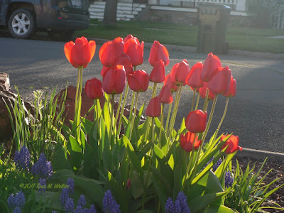
Red tulips with beautiful shadows cast on a yellow house. Perfect sunset light. ©2017 Tina M.Welter
Perfect sunset light on these red tulips.
Taking photos of the flowers in this lovely old neighborhood in Baker City has been a delight to me this year. If I was feeling tired, overwhelmed or just plain blue, I could grab my camera and step outside to go hunting for something beautiful to capture and I rarely came back disappointed. All winter I longed for the flowers to start blooming again. 
Tulip buds ©2017 Tina M.Welter
So excited for the blooming to begin!
 Spring was here early last year, so we missed most of the tulip blooms. It’s a fitting completion of our year that we will be moving as the tulips fade and the irises begin. 

Some of my thoughts to share if you have a hankering to go photograph flowers this spring/summer too! 

First, honestly, not all my photos are winners. Part of the fun is being surprised by which shots turn out to be the best once I can see them full size on my computer.

What I consider when I am out taking pictures:

What direction is the sunlight light coming from? Are there nice shadows and highlights on the flower to make the photo more interesting? Often low angle light at sunrise or sunset is the best, decide when those flowers you want to capture will have that light and plan to go out hunting at that time. 
Red and Yellow tulips, good morning! ©2017 Tina M. Welter
Wonderful morning light.
 What is the best level and angles? Does the photo improve by getting down on the same level as the flowers? What if I take a step to the right or left? 
Peppermint stripe tulip, top view. © 2017 Tina M. Welter
I thought I had the best angle, until...
 
Peppermint Stripe Tulip, side view ©2017 Tina M. Welter
I decided to try a lower viewpoint!

Be aware of the background. What is going on behind the flower, does it distract from the focus of that beautiful bloom? Zoom-in or move the camera, see I can get a more flattering backdrop. 
Red Tulips and blue grape hyacinths in nice morning light with car and garbage can. ©2017 Tina M. Welter
Lovely tulips...with car and garbage can!


Red tulips with treebark background. ©2017 Tina M.Welter
I took a few steps over to change the background.
Red flowers can be difficult to photograph in bright sun! Often my photos would have no detail and look like big red/orange blobs. I had to research to find out why this is, it can be so aggravating! Basically, intense shiny-red can overwhelm the sensors in your camera. P.S. your camera is not broken! 
There are discussions on this topic with all the geeky details. For example, the StackExchange discussion board covered this question about red flowers here.
 
If you are baffled like I was about what a “histogram” is, here is a very informative post on the subject from Todd Vorencamp who understands and can explain the technical side much better than me! How to read your camera's histogram. 

The super simple solution I took from all this information? Underexpose or try to photograph red flowers in partly shaded or filtered light. For example, one person suggested using an umbrella! I tried looking for red flowers with partly shaded light and I was thrilled with the results. 
Scarlet beauties. ©2017 Tina M.Welter Low morning light plus a little shade equals gorgeous tulip photo!
Low morning light plus a little shade equals gorgeous!
 Editing. I try to get the best photo I can, but the crop photo edit feature in my computer is my favorite tool. Sometimes just cropping a photo to get a better composition turns an “o.k." photo into a “wow" photo. 
White tulip with friends. ©2017 Tina M.Welter
This is a lovely photo full of color, but...
 
White tulip, wow what a soloist! ©2017 Tina M.Welter
 I also think this cropped photo has more "wow" factor.
So, there you are, all the things I think about beside hoping people won’t yell at me for hanging around their front yard! I do try to intrude as little as possible. Learn to use the super zoom and practice steadying your camera to get those flowers that are so tempting but are a little too far away, it really works. Double-check your focus, and if it's nice, shoot twice!

>^-^<
Tina 
Pink Tulip Twins ©2017 Tina M.Welter I couldn't resist these, I had to capture them.
The lady who owns this garden is kind of grumpy, so I shoot long distance!

Sunday, April 30, 2017

Playing with marbles.

I was delighted last winter when our landlady, Kelly, asked if we would be interested in doing some artwork to add to the sign that advertises her apartments for rent.
Palmer house sign, Built for Charles L. Palmer, owner of Palmer Grocery and Mayor of Baker City in 1902
Built for Charles L.Palmer, Mayor of Baker City 1902 
What Kelly wanted was to replace the purple wooden balls on the top of each post with larger globes that would have original art designed on them. Since the house was built in 1906 and one of my favorite eras for art, Art Nouveau, was still in fashion then, I was excited to begin looking for inspiration and start drawing designs.

Dutch art nouveau (Jugenstil) book cover, blue and gold flower motif - public domain
Dutch Art Nouveau style (Jugenstil) book cover - public domain

Art Nouveau takes it's inspiration from nature and often features flowing lines and floral motifs. I suppose it is not much of a surprise that I like this style so much. I made several sketches, imagining a copper metallic design painted over colored globes in this linear style.

Art Nouveau inspired pencil sketches ©2017 Tina M. Welter
This is only one of the pages out of my sketchbook!
Next, I started thinking about the color and design of the globe itself. Many of the Nouveau pieces I had been studying had metal work over beautiful glass. 

To see some of them, here's a link to my "Wonderful Nouveau" collection of images on Pinterest. (Because of copyright laws, I am not certain which images were o.k. to post on my blog!)

I was going to be using outdoor paint on metal, so I decided I would try a technique I have wanted to do for years, painting faux stone. Pinterest was also a great resource for finding tutorials on how to do marbling techniques. Here are a couple of good ones that I thought were helpful if you would like to try this technique out yourself...Hand painted faux marble tutorial and Painting marble fragments.

For color, I had access to the paint used on the house and the sign. The front door is warm purple, and I like the orange accent that is on the sign and in the front hallway of the house. I found photo examples of natural marble stone with purplish veining, but it wasn't exactly what I had in mind. I actually found a better color and texture match for what I was looking for in these polished amethyst beads.

Amethyst beads on Pinterest, by Fire Mountain Gems and Beads
Hopefully it is ok to use this image since it credits Fire Mountain Gems and Beads.
Putting all this information together, plus 
paint and brushes for several hours on a Saturday afternoon yielded this, my first result...

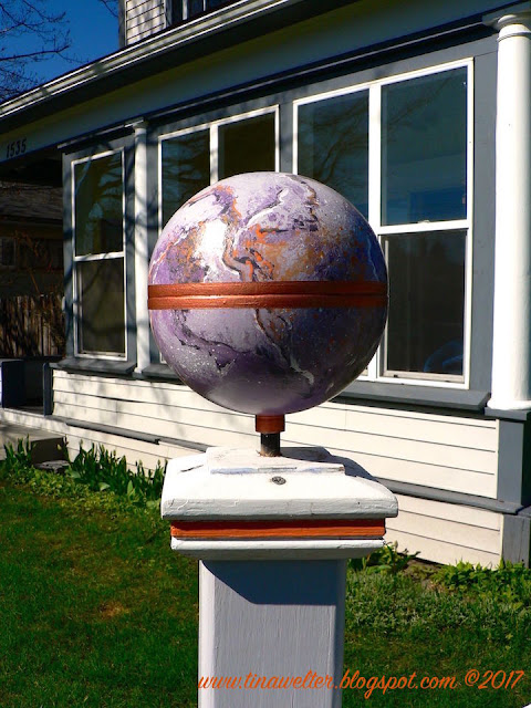
Faux  painting, purple marble globe, ©2017 Tina M. Welter
It is such a joy when one of my creative experiments works!

I was thrilled, sometimes you do get projects to go right the first time! :D The only problem was when I tested putting my favorite line design over the stone texture, it didn't seem to be working very well.

Nouveau inspired design over faux painted marble, ©2017 Tina M.Welter
Testing out ideas, another reason to like digital art tools!

It was hard for me to give up on doing the Nouveau style line-work since I had spent so much time on those designs and I really liked them! But, I do know from experience that making art is a balancing act and putting too many ideas into one art piece can overwhelm it. 

I still wanted some faux copper metal on the globe and Jeff suggested a simple band around the middle, like a holder for the stone.
Faux marbling, globe, ©2017 Tina M. Welter
I liked his suggestion, so I added one on the middle and around the base. I think it matches the line work on the sign and shows off the faux stone. Success! (Note: the small block of wood that is supposed to cover the metal rod hasn't been installed yet.

Full view of faux marble globes on Palmer House sign, Globes designed by Tina M. Welter
It's cool to think my art will be here long after we are gone.
Overall, I am really happy with the way this project turned out. Plus, I still have some great Nouveau designs that might come in handy another day!

>^-^<

Tina