Bird & Sunrise photo

Bird & Sunrise photo
Because "someday" is today!
Showing posts with label landscape. Show all posts

Wednesday, July 30, 2025

Summertime Sketchbook Tour

 Summertime and I can never get enough of sunlight shining through the various types of green leaves, whether it be flowers or trees, I'm always looking for those glorious, glowing moments. 

Here's a quick look at a few "stop me in my tracks" inspirations which have made it into my July sketchbook pages so far...

Early morning light is magical.

Early morning in a nearby park and the blossoming Russian sage is captivating, I took so many photos!! I love the soft purple surrounded by all that green.


The perfect place to sit and dream.

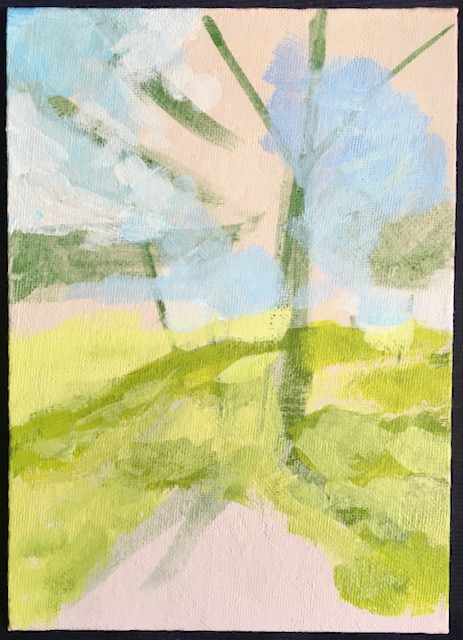
 Photographing into the sun, hoping to get a balanced image of the brilliant sun rays and dappled shadow below pine and deciduous trees.


The mood is balanced and serene.

The formal arrangement of repeating sprinkler arches and strategically placed trees is satisfying to me. It feels balanced, serene.


Holding the sun in his arms.

One of my favorite trees to photograph, I always find it's twisty branches so interesting.


A great space for ideas to live.

 A reminder that all of these little gems are truly small, only 2.50 by 3.50 inches, it takes me about an hour to paint each one. My goal is to choose my favorite ones, then paint them larger and try to capture that same fresh brushwork.

I haven't been successful yet, but I keep trying. I find it's often helpful to have an inspiration and goal to keep me focused and moving forward to improve my skills. 

 What type of creative journey calls to your heart? Decide on one small step you can take on that path and begin.

Happy Creating! 

>^-^< 

Tina


Saturday, August 31, 2024

Perception Shift


Remember those times when you thought you had failed?

This painting is a failure. 

Yes, you read that right, I painted this sunrise in 2009, it was the view from our house in Taos Canyon looking towards the east, I used to love to watch the sunrise colors shine through the branches of a group of juniper trees and one young ponderosa pine. 

I remember struggling with this painting for a long, long time. My sunset colors were too bright at first, I toned them down, but I couldn't get them to blend how I wanted, purple and yellow made an awful muddy color where they met in the sky, I couldn't get the dark color for the trees to be less transparent, plus the clouds looked just awful to me. I finally reached a point where I declared it “finished enough," put it away and decided painting sunrise/sunset landscapes was just not for me.

15 years later...

Imagine my surprise when I pulled it out of the cardboard box it was stored in last week and realized, it’s not as bad as I remembered, I had actually captured the look of those sunrises from that particular place and time!

What in the world was wrong with my perception that I thought this painting was such a failure?

If I remember correctly, I think I was too invested in making it look exactly like the photo. I had the idea that if I followed the colors in a photo precisely, my painting would be successful, I couldn't fail, and I was truly disappointed that I couldn't get the clouds or the colors to express the joy I felt on those mornings.

The irony is that this spring I finally made a little sunset painting that I absolutely love. I was taking a class on painting light taught by Jed Dorsey, and instead of following the reference photo for the class assignment exactly, I combined his color strategy and my own memories of Greece.

When memory and experience combine to make magic. ©Tina M.Welter
 

The sunset colors are kind of over-the-top bright, but I love them, as well as the whole glowing rocky shoreline moodiness of the painting. I didn't think I had sunset painting capability in me, but there it is!

This was truly a lesson learned, I think being so obsessed with perfection clouded my judgement, I couldn't see clearly what I had done right! I also never imagined that letting go of the strategy to copy colors exactly would give me more of what I was looking for.

Let go of the fear of doing it wrong, and trust more -

Happy Creating!

>^-^<

Tina

Sunday, June 9, 2024

Seeing the World in Black and White.


Ice skating, yes, if the pond is frozen.

In the 36 years that I have been making paintings, mixing color to exactly match the subject has been a big priority for me and over the years, I have become fairly confident at it. 

With that in mind, I was very intrigued when I saw a free YouTube class taught by artist Dianna Shyne called "Freedom with Color" where she was offering another way to paint besides just matching the colors of the subject, so of course I signed up!

Seeing the world in black and white.

In the class, Dianna gave a great condensed explanation about the qualities of color, encompassing Hue, Value, Color temperature and Intensity which was a great refresher for me and very helpful for people who are new to making art.

What I absolutely loved was watching her painting demonstration where she took those qualities of color and made three completely different paintings using only her black and white photo, posted above, for reference.

Honestly, I had thought of trying this myself before this class, but was feeling like a bit of a 'fraidy cat, not knowing exactly how to start. It was freeing to watch her do it, it seemed completely do-able, especially if you only chose one color family to practice.

Next Dianna gave us the assignment to:

1. Choose a black and white photo, either hers or our own.

2. Paint a study in one color, matching the values in the photo.

3. Paint another study and play with color. 

Where you place the darks and lights matter.
All my values in place.

I started with a value sketch based on Dianne's reference photo. This always helps me to simplify shapes and decide where to place the darkest dark and lightest lights.

I was excited to try this for myself, but I admit, it was such a different way for me to think about choosing colors and the options were so wide open, it was a little overwhelming!
 

Early morning, cool and peaceful, breathe it in.
Sunrise

Thankfully, all that work I did playing with complimentary colors in my sketchbook came to the rescue, I had some experience on how they could work together, so I chose purple and yellow to start, with a little orange to warm things up. I began with imagining an early morning sunrise.


Ice skating, yes, if the pond is frozen.
Winter stillness

For my second practice attempt, I chose blue and orange which is another complimentary pairing that I've had success with, all I needed to do was add was a bit of white. I had more of a wintry vibe in mind and I ended up really liking this one a lot.


Take a break, listen to the evening birds.
Summer Evening

 Last, I decided to try adding some green to what I had learned from the other two paintings, secretly hoping I might come close to the original color photo, I couldn't give up all my color matching habits that quickly. :D

Eventually Dianna did allow us to see her original color photo, the sky has more purple and the water reflections are more pink, but overall I think I did surprisingly well!  

It's not that exciting to look at until you paint it!

 
I found this exercise so incredibly fascinating and helpful, it really made it clear to me that getting the values correct, the dark, light and middle tones in the right places, is truly more important than matching the colors of the subject exactly!

Ever since this class, I've been inspired to drop all the color out of my reference photos and practice painting how light or dark the subject is, not the exact color.

Here's an example from one of my sketchbook pages, with all four studies painted from the same black and white photo of one red pear. 

Simple and elegant.


The color, all the variety of possibilities!
One pear, so many colors!

If you are wanting to experiment with the way you use color, I can definitely recommend trying this strategy.

Happy creating!

>^-^<

Tina

Thursday, November 30, 2023

A Tale of Two Kayaks

Dipping deep into the wet landscape.


 It's November and another free class taught by artist Chris Fornataro becomes available. I almost didn't sign up again because there is so much to get done in putting the garden to sleep for the winter and Thanksgiving just around the corner, but at the last minute I decided I really need the practice with landscapes.

Mangroves photo ©Chris Fornataro

Again, I wasn't exactly thrilled with the reference photo, but I knew from the last class in March that it is still possible to end up with a decent painting even with a less than inspirational photo.

Big values, big shapes!

The first lesson was breaking the landscape into large value shapes and not getting stuck in the details which is great practice for me. I already like where this painting is going better than the photo.

The details can really drive you crazy.

Here it is with all the steps completed, but the water reflections and getting that illusion of sand underwater in the foreground didn't look right to me.

Sometimes less detail is more.

I decided to forget the sand under the water and make the side canal more still and reflective, but I'm still not certain this choice was an improvement. ??? 

One of Chris's tips was to remove detail and add more blue grey color to the background trees to get a deeper sense of depth on the painting. You can see the difference between the two paintings above, I found that suggestion was very helpful and I loved how that little change made such a difference. 

                                              *****************

Paddling a kayak and taking photos is difficult.

Next I decided to challenge myself to see if I had really learned the skills from class by painting from a photo I took of Jeff kayaking Sept of 2019,

Mapping out where you want to go is important.
First step, start with a value sketch. Second, adjust the design to feature your main focus. I wanted to showcase the sunlight through the trees and also extend the land more than the photo so that I could practice adding visual depth.

Structure holds up everything.

Blocking in the shapes, I added an extra step by adding an under-painting of yellow and orange just because I wanted to try it out.

Wow, that sky is not right!
Adding the darker colors of the water and trees went well, I wasn't too keen on the sky and had to go back and fix that!

Finally, some visual balance.

The sky is much improved, but the water reflections don't look correct to me yet, too bright, the lake water isn't that choppy, also not enough shadow on the vest or kayak.

Early morning bliss.
Greying down the water reflections and adding shadows to the  vest and kayak helped a lot, but I still don't think the water looks right. Obviously I need more practice understanding how to paint light on water.

Overall, I'm thrilled with most of it, I improved on the photo, I got the depth and "atmospheric perspective" looking pretty good and I resisted the urge to do anymore detail on the trees which is a big win for me, "Miss Fiddle-brush."

I'm glad I did the class, even though it was very similar to what we did in March, I know the repetition really helped some concepts sink in for me! Practice makes progress...

Happy Creating!

>^-^<

Tina

Here's a sample of Chris's teaching style on YouTube: Click to watch 10 Tips to Improve Your Landscape Paintings

Sunday, April 30, 2023

Going from Weird to Wow!!


Weird to wow, what a difference!
What a journey!


I signed up to take a free painting class from Chris Fornataro, an artist who I admire and follow on YouTube.

The emphasis of the class was practicing how to use large value shapes as a foundation for better paintings. I don't usually paint by following another artist step by step, so this was definitely going to be an interesting hands on look into his process. 

The beginning of the first lesson, a still life, was a little strange looking...
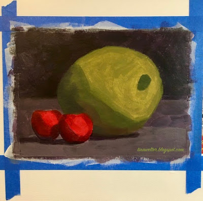
Wow, that pimento is extremely large.
Is that a huge pimento?
 

We began with painting the subject by only representing the largest basic shapes of light and dark. Jeff told me he thought I was painting a giant pimento olive, not a very promising start!

What I did like was watching how efficient Chris was in mixing his colors using a limited palette, this painting only used ultramarine blue, cadmium red, cadmium yellow and titanium white.   

For example, he would start with the basic color, mixing blue and red for the purple background and then adding a little of the yellow to "de-saturate" the purple to make it less vivid and more natural looking. He did the same thing for the apple, blue and yellow to make a medium green and then a bit of red to tone it down a bit. 

Chris also emphasized how we can simplify mixing color by focusing on the primary colors and asking ourselves, does this mix need more blue, more red, more yellow?


Second round of shapes, lesson example.
 

Next, we painted smaller shapes onto those larger mid-tone light and dark sections using the same color mixes, but adjusting them by adding some white or yellow to lighten or some mixed purple to darken the colors or add shadow.
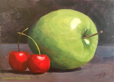
 

What a difference refining layers can make.
Snack time!
 

As I added more refining shape layers, I was so relieved to watch the painting begin to take form. The class was taught using oil paints which stay "wet" and are easy to mix for a long time. I didn't know if I could make his process work with acrylic paint, which even with extenders, dries very quickly. I was very happy and excited to try another subject after I ended up with this first result.

The second assignment was a landscape. Here is the reference photo we were given to work from.
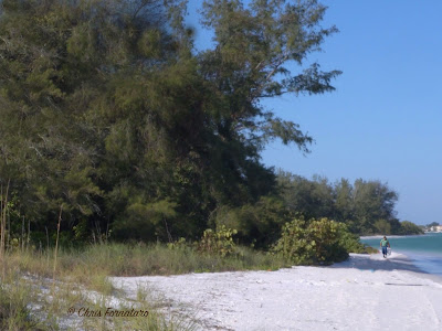
Not my idea of a good photo.
Beach photo © Chris Fornataro
 

I was rather disappointed when I saw this photo, it was not my idea of an inspiring subject. I would never pick a photo with lighting that it would make trees look like a huge block of uniform green. The cast shadow across the beach and into the water was nice, but still!!

The first blocking in of the large mid-tone value shapes was not great to look at either. Some of the students called it the dinosaur stage, I thought mine looked like a duck with big hair!
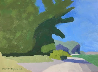

Weird, weird shapes man.
Hello Lochness, I think I found your monster!

I could understand what he was trying to teach though, seeing the large blocks of color and value to build a good foundation for the painting first, then adding smaller value shapes on top to create form. I intended to follow exactly what the instructor was asking us to do, hoping that some how I could eventually make it come out alright.
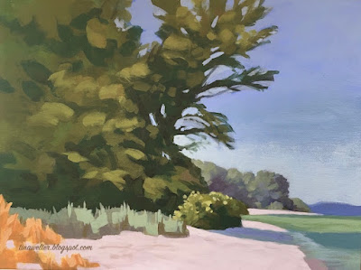
 

Sometimes more is better.
The secret is all in the layers!

Adding the second layer with the smaller value shapes did help. It took me a lot longer to get the acrylic color mixed and in the right places, but I could see the finish line now.

I could imagine myself here afterall.
I could imagine myself here after all!

The final little details brought it all together and it was a logical way to paint, going from large shapes to small. I am curious how it would have looked if I had used oil paints instead. I suspect it would have been faster! It took me a lot of extra time to remix and blend my fast drying acrylic paint.

Overall, it was a good class and I would recommend him as a teacher. It wasn't anything I didn't know, but it was valuable practice and I gained some insights into mixing color that I'm going to use going forward with my own work. Sometimes it is so worth while to see the world through some one else's eyes.

Happy creating! 

>^-^< Tina
Wednesday, August 31, 2022

A Walk In the Park

We feel very lucky to live in a neighborhood that has a nice large park within a few blocks of our apartment. There is a baseball diamond and a soccer field, but my favorite feature is the groups of trees planted around the edges of the park. 

Photo of sketch and final painting together. ©2022 Tina M.Welter
The Beginning and the End
 

 I have always been a great admirer of trees. As a young child I imagined the large ones growing on our farm had personalities, mostly friendly, but some seemed so old and ancient I often felt a bit anxious if I walked too close by them! All worries vanished at the end of the day though, when tucked in bed and listening to the soothing conversation of their rustling leaves at night, then it was only sounds of comfort and home.

Beginning a painting by blocking in the background colors. ©2022 Tina M.Welter
In the beginning...
 

 On one of our early morning walks around the park this summer, I had another one of those "I must paint this moment" inspirations. I came home and sketched out a drawing from the photo I took, I liked it so much I could envision a whole series of  "A Walk Around the Park" paintings.

Almost every painting goes through an ugly stage. ©2022 Tina M.Welter
Underlying structures often look strange.
 

Life being life though, a previous commitment to finish a set of illustrations that are due this fall didn't leave me much time for personal painting projects.

Building up the layers of green on my acrylic painting. ©2022 Tina M.Welter
Putting more layers of color on those bones.
 

I was determined to not let this sketch end up on the "projects that are never going to happen" pile, so I rearranged schedules and crammed in some precious painting hours. The laundry is still waiting...

Painting of green summer trees in the park almost finished. ©2022 Tina M.Welter.
Almost there!
 

In honor of the last days of summer and all the lovely green world that inspires me, I'm happy to share with you "A Walk in the Park."

Painting of early morning sun through summer trees at my local park. ©2022 Tina M.Welter
Shadows and light dancing!
 

This scene still makes my heart sing, even as a rushed, imperfect artwork interpretation of that lovely summer morning.

Don't let go of those moments that inspire you!

Happy Creating >^-^< 

Tina


Sunday, July 31, 2022

Learning to Love Landscapes


Summer morning light casting shadows from trees. Acrylic painting ©2022 Tina M.Welter

Unlike many artists, I rarely felt the desire to paint landscapes, I'm actually not certain why. I've taken many photographs of wonderful views but haven't very often felt that irresistible pull to put paint to canvas to capture it. 

I have painted a few okay landscapes over the years, but also a couple attempts in the past led me to decide that landscape painting was just not my thing. A particular sunrise sky with clouds comes to mind...ugh, I never got that thing right!

Photo of green and yellow fields and blue sky. ©2021 Alan Manning

 Last fall, my brother asked me to paint a landscape for him from this photo. With only one point perspective, no buildings and no trees, I felt I could manage it although the clouds did make me a bit nervous.

Color sketch of summer fields and sky. ©2021 Tina M.Welter

 After making my usual color sketch to figure out the palette and the basic layout I was encouraged. Plus it helped me see where I could improve the painting.

One point perspective painting of road, summer fields and sky. ©2021 Tina M.Welter
"Happy Travels"

The final painting came out pretty nice. I still wasn't itching to paint more landscapes, but it was a great feeling to know my skills have improved over the years and it was possible for me to paint this simple one successfully.


Summer trees and shadows in the lot across the road. Photo ©2022 Tina M.Welter

 June of 2022, I had the strangest thing happen. This early morning view out of my kitchen window captivated me. It was the pattern of shadows and the way the light was making the green tree leaves glow. I finally felt the call of the landscape, I absolutely had to paint it!

Value study drawing in pencil of trees and shadows. ©2022 Tina M.Welter

This year, instead of going straight to color sketches, I have been making simple value studies of all my subjects first. I am finding they are a great tool to simplify and get to the heart of what is working in a composition before adding color. When the black and white sketch still feels interesting, I know I am onto something good!

Summer morning light casting shadows from trees. Acrylic painting ©2022 Tina M.Welter
"View from My Kitchen Window"
I have also been watching several landscape painting classes on YouTube, specifically Mastering Composition by Ian Roberts. After watching his How to Use Color Temperature video, I followed his instructions and boom, it actually felt like a bit like magic as this great little painting came together for me. 


I was feeling so encouraged, I decided to offer to paint a landscape for my sister. She sent me two of her favorite vistas and told me I could choose which one I wanted to paint.

Red rock cliffs and snow capped mountains in Southern Utah. Photo ©2022 Evelyn Waldron
Landscape one.

Red rock cliffs, snow capped mountain and yucca bush in Southern Utah. Photo ©2022 Evelyn Waldron
Landscape two.
      

Two value studies in pencil and wash. ©2022 Tina M.Welter
 Hmmm, which one to choose! I was having a really hard time deciding between them and the value studies helped me clarify what elements I felt were resonating with me and that made it easier to decide what direction to go.

Of course this involved plenty of color palette testing too.

Landscape value study and palette test. ©2022 Tina M.Welter


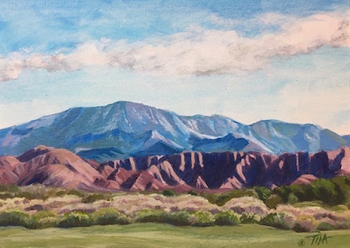
Acrylic painting of sage, red rock cliffs and snow capped mountain in Southern Utah. ©2022 Tina M.Welter
"View from Green Springs Drive"

 My value sketches were pretty rough, but the essence of that wonderful dark and light contrast on the red cliffs still came through as the focal point of the painting. I'm really pleased with the outcome and yes, I think I may be learning to love painting landscapes. I've already had a few more calling to me...

Definitely a reminder to keep that creative ear open, you might hear an unexpected Muse! 

Happy creating!

>^-^<

Tina
 

Ian Roberts Mastering Composition

How to use Color Temperature

Another favorite YouTube Teacher:

Paint Coach

Seven Reasons Students Struggle Painting Landscapes