
In the 36 years that I have been making paintings, mixing color to exactly match the subject has been a big priority for me and over the years, I have become fairly confident at it.
With that in mind, I was very intrigued when I saw a free YouTube class taught by artist Dianna Shyne called "Freedom with Color" where she was offering another way to paint besides just matching the colors of the subject, so of course I signed up!

In the class, Dianna gave a great condensed explanation about the qualities of color, encompassing Hue, Value, Color temperature and Intensity which was a great refresher for me and very helpful for people who are new to making art.
What I absolutely loved was watching her painting demonstration where she took those qualities of color and made three completely different paintings using only her black and white photo, posted above, for reference.
Honestly, I had thought of trying this myself before this class, but was feeling like a bit of a 'fraidy cat, not knowing exactly how to start. It was freeing to watch her do it, it seemed completely do-able, especially if you only chose one color family to practice.
Next Dianna gave us the assignment to:
1. Choose a black and white photo, either hers or our own.
2. Paint a study in one color, matching the values in the photo.
3. Paint another study and play with color.
 |
| All my values in place. |
I started with a value sketch based on Dianne's reference photo. This always helps me to simplify shapes and decide where to place the darkest dark and lightest lights.
I
was excited to try this for myself, but I admit, it was such a
different way for me to think about choosing colors and the options were so
wide open, it was a little overwhelming!
 |
| Sunrise |
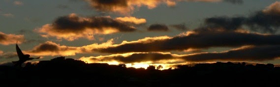
Thankfully, all that work I did playing with complimentary colors in my sketchbook came to the rescue, I had some experience on how they could work together, so I chose purple and yellow to start, with a little orange to warm things up. I began with imagining an early morning sunrise.
 |
| Winter stillness |
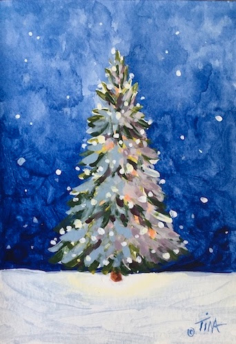
For my second practice attempt, I chose blue and orange which is another complimentary pairing that I've had success with, all I needed to do was add was a bit of white. I had more of a wintry vibe in mind and I ended up really liking this one a lot.
 |
| Summer Evening |
Last, I decided to try adding some green to what I had learned from the other two paintings, secretly hoping I might come close to the original color photo, I couldn't give up all my color matching habits that quickly. :D
Eventually Dianna did allow us to see her original color photo, the sky has more purple and the water reflections are more pink, but overall I think I did surprisingly well!

I found this exercise so incredibly fascinating and helpful, it really made it clear to me that getting the values correct, the dark, light and middle tones in the right places, is truly more important than matching the colors of the subject exactly!
Ever since this class, I've been inspired to drop all the color out of my reference photos and practice painting how light or dark the subject is, not the exact color.
Here's an example from one of my sketchbook pages, with all four studies painted from the same black and white photo of one red pear.

 |
| One pear, so many colors! |
If you are wanting to experiment with the way you use color, I can definitely recommend trying this strategy.
Happy creating!
>^-^<
Tina