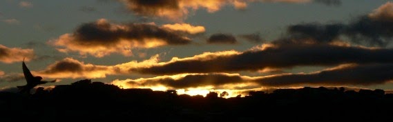
Bird & Sunrise photo

Bird & Sunrise photo
Because "someday" is today!
Showing posts with label Leaves. Show all posts

Sunday, November 30, 2025

Autumn Walk in the Park


Brilliant orange against green, the first changes of the season.
"Autumn Walk in the Park" ©2025
 

In my last blog post I mentioned that I hoped to use the small 3.50 x 2.50 inch paintings in my sketchbook as inspiration in painting larger artworks.

I rarely paint fall landscapes, so I made a goal to make several in my sketchbook this year. Out of that group, this little mini painting really captured a fall mood, so I decided to try painting it larger and on canvas. 


Small, but with a mighty big mood.
Small, but has a mighty big mood.
 

I have to admit, in the end I couldn't resist the the pull of the referring back to the photo. Which is a really good inspiration point and nothing wrong with using it, I just hoped to get closer to that wonderful expressiveness that lives in these little paintings.


What the camera captures doesn't compare to the mind's eye..
October 19, 2025 photo

To be fair, my larger 7 x 5 inch painting isn't an exact copy of the photo either and that is exactly what I am striving to do, create an interpretation that is mine but still hopefully expresses why I thought this moment was worth painting that other people will resonate with too. 


The captivating contrast of orange against green.
"Autumn Walk in the Park" ©2025
 

I believe that what the camera captures doesn't always compare to what the mind's eye sees. I may not be able to step very far from my references yet, but I will keep trying because think there is an important skill there for me to learn. 

If you find you are feeling stuck in the same old, same old in creating, think of a small way to push your boundaries and feel that excitement of exploring the unknown again. 

Happy creating!

>^-^<

Tina 


Tuesday, May 31, 2022

Focusing on Green - Steps for Dealing with Emotional Overwhelm.


Painting sketch of light through green leaves. ©2022 Tina M.Welter
Spring Green mini sketch.

I only have a very small garden space, but it is a much loved oasis of calm for me.
 

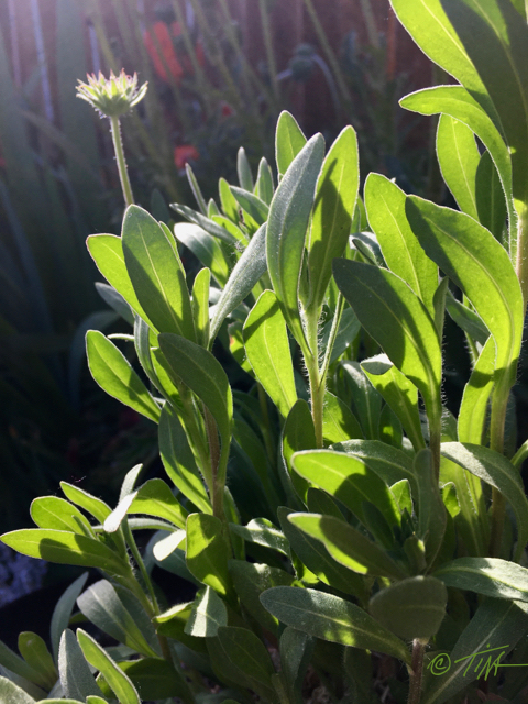
Sunlight through iris leaves, photo©2022 Tina M.Welter
Iris

 Artists often have the ability of being very empathetic people which is a great gift to have, but the downside of being an empathetic person is that it is hard not to take in the suffering of others in such a way that you can't function yourself.

Close up of a stripey nasturtium leaf. Photo©2022 Tina M.Welter
Nasturtium

Knowing this about myself, I already try to limit social media and news time, but sometimes even with those limitations I still find myself absorbing and getting emotionally wrapped up in the loss and pain going on in the world.


Glowing sunset light through Gaillardia leaves. Photo©2022 Tina M.Welter
Gaillardia - Blanket Flower

 I'm used to feeling sad about things I can't control, but after several awful events these last couple of weeks I was finding it extra difficult. I felt so overwhelmed, angry and powerless that those emotions were consuming my thoughts day and night.


Sunset light through strawberry leaves. Photo ©2022 Tina M.Welter
Strawberry


 I realize it seems illogical and a waste of energy to feel so bad when I'm not being directly hurt myself, so it was actually a relief when I happened to see a recent article from the Los Angeles Times that addressed this issue.

Here is the actual list I wrote down for myself after reading what the featured therapists had to say.

  1. Pay attention to physical and emotional warning signs that you need to take a break.  Notice sensations of outrage, terror, overwhelm, despondency or numbness. 
  2. You must stop and process these feelings. Don't flood yourself with new images and coverage.
  3. Digest the stressful build up of these emotions by any type of healthy movement, writing, talking to people you trust. (For me, a good solid cry also helps.)
  4. Take action in positive ways that are within your reach.
  5. Do something kind and good where you are.
  6. Start small. 

 Since now I know I am not the only person that may be struggling, I decided that sharing what I learned along with featuring some photos from my little green oasis would be one small positive thing I could do.

Sketchbook, sunlight through leaves.©2022 Tina M.Welter
My Sketchbook

When I feel distressed it's actually harder for me to make art. My mind bombards me with thoughts that art making is pointless and self-indulgent and does very little to improve this brutal world. 

After processing some of those heavy emotions I could silence some of that negativity and focus on creating again. I like how these little sketches featuring sunlight through green leaves turned out. I would like to make a larger version to go on my wall as a reminder of how the green world calmly goes about growing a little at a time. 

Even small changes towards good make a difference.

>^-^<

Tina

p.s. Here is a link to the full article if you would like to read it.

Los Angeles Times - Coping with secondary trauma.


Tuesday, November 13, 2018

Little bits of color, Big impressions.

Season Finale painting, color and brush stroke detail ©2018 Tina M.Welter
Season Finale painting, color and brush stroke detail ©2018 
I've always been inspired by the impressionist painters. It's not just because they caused a big stir in the 1860's French art scene by going against the centuries old painting traditions of the Academy of Fine Arts. I didn't know anything about their painting "rebellion" until I went to college. I certainly wouldn't have guessed that using primary colors directly on the canvas, choosing to leave your brush strokes visible, and painting outside to record scenes from everyday life was controversial. I just loved the colors and the sense of light that sparkled across the canvases of Claude Monet. 
 
Claude Monet, Woman with a Parasol - Madame Monet and Her Son (Camille and Jean Monet), 1875, National Gallery of Art, Washington, D.C.
Claude Monet, Woman with a Parasol - Madame Monet and Her Son
1875, National Gallery of Art, Washington, D.C.
images from Wikipedia


Claude Monet, Haystacks, (sunset), 1890–1891, Museum of Fine Arts, Boston
Of course, admiring a beautiful style of painting doesn't translate into being able to actually paint in that style. It's been years since I have tried, but I've decided to attempt it again. 

For me, part of the puzzle is learning how to break down the color I am seeing into little pieces and then having the restraint to paint those small bits as individual brush strokes. This has always seemed overwhelming to me, but I recently came up with a solution. I used an effect on my computer to "crystallize" my reference photo to help me focus on those little bits of color.
 
Season Finale photo "crystallized" ©2018 Tina M.Welter

Perhaps some folks will think this is cheating, but for me, it feels like using training wheels on a bike. I know practicing this skill will alleviate my overwhelm now and hopefully make it possible for me to become more confident painting this way.

So far, this strategy is working quite well. I've been able to get the basic colors and shapes down a lot faster than usual. Compare my first day painting to what I accomplished only eight painting days later.

Season Finale, acrylic on canvas, first day painting ©2018 Tina M.Welter
Season Finale, 36x48 inches - first painting day ©2018
Season Finale, 36x48 inches, acrylic on canvas ©2018 Tina M.Welter - not completed
Season Finale, 36x48 inches - eighth painting day ©2018
About 1/4 of the right side isn't completely covered with the first layer of paint, you can still see the white canvas showing through. Once I get all of the canvas covered, I'm going to try refining the shapes with more complementary colors and smaller brush strokes. 

The Impressionists wanted to capture the effects of light by not blending and shading colors smoothly on the canvas. They experimented with placing small brush strokes of primary colors and their complements together in such a way that the eye of the viewer does the color mixing instead. It's an ambitious goal and I think of it as one of those beautifully creative ideas that was perhaps a first step towards making the technology of television and computer screen pixels that we are familiar with today.

If you are interested in reading more about how the Impressionism movement began, who was in it and what the painting techniques were, this Wikipedia entry is really helpful. Click here


Happy learning and creating!

>^-^<
Tina


Sunday, September 30, 2018

Happiness is a Big New Canvas

 
Crab apple leaves and fruit, ©2017  photo by Tina M. Welter
Crab apple leaves and fruit, November 2017


Oh the possibilities! It's always exciting to start a new project. None of the frustrations that will inevitably surface have arrived yet. That big canvas is one beautiful, wide open expanse ready for exploration. The best part is that I can envision the painting in my mind and it looks great. :D I savor that moment, because reality will surface soon enough and cause me plenty of creative anxiety! 


Roughing in basic design layout with thinned paint wash.

I learned a lot from my first large painting. These are the lessons I want to share and that I will be taking with me for this second try. 

1. It takes so much more paint that I expected. Plan on several layers of acrylic paint to get good coverage of the canvas and to add depth to the colors. Be patient!

2. Don't take the extra time to paint the under-grid, it's not necessary. Drawing it on the canvas lightly with pencil is fine.

3. Loosen up! Don't worry so much about getting the shapes and colors perfect on the first try. Acrylic paint dries fast and is super forgiving. Plus those layers add character. Warning: Do be cautious about putting the paint on too thick though, unless you want that texture. Edges from lines of thick paint will be visible even under several following coats of paint.

4. Thou shalt not dive into the details too soon! This only leads to frustration and wasted time, trust me. Focus on getting the large shapes and values right first. 

I hope those thoughts were helpful, especially if you have a large wall just begging for a painting. Here is our dining room wall that I have been pondering over for more than a year.

Photo of our dining room and wall, imagining the painting possibilities.

I imagined so many different images for this space. I tried several of my flower photos and they just didn't feel right. Finally, both Jeff and I felt this fall photo of the crab apple fruit and leaves from the tree in our front yard suited the color scheme and had the right mood. I remember taking the photo as kind of an afterthought. I happened to notice the light on the leaves when I was going in the front door after a walk and made myself go and get my camera. It just goes to show you never know when a great photo opportunity is going to happen.
 
Our dining room and wall with photo insert, imagining the painting possibilities.

Now begins the uphill climb of trying to capture something of that light and movement in paint. The adventure of exploring another lovely big canvas has begun.

Happy creating!

>^-^<
Tina

p.s. Photo of that little crab-apple tree from today. It's fall glory of golden leaves will be appearing soon.

Dwart crab apple tree in our front yard full of fruit.

Sunday, July 20, 2014

Only the Shadows Remain...

11"x 8" watercolor on 200lb paper, copyright 2013 Tina M. Welter
"Pfirschbaum" 11"x 8" watercolor on paper, c. 2013
I mentioned in an earlier blog post that I was going to give the "Royal Iris" painting to our kind landlords in Dresden, the Sobotta family.   Upon reflection, I decided the iris was my favorite flower and I wanted to paint something for them that was more representative of their tastes.   The artwork they had hanging in their home was more abstract than realistic.

In those fall evenings, Dresden has the loveliest shadows from the low, intense red sunsets.  One evening, I noticed the shadow patterns from the peach tree in the yard on the white concrete wall of the stairs just behind the trees.  Aha! Inspiration!  I ran for my camera.

I was a bit nervous since I had never attempted a painting quite like this before.  I chose watercolors because I wanted the softness of the shadows and I struggled a bit trying to get the layers of color not to have hard edges.  Plus, layering blue over peach created some brownish tones that were not exactly what I wanted.

"Pfirschbaum" (Peach Tree) framed
Framing the finished piece on a tight budget was another hurdle.  I re-purposed a gold frame I had been given by spray painting it blue and then hand painting over that with black acrylic.  I then added another final spray of varnish to protect the paint.  The blue underneath matches the blue in the painting, and is visible in the braid work around the frame, which is what I wanted.  Success!

This painting is a departure from what I usually do, the Sobottas were really happy with it, so that is the main thing.  I think I would like to try it again with oil paints, just to see if I would like it better.   Any thoughts or comments?


Wednesday, October 28, 2009

Inspiration

After our snow storm in September, we actually did get some warmer days and some beautiful fall colors. I was particularly inspired by a group of Popular trees that were such a rich golden color, they fairly glowed in the fall sunshine. I stopped to pick up some of their leaves from the parking lot that was under them, and the combination of the black asphalt, yellow leaves and the red coat I was wearing gave me an immediate inspiration for a painting.
11"x 14" yellow and black acrylic painting using Popular tree leaves on the painting, ©2009 Tina M Welter.
"Flip-side" 11" x 14" acrylic on canvas ©2009 Tina M Welter
I don't often get flashes like that, but it was great to be able to see something in my mind's eye that I wanted to create. Lately, I had been considering incorporating some collage into the background of my paintings to give them more interest and texture. I saw those leaves as an excellent resource to practice with. I purchased some "Golden" brand acrylic gel medium, which was suggested for collage, and got to work.

I chose to paint with acrylics because I knew that would mix well with that medium and because they dry fast. I didn't start with a drawing, I just started putting down the colors I wanted. My only rule was that I had to go with what felt right, and that I couldn't stop and think about it too long. This was incredibly fun and I ended up getting surprised mid-way with an idea that I wouldn't have thought of to start with, it had to evolve with the painting. A good lesson for me, since I often like to know the solution to many problems before I even get started!
11"x 14" yellow and black acrylic painting using Popular tree leaves on the painting, ©2009 Tina M Welter.
"Flip-side" 11" x 14" acrylic on canvas ©2009 Tina M Welter
 Soon I felt I was finished, so I asked for Jeff's opinion, and he had one excellent suggestion to add one red leaf. Perfect. That is why it is good to have another pair of eyes that you trust. I signed the painting and hung it up. After a few days, I ended up turning it upside down and I think I like it better that way. I have posted it with both views, because I am interested in hearing some other opinions. Tell me which view you like better!

Jeff's Corner: I've looked at leaf from both sides now...

Update. I realized I didn't make it clear that the leaves in the middle of the painting ARE real leaves that I added onto the canvas using the acrylic gel medium. Thanks for asking and for voting!