 |
| Snow Bear contemplates the Blue. |
I have several tubes of acrylic paints in my paint box and they are a motley crew! Paint I bought in college, Jeff’s acrylic collection was added to mine when we got married, paint that was inherited from a friend of Jeff’s parents, and a selection I purchased when I was reading Helen Van Wyck’s wonderful book on color mixing.
I made a New Year’s art resolution: to have a better understanding of what tools I actually have in my tool kit. The first step I learned from Marie Kondo, get everything out and look at it!
 |
| All the colors arranged in a color wheel. |
 |
| Black, white, gold and silver in a separate category. |
Looking at the color on the tubes is only part of the story, the next step is to put the paint on paper in it's full strength, then mix with increasing amounts of white and let them tell me something about their personality.
Beginning with Blue

Initial guess at the color arrangement.
I arranged the blue tubes in how I thought they would fit on the color wheel, ranging from the most purple/red to the most green/yellow.
I included three sets of the same colors, three ultramarine blue and two cerulean blue from different manufacturers and two cobalt blue tubes that varied in price. I was curious how much difference there be between the low cost vs. higher priced paint.
 |
| Twelve Blues and White |
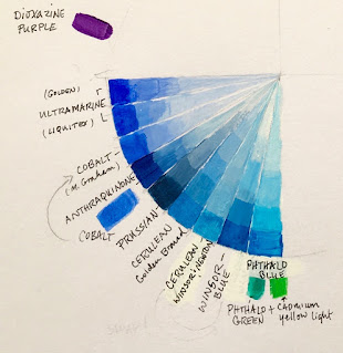
I definitely learned a few things I didn’t expect! The Golden brand ultramarine was a shade more lavender than the Liquitex ultramarine. The Daler-Rowney went the lightest lavender when I added the same amount of white. The Liquitex was the most sheer and least opaque of the three.
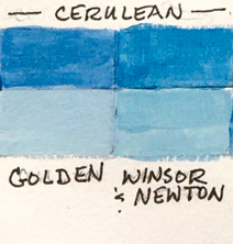
The Golden brand Cerulean had a lot more staining strength than the Windsor & Newton, which was much more sheer.
The less expensive Daler-Rowny cobalt blue was more opaque and seemed to have some white tint in it compared to the more expensive M.Graham paint. You do get what you pay for.
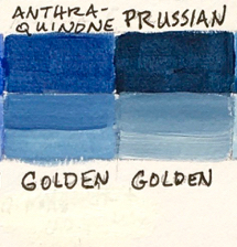
Anthraquinone Blue had a lot more in common with the Prussian blue. I had read that I could swap it out for ultramarine! I don't see how, it is a much more greyed down denim blue than I expected. It's a beautiful color, but I don't see how it would behave the same as ultramarine when mixing it with other colors for a painting.
I also learned that my initial arrangement of the paint tubes wasn’t correct when I actually got the paint on paper. Phthaloblue is the blue that leans the most towards green/yellow, not cerulean.
 |
| Swap the phthalo and the cerulean! |

Phthaloblue finds the right place.
The last thing I was curious about was to see if I could create a whole painting just using all my blue paint and white. The result was the "Snow Bear in Shades of Blue" painting posted at the first of this entry, I used all twelve blues and I think it turned out pretty good.
I learned a lot from this experiment and it was fun. I would encourage anyone to get out what paint you have become more acquainted with it’s character and personality a little better.
Happy Creating!
Tina
Tip: I learned that drawing a straight line with some equal sized squares makes the color comparison easier to see, plus it just looks nicer.
 |
| My full sketchbook page. |
P.S. Yes, the snow bear does exist. I built him in celebration of finally getting some more snow! I did use artistic license and remove all the houses in our neighborhood to improve his view of the mountains.


