Bird & Sunrise photo

Bird & Sunrise photo
Because "someday" is today!
Showing posts with label Experiments. Show all posts

Friday, July 31, 2026

A Different Kind of Painting Inspiration


Light shining through the tall grasses in the evening is fractured. ©2026 Tina M.Welter 


"Fractured" Reminds me of sunset light shining through tall grasses.

Last January I saw that Nicholas Wilton's free course called the"Creative Awakening Challenge" was going to be offered in February.

My art making plate was already dangerously full last winter, but this class was exactly what I had been looking for. I had been searching for awhile for another way to approach my art making and Nicholas promised that his 20 minute a day "Bloom" practice could really transform the way I made my art.

I had never allowed myself to paint a sad emotion before.
I had never allowed myself to paint this type of sadness before, it helped me.
 
The class was only for 25 days and when I read that we would be making paintings too and not just listening and observing, I squeezed a little more space onto that overflowing plate and signed up.  

The essence of spring, colors emerging from the mud. ©2026 Tina M.Welter
"Feelings of Hope" I felt compelled to start with pink and green.
 
Essentially, Nicholas was teaching us how to tap into our own feelings as inspiration for creativity. This may sound very odd to many of you, but this was never a topic discussed in my time at art school. 
 
Design, Value, Color theory, drawing skills, all the essential building blocks were covered but never anything about how to use emotion as inspiration, this was very new territory for me. I suppose they just expect that you already know how to do this, but I honestly didn't, of course I learned how in the sense of using color and design to reflect a mood, yes, but not tapping into what kind of marks and color choices reflect me.

I persisted on painting even on a day I felt like crap. ©2026 Tina M.Welter
"Headache" I tried to capture how awful I felt that day.


Imagine using NO photo references, just sitting with an emotion, choosing a color and putting it down on the paper however you want. Then choosing how to respond to that color and continuing for 20 minutes or longer if you wish, but only 20 minutes were required. 

The pressure of how much work was stacking up was getting to me. ©2026 Tina M.Welter

"Feeling Stressed" The work load was overwhelming me.


It was fascinating over those 25 days to see what colors I chose, what marks I loved making. I had no idea how much I loved cadmium orange as an exclamation mark of color, or how just the movement of scribbling with a colored pencil could feel so good and then the satisfaction of spreading thick acrylic paint over it all with a palette knife.  I could use any materials I wanted, I used acrylic metallic inks that I rarely use, it was so much fun!  

A blue city skyline in the fog, orange birds circle above the sadness. ©2026 Tina M.Welter
"Feeling a Little Blue" I love this painting so much.

I chose to make small paintings on paper, some of them amazed me with their power or beauty, others were not that great, but it didn't matter. The point was to practice gaining confidence in connecting to my own inner north star.

These paintings are the first seven I made in order day by day so you can see how varied the images were. I certainly wasn't sure what I was doing at first, but I did figure out a format eventually. For me, 5 x 7 inches was a good paper size and after the first four, I changed from painting in my sketchbook to heavier 185lb watercolor paper.

This may be a reflection of my usual painting style. ©2026 Tina M.Welter

"Constrained and Contained" An image from a dream that morning. 


All of this exploration involved making abstract art and after 25 days of trying this type of creating, I was interested in figuring out how to take what I learned and combine it with my usual style of realism, but I will save that post for another time, so until then, challenge yourself to try a different type of inspiration for making your art, you might surprise yourself.

Happy Creating! 

>^-^< 

Tina 

 p.s. If you are interested in learning more about Nicholas Wilton, his website is:www.art2life.com  This link sends you to the Sunday Bloom tab where he posts weekly insights about art making.

He also has a YouTube channel called Art2Life 


Sunday, November 30, 2025

Autumn Walk in the Park


Brilliant orange against green, the first changes of the season.
"Autumn Walk in the Park" ©2025
 

In my last blog post I mentioned that I hoped to use the small 3.50 x 2.50 inch paintings in my sketchbook as inspiration in painting larger artworks.

I rarely paint fall landscapes, so I made a goal to make several in my sketchbook this year. Out of that group, this little mini painting really captured a fall mood, so I decided to try painting it larger and on canvas. 


Small, but with a mighty big mood.
Small, but has a mighty big mood.
 

I have to admit, in the end I couldn't resist the the pull of the referring back to the photo. Which is a really good inspiration point and nothing wrong with using it, I just hoped to get closer to that wonderful expressiveness that lives in these little paintings.


What the camera captures doesn't compare to the mind's eye..
October 19, 2025 photo

To be fair, my larger 7 x 5 inch painting isn't an exact copy of the photo either and that is exactly what I am striving to do, create an interpretation that is mine but still hopefully expresses why I thought this moment was worth painting that other people will resonate with too. 


The captivating contrast of orange against green.
"Autumn Walk in the Park" ©2025
 

I believe that what the camera captures doesn't always compare to what the mind's eye sees. I may not be able to step very far from my references yet, but I will keep trying because think there is an important skill there for me to learn. 

If you find you are feeling stuck in the same old, same old in creating, think of a small way to push your boundaries and feel that excitement of exploring the unknown again. 

Happy creating!

>^-^<

Tina 


Sunday, June 9, 2024

Seeing the World in Black and White.


Ice skating, yes, if the pond is frozen.

In the 36 years that I have been making paintings, mixing color to exactly match the subject has been a big priority for me and over the years, I have become fairly confident at it. 

With that in mind, I was very intrigued when I saw a free YouTube class taught by artist Dianna Shyne called "Freedom with Color" where she was offering another way to paint besides just matching the colors of the subject, so of course I signed up!

Seeing the world in black and white.

In the class, Dianna gave a great condensed explanation about the qualities of color, encompassing Hue, Value, Color temperature and Intensity which was a great refresher for me and very helpful for people who are new to making art.

What I absolutely loved was watching her painting demonstration where she took those qualities of color and made three completely different paintings using only her black and white photo, posted above, for reference.

Honestly, I had thought of trying this myself before this class, but was feeling like a bit of a 'fraidy cat, not knowing exactly how to start. It was freeing to watch her do it, it seemed completely do-able, especially if you only chose one color family to practice.

Next Dianna gave us the assignment to:

1. Choose a black and white photo, either hers or our own.

2. Paint a study in one color, matching the values in the photo.

3. Paint another study and play with color. 

Where you place the darks and lights matter.
All my values in place.

I started with a value sketch based on Dianne's reference photo. This always helps me to simplify shapes and decide where to place the darkest dark and lightest lights.

I was excited to try this for myself, but I admit, it was such a different way for me to think about choosing colors and the options were so wide open, it was a little overwhelming!
 

Early morning, cool and peaceful, breathe it in.
Sunrise

Thankfully, all that work I did playing with complimentary colors in my sketchbook came to the rescue, I had some experience on how they could work together, so I chose purple and yellow to start, with a little orange to warm things up. I began with imagining an early morning sunrise.


Ice skating, yes, if the pond is frozen.
Winter stillness

For my second practice attempt, I chose blue and orange which is another complimentary pairing that I've had success with, all I needed to do was add was a bit of white. I had more of a wintry vibe in mind and I ended up really liking this one a lot.


Take a break, listen to the evening birds.
Summer Evening

 Last, I decided to try adding some green to what I had learned from the other two paintings, secretly hoping I might come close to the original color photo, I couldn't give up all my color matching habits that quickly. :D

Eventually Dianna did allow us to see her original color photo, the sky has more purple and the water reflections are more pink, but overall I think I did surprisingly well!  

It's not that exciting to look at until you paint it!

 
I found this exercise so incredibly fascinating and helpful, it really made it clear to me that getting the values correct, the dark, light and middle tones in the right places, is truly more important than matching the colors of the subject exactly!

Ever since this class, I've been inspired to drop all the color out of my reference photos and practice painting how light or dark the subject is, not the exact color.

Here's an example from one of my sketchbook pages, with all four studies painted from the same black and white photo of one red pear. 

Simple and elegant.


The color, all the variety of possibilities!
One pear, so many colors!

If you are wanting to experiment with the way you use color, I can definitely recommend trying this strategy.

Happy creating!

>^-^<

Tina

Thursday, January 4, 2024

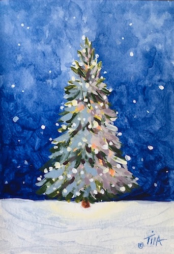
Oh, Christmas Tree! Revisted


Practice can make improvement!

Which one do you resonate with? Honestly, I like them both, but it was an unsolved puzzle that made me want to revisit this painting.


Practice can make improvement!

The key to solving that puzzle was found in that black and white drawing on the upper right hand side of my sketch book, plus going back to the original source material.


Even one light in a dark night warms the soul.
 

This was the original inspiration, and even though my painting from 2020 is nice, it has bothered me since then that I didn't capture that same sense of winter magic, I wanted my lighted tree to glow at night too, dang it! 

(Note, I would give credit to the artist if I could find them, if you know, please tell me.)

Lovely even in basic black and white.

 What helped me see the solution was dropping all the color out of the original so I could get my brain to register how truly dark that background sky and foreground snow really is. 


Organizing my palette and ideas.

The irony is, this is my first sketch in 2020 and I had the right idea. It's a mystery to me that I ended up with such a different final painting. 


Calm, peaceful, twilight.

I do know that even as a beginning artist, I always struggled to get the dark values truly dark. My brain seems to default to seeing a lighter value unless I consciously remind myself to triple check.


Everything in life is a process.
 

Even with this year's painting, I wish I had taken a photo of how light in value that first sky background was at the start. It took at least four more layers of ultramarine blue and purple to get that value dark enough!

 I'm pleased to say that now I feel that wonderful sense of completion from finally solving a puzzle. After the success of this experiment, I'm always going to make a value sketch of every subject before I start painting!

What dreams lie in our minds eye?

 For example, here's an interesting exercise I created for myself. I made the value sketch first from an idea in my mind, no reference photos, gasp! Next I did my best to match those values in color, it's not an amazing painting but I think I matched the values well. I'm determined to train that brain of mine!

Happy Creating!

>^-^<

Tina

P.S. One of my favorite things for making those value sketches, besides plain black acrylic paint and water, is a water soluble graphite pencil. The brand is "The General's Sketch and Wash" No links to sponsors or anything, I just wanted to share.

Wednesday, August 30, 2023

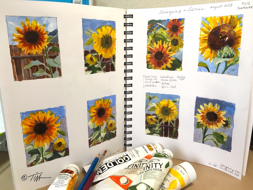
Sunflowers in Series for August


Designing in Series, a wealth of ideas.
"What a surprising group of lovely suns!"
 

I haven't designed many paintings in a series, I think the last time I attempted it was back in 2010-2011 when I made five 5x7 inch oil paintings of swans. I remember each painting took me many days to complete and I became a bit burned out on the subject.

In an attempt to paint more with less anxious fussing around about the details, I made eight little 2.25 x 3 inch rectangles in my sketchbook and chose the glorious sunflowers in my garden as my subjects. 

I have to say, I even surprised myself with this result! I hope I can capture the same energetic brush work when I try to paint them in a larger size. Now I have a new problem, which design do I want to spend the time and effort to paint larger?

Here is a closer look at my favorites:

Could it be a family resemblance?
"Bouquet of Suns"
 

I really like how this group relates to each other, I planted the original seeds two years ago, one seed packet was burgundy brown and the other pale yellow. These volunteer "grandchildren" plants are interesting, some of them have deep red brown centers with gold edges and others are pure yellow with green centers.
 

Some repeat visitors are welcome.
"The King and Bee"
 

The bees and butterflies have been having a grand time sipping and zipping around the garden, this was my tallest and largest sunflower and that white bit is a quick shorthand for a bee.

Friends large and small are great.
"Blondie and Friend"
 

I was calling the sunflowers that were all yellow with green centers the "Blondies," I wanted to be certain to get a portrait of them.

You never know when a sunburst will surprise you.
"Sunburst Afternoon"

I tried several times of day to get the perfect photo of this sunflower, the afternoon photo turned out to be one of my favorites.

Sometimes going it alone it the best way to go.
"Solo Sun"


Since the sunflowers this year are all volunteers from seeds from the year before, some of them were scattered by the birds and it was surprising where they popped up, like this solo beauty standing by itself.

Who can resist a warm heart?
"Warm-Hearted"

 My attempt to capture some of that wonderful warm sun glow through those gold and red brown petals.

Which one of these charming sunflowers would you pick?

I'm reminded of that very expressive German phrase "Die Qual der Wahl" which means the "the torture of choice." That sounds a bit dramatic, but it's a great phrase to try to convey that predicament of having too many good choices.

Happy Creating!

>^-^<

Tina

Saturday, July 29, 2023

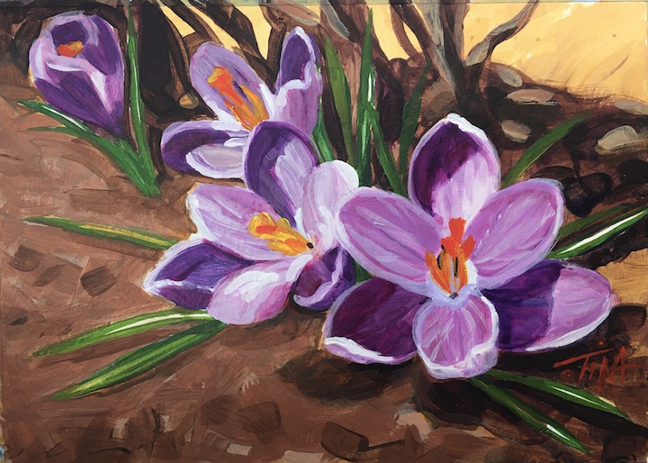
Why Crocus in July?

I had great plans this spring, I was going to paint and post flowers that inspired me as they bloomed in my garden, beginning with some lavender crocus that bloomed on Easter morning.

 I set out with brushes in hand and a new book to inspire me, "How to Paint fast and loose and bold" by Patti Mollica, determined to get my art process loosened up and faster so I could keep up with my flowers.

I wait all winter for the first hints of color from the earth.
April 9, 2023- Easter morning awakens.

I started off okay with a clever type of value study I learned from Patti's book. Look at each line horizontally and notice how the same color looks so different on each different grey background. A color can shout out "here I am" and then almost disappear depending on the background behind it.


We need contrast to understand what we are looking at.
Background color sets the mood!
 

I painted a couple of small color studies to test out my color choices. Note the May 13th date on the left hand page, I'm all set to go for finishing a painting for my May blog post. 

Then I decided on a last minute whim to go visit family on Memorial Day weekend and ended up with a surprise, an extreme allergic reaction to what the doctor thinks were 6 mosquito bites, seriously?!? Whatever it was, I did not feel well for over two weeks, I felt fatigued and my balance was off.


You can't really know anything unless you test it out.
Testing, testing, testing!!
 

Now it's June and I'm feeling mostly better. My plan on this painting was to follow Patti Mollica's advice and try to use more paint and fewer brush strokes, really think about how I'm going to be efficient and not overwork the paint. Here I go, all on the same day...


Everything needs a background.
Background wash, one brush!
 

Dark defines the light.
Darkest value defines the light.


Green means Life.
Bring on those green leaves!

Lavender Lights up the Room.
All dressed up in lavender.
  

Boom, layer after layer going on, valiantly resisting the urge to touch up any of the brush strokes and then my painting time is up that day. 

We had made plans to go camping for two nights, something we haven't done in years. We have a grand time getting there, camp site is great, all is going pretty well until evening and then I don't feel well, I feel so dizzy. I can't sleep all night, the next day we hike a little but I am getting worse. We go home and I try to figure this out, I've had these attacks before, and I try all the things, but this just wants to hang on and on and on! 

No painting happening, I don't have the energy or focus for it. June passes by and now it's July before I finally feel up to figuring this painting puzzle out.


Orange centers are delicious.
Orange completes the look!
 

 I wasn't certain how I was even going to finish this painting, I felt so discouraged about all the set backs and then I didn't really like how it was looking! I couldn't quite put my finger on what was bothering me, all the brush work looked pretty good and the values are right, I think... then I compared it to my photo and realized the foreground is a bit too bright for the flowers to really stand out, so I broke the "fast and loose" ideals and painted over the foreground again to darken it.


Let there be more dark.
No shining stars without the dark.
 

What a journey, and I still can't decide if I like this painting or not, the brushwork in the foreground isn't as nice and the crocus look too stiff and heavy to me. At least I learned some new techniques and it is done. I don't like to leave paintings half done because they haunt me, seriously, they do!

 Happy Creating and Persevering...

(Sometimes creating involves not giving up, even when you want to.)

 >^-^<

Tina 

p.s. I am feeling better, not 100 percent, but better. Possibly some sort of virus messing with my inner ear and taking it's sweet time to heal. Thanks for reading! 

Sunday, April 30, 2023

Going from Weird to Wow!!


Weird to wow, what a difference!
What a journey!


I signed up to take a free painting class from Chris Fornataro, an artist who I admire and follow on YouTube.

The emphasis of the class was practicing how to use large value shapes as a foundation for better paintings. I don't usually paint by following another artist step by step, so this was definitely going to be an interesting hands on look into his process. 

The beginning of the first lesson, a still life, was a little strange looking...

Wow, that pimento is extremely large.
Is that a huge pimento?
 

We began with painting the subject by only representing the largest basic shapes of light and dark. Jeff told me he thought I was painting a giant pimento olive, not a very promising start!

What I did like was watching how efficient Chris was in mixing his colors using a limited palette, this painting only used ultramarine blue, cadmium red, cadmium yellow and titanium white.   

For example, he would start with the basic color, mixing blue and red for the purple background and then adding a little of the yellow to "de-saturate" the purple to make it less vivid and more natural looking. He did the same thing for the apple, blue and yellow to make a medium green and then a bit of red to tone it down a bit. 

Chris also emphasized how we can simplify mixing color by focusing on the primary colors and asking ourselves, does this mix need more blue, more red, more yellow?


Second round of shapes, lesson example.
 

Next, we painted smaller shapes onto those larger mid-tone light and dark sections using the same color mixes, but adjusting them by adding some white or yellow to lighten or some mixed purple to darken the colors or add shadow.


What a difference refining layers can make.
Snack time!
 

As I added more refining shape layers, I was so relieved to watch the painting begin to take form. The class was taught using oil paints which stay "wet" and are easy to mix for a long time. I didn't know if I could make his process work with acrylic paint, which even with extenders, dries very quickly. I was very happy and excited to try another subject after I ended up with this first result.

The second assignment was a landscape. Here is the reference photo we were given to work from.

Not my idea of a good photo.
Beach photo © Chris Fornataro
 

I was rather disappointed when I saw this photo, it was not my idea of an inspiring subject. I would never pick a photo with lighting that it would make trees look like a huge block of uniform green. The cast shadow across the beach and into the water was nice, but still!!

The first blocking in of the large mid-tone value shapes was not great to look at either. Some of the students called it the dinosaur stage, I thought mine looked like a duck with big hair!


Weird, weird shapes man.
Hello Lochness, I think I found your monster!

I could understand what he was trying to teach though, seeing the large blocks of color and value to build a good foundation for the painting first, then adding smaller value shapes on top to create form. I intended to follow exactly what the instructor was asking us to do, hoping that some how I could eventually make it come out alright.


Sometimes more is better.
The secret is all in the layers!

Adding the second layer with the smaller value shapes did help. It took me a lot longer to get the acrylic color mixed and in the right places, but I could see the finish line now.

I could imagine myself here afterall.
I could imagine myself here after all!

The final little details brought it all together and it was a logical way to paint, going from large shapes to small. I am curious how it would have looked if I had used oil paints instead. I suspect it would have been faster! It took me a lot of extra time to remix and blend my fast drying acrylic paint.

Overall, it was a good class and I would recommend him as a teacher. It wasn't anything I didn't know, but it was valuable practice and I gained some insights into mixing color that I'm going to use going forward with my own work. Sometimes it is so worth while to see the world through some one else's eyes.

Happy creating! 

>^-^< Tina