Bird & Sunrise photo

Bird & Sunrise photo
Because "someday" is today!
Showing posts with label color mixing. Show all posts

Sunday, April 30, 2023

Going from Weird to Wow!!


Weird to wow, what a difference!
What a journey!


I signed up to take a free painting class from Chris Fornataro, an artist who I admire and follow on YouTube.

The emphasis of the class was practicing how to use large value shapes as a foundation for better paintings. I don't usually paint by following another artist step by step, so this was definitely going to be an interesting hands on look into his process. 

The beginning of the first lesson, a still life, was a little strange looking...

Wow, that pimento is extremely large.
Is that a huge pimento?
 

We began with painting the subject by only representing the largest basic shapes of light and dark. Jeff told me he thought I was painting a giant pimento olive, not a very promising start!

What I did like was watching how efficient Chris was in mixing his colors using a limited palette, this painting only used ultramarine blue, cadmium red, cadmium yellow and titanium white.   

For example, he would start with the basic color, mixing blue and red for the purple background and then adding a little of the yellow to "de-saturate" the purple to make it less vivid and more natural looking. He did the same thing for the apple, blue and yellow to make a medium green and then a bit of red to tone it down a bit. 

Chris also emphasized how we can simplify mixing color by focusing on the primary colors and asking ourselves, does this mix need more blue, more red, more yellow?


Second round of shapes, lesson example.
 

Next, we painted smaller shapes onto those larger mid-tone light and dark sections using the same color mixes, but adjusting them by adding some white or yellow to lighten or some mixed purple to darken the colors or add shadow.


What a difference refining layers can make.
Snack time!
 

As I added more refining shape layers, I was so relieved to watch the painting begin to take form. The class was taught using oil paints which stay "wet" and are easy to mix for a long time. I didn't know if I could make his process work with acrylic paint, which even with extenders, dries very quickly. I was very happy and excited to try another subject after I ended up with this first result.

The second assignment was a landscape. Here is the reference photo we were given to work from.

Not my idea of a good photo.
Beach photo © Chris Fornataro
 

I was rather disappointed when I saw this photo, it was not my idea of an inspiring subject. I would never pick a photo with lighting that it would make trees look like a huge block of uniform green. The cast shadow across the beach and into the water was nice, but still!!

The first blocking in of the large mid-tone value shapes was not great to look at either. Some of the students called it the dinosaur stage, I thought mine looked like a duck with big hair!


Weird, weird shapes man.
Hello Lochness, I think I found your monster!

I could understand what he was trying to teach though, seeing the large blocks of color and value to build a good foundation for the painting first, then adding smaller value shapes on top to create form. I intended to follow exactly what the instructor was asking us to do, hoping that some how I could eventually make it come out alright.


Sometimes more is better.
The secret is all in the layers!

Adding the second layer with the smaller value shapes did help. It took me a lot longer to get the acrylic color mixed and in the right places, but I could see the finish line now.

I could imagine myself here afterall.
I could imagine myself here after all!

The final little details brought it all together and it was a logical way to paint, going from large shapes to small. I am curious how it would have looked if I had used oil paints instead. I suspect it would have been faster! It took me a lot of extra time to remix and blend my fast drying acrylic paint.

Overall, it was a good class and I would recommend him as a teacher. It wasn't anything I didn't know, but it was valuable practice and I gained some insights into mixing color that I'm going to use going forward with my own work. Sometimes it is so worth while to see the world through some one else's eyes.

Happy creating! 

>^-^< Tina

Saturday, March 4, 2023

Lost in the Shadows


Sweet pixel love at harvest time.

  As an art student, I wasn't always excited about making still life paintings. We did several of them in school, but I didn't feel compelled to make any more after I graduated. 

Lately though, I am appreciating the wisdom in regularly practicing this style of art work. 

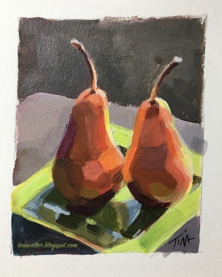
I recently set up a simple still life of two Bosc pears, my goal was to practice blocking in color more efficiently.


Sweet love at harvest time.
"The Kiss"

 In support of this goal, I decided to make a drawing from my photo in digital form on my computer to pre-block out the colors. I thought this would make them easier to see and help me make better color value decisions.


Sweet pixel love at harvest time.
"Digital Kiss"

 Everything was going smoothly, the 8x10 drawing and complementary color under painting came together nicely and I thought once I had those dark and light values in place, I could just charge ahead with the final color. Imagine my surprise when I suddenly felt stuck! 


Opposites attract, sweet love at harvest time.
"Complementary Kiss"


  My color blocking plan had been too successful, I could see so many colors in the shadows of my digital sketch that I wasn't certain how to mix them to get all those subtle shifts! 

I usually only use a limited palette to mix my colors so that the painting feels cohesive. 

 The bright oranges, yellows and greens where the sunlight was hitting the objects were not a problem, I wasn't certain how to mix that wide range of  browns that varied from tones of green, deep orange to red violet from a limited palette.

 
Focused in on sweet pixel love at harvest time.
"Digital Kiss" it's all in the details.

 Mixing colors is usually the part of painting I love the most, it was weird to feel so stuck. 

So before putting another brushstroke on my still life, I went to my tried and true anxiety calming back-up, testing out color mixes in my sketchbook.


Sweet anxiety relief mapped out in tiny colored squares..
Anxiety reliever.


  Six hours of mixing and painting later, I finally had some answers.  

My great light-bulb moment came when I finally figured out how to mix a wonderful range of related of browns by adding a little blue to cadmium red light or cadmium orange.

I was surprised that even using different blues still increased the color range without looking out of place.


Sweet Georgia, I figured out Brown!
Hearts and stars marking my favorite mixes.

  That little 2.75 x 3.50 inch color study took so much work, but I feel like I can paint the larger 8x10 with a lot more confidence now, since I've mapped out how the color temperature and value changes as it wraps around the pears and across the plate. 

Painting such a subtle shift in colors in the shadows added so much interest and richness, I really loved the effect.  I know I will be thinking more about what is going on in the shadows of the next paintings I make.


A little sweet love at harvest time.
"Little Kiss"


Here's to the wisdom of going back to practice the basics. 


Happy Creating! 

>^-^< Tina


Friday, September 30, 2022

Striking it Rich, hello Yellow!


Yellow sapphire painting using only yellow and white paint.©2022 Tina M.Welter
Yellow Sapphire painting

Since I started an in-depth color by color exploration of the paints in my paintbox back in January of 2021, I've found it's quite a challenge to figure out a subject I can paint using only one color family. I bent the rules a bit this summer when I reveled in the color green while painting trees and grass, but I did not stick to the one color family rule. 

Thirteen different yellow acrylic paints from my paint box plus white.
Thirteen different yellows plus white.

 I was able to use all my blues to make a believable night-time landscape, but I've found that painting nature believably generally requires at least a minimum of two colors, often the primary and it's complimentary color are necessary, except when it comes to recreating gems. So far, I've been able use this single color gem solution twice, once with purple and now happily with yellow.

Seven varieties of yellow I used to create the "Yellow Sapphire" painting. ©2022 Tina M.Welter
The seven yellow paints I used to make my gem.
 

I wasn't certain at first if I could get some of the greenish yellow tones I would need, but combining burnt umber with a cool cadmium yellow light and some white was the answer. One of the best pieces of color mixing advice I ever received was to include burnt umber, which normally looks like a dark cool brown, in the yellow family.

Detail: burnt umber and gold variations plus the thirteen types of yellow in my paintbox. ©2022 Tina M.Welter
Detail: burnt umber and gold variations.
 

I've learned so much doing these color swatch studies and find that I refer to them again and again when choosing colors for a painting. This time I learned that the two different brands of burnt umber I own look very different on paper, Liquitex brand is much cooler and the less expensive Daler-Rowney is much warmer. Also, I didn't know that adding white to the iridescent gold colors would make such pretty opaque cream colors. The shiny reflective quality goes away, but that cream color could be handy.

It takes a little extra time and effort, but I highly recommend going on this useful color exploration journey.

Happy Creating!

>^-^<

Tina

Links to my other single color family deep dives:
Into the Deep Purple

Shades of Blue landscape 

Friday, March 26, 2021

Into the Deep Purple

Acrylic painting of purple amethyst stone ©2021 Tina M.Welter
Amethyst Heart

 Even though it is my favorite color, I don't have a lot of tubes of purple paint in my paint box simply because it is a "secondary color" and it is often easy to mix a wide range of lovely shades from red and blue.

I do have a couple pre-mixed purple paints that I consider absolutely essential though, Dioxizine purple and Acra Violet. Dioxizine purple is a wonderfully deep, sheer purple, it mixes well with other colors and adds shadowy depth. I especially like it for painting dark purple irises. Acra Violet, is an incredibly versatile red purple that can add so much vibrancy to a range of flowers from red, pink and purple.

Purple paint mixed with white, color test ©2021 Tina M.Welter
Arranging my purple paints from cool to warm.

Since I am exploring what the paints in my paintbox can do, I wanted to test out mixing my red and blues to see what kind of variety of purples were possible. I had to start with classifying my reds from cool to warmest so I would know where to start. I already tested out all the blues, see the "Shades of Blue" blog post from January. Again, I learned you can't judge a color by it's paint tube, some reds I thought were more cool were actually more warm, and visa-versa. After I painted a swatch of color onto paper, it was much easier to classify once I could see the colors next to each other.

Red paint arranged cool to warm, color test. ©2021 Tina M.Welter
Re-arranging my red paints from cool to warm.


Blue paint plus white, arranged cool to warm. ©2021 Tina M.Welter
My blue paints arranged cool to warm.

After I sorted my red colors, I mixed my coolest red and coolest blue, then warmest red and warmest blue to see what kind of range of purples I had. The biggest surprise for me was my two warmest colors yielded a dark gray that wasn't very purple at all! Good to know.

Comparing the extremes, coolest to warmest. ©2021 Tina M.Welter
Comparing the extremes, coolest and warmest.

 Some of the my favorite purples were mixed from the middle range of warm red+blue or cool red+blue, not the extremes at either end.

Nice purple mixes, somewhere in the middle. ©2021 Tina M.Welter
Nice purple mixes, somewhere in the middle.

Next was the painting challenge, what subject could possibly suit this wide range of purples? Eventually I decided on an amethyst stone, which seemed very appropriate since it is often considered a traditional birthstone for February.

Amethyst Heart acrylic painting, first layer of paint.
Amethyst Heart, first layers of paint.

 Although I was really happy that I was able to use almost all the shades of purple I mixed, including that surprising gray, I really felt like the painting could use more work. Adjusting the values would make it more unified and improve the illusion of a sparkling cut stone. I wrote this blog at the end of February and hoped to post it for that month, but I had to make a decision. Do I post the painting as is and on time, or do I improve the painting to how I envisioned it and post in March? What do you think? First heart above, finished heart below.

Amethyst heart acrylic painting, various shades of purple paint.
Amethyst Heart, finished!

I heard an interesting point of view recently from a person I admire, YouTube's Sci-Show host and creator, Hank Green. He said he is able to accomplish so many creative projects because he focuses on getting them to 80 percent perfect and then doesn't worry about that last 20 if it isn't necessary. He is right, that last 20 percent can take a surprising amount of time and may not even improve things that much!

At first I thought I could move forward and post a painting that I felt was at 80 percent, but eventually I chose not to. Even though I think the initial painting did illustrate what I was trying to accomplish, I honestly really wanted that last 20 percent!

Now I'm glad I waited because the finished painting makes me very happy when I look at it. I hope you will enjoy this sparkly purple heart in March as much as I do.

Happy creating!

>^-^<

Tina


Full page view of my notebook with color tests. ©2021 Tina M.Welter
Full page view of my color tests, 8.5 x 5.5 inch notebook.


Thursday, December 31, 2020

Oh, Christmas Tree!

"December Evening" ©2020 Tina M.Welter 5x7 inches acrylic on paper.
"December Evening"
 

One positive aspect of dealing with a pandemic is that it pushes people to be creative in connecting with each other.

In November, one of my friends asked if I would try teaching a short mini-class on painting using the App, Marco Polo. Instead of sending texts, this app allows people to leave videos for each other. I've often wondered what it would be like to teach a painting class, so I decided to give it a try.

Tiny Christmas tree sketch, 2x2.5 inches, acrylic on paper, ©2020 Tina M.Welter
Tiny Sketch, 2 x 2.5 inches

I chose a lighted Christmas tree outside with a twilight sky as our subject. Simple, right? Just one triangle shape with a dark background and some lights, how hard could it be…and so began my innocent journey into the thick of the woods.

Tiny Christmas tree sketch, 1.5 x 2.25 inches, acrylic on paper, ©2020 Tina M.Welter
Tiny Sketch 1.5 x 2.25 inches

 I’ve never actually broken down my painting methods into steps so that someone else could follow me before, and I soon found that taking apart what I do was quite the challenge.

Figuring out the palette is often my first and favorite step, but this time I also had to think about palette colors that would be really common to find and versatile for beginning painters to use. 


Palette, Cadmium Red, Yellow, Ultramarine Blue , Titanium White ©2020 Tina M.Welter
 Cadmium Red, Cadmium Yellow, Ultramarine Blue, Titanium White

I painted a couple of sketches using the basic colors of Cadmium Red, Cadmium Yellow, Ultramarine blue, and Titanium White. Then I went on-line and looked for paint sets that would include those colors, but many used Cobalt blue instead of Ultramarine blue and the red and yellow were listed as “primary” colors.  Goodness, what should to tell people to buy?

December Evening painting sketch, 5x7 acrylic,©2020 Tina M.Welter
Painting Sketch, 5x7 inches, using Cobalt blue.

This led me to make more sketch paintings using Cobalt blue to see if it that color would work instead. Soon I found myself down a whole color theory rabbit-hole, testing out “color bias” combinations of warm red, yellow and blue compared to using a set of cool red, yellow and blue. This topic deserves a whole blog post of it’s own.

Warm biased colors, Cadmium Red, Cadmium Yellow and Phthaloblue ©2020 TinaM.Welter
Warm biased palette.
 
Cool biased palette, Alizarin Crimson, Cadmium Yellow, Ultramarine Blue ©2020 TinaM.Welter
Cool biased palette.
 

My biggest concern being that my initial palette choice was wrong and would make painting harder for other people because I used a “cool” blue with a “warm” red and yellow. Seriously, this kept me up at night and I wasn’t happy until I had tested all the options. It turned out that I still liked that initial palette best after all, even if it didn’t follow the “color bias” theory. Well, that is creativity, sometimes breaking the rules makes the best art.

Pine Tree Basics, 5x7 inches, pencil drawing ©2020 Tina M.Welter
Pine Tree Basics

Next, was breaking down the drawing. One friend said she could barely draw a circle, so I told her not to worry because we would be making triangles! I measured and marked every shape so that I could explain how to get the tree and it’s branches placed correctly.

Since we were only using red, yellow and blue, I made one video on color mixing. I was amazed that it took 40 minutes to explain and my poor iPhone got really hot doing all that recording!

Then, it was the painting steps. Goodness, I think I made three or four sketch paintings to make certain I could explain and show everything in order. Yes, I wrote the steps down, I needed those reminders for when I actually made the final video.

Three pine tree sketches, figuring out the steps, ©2020 Tina M.Welter
Figuring out the steps!

As a side note, I believe that some of the quick, tiny sketches I threw together are much better paintings than the larger sketches I spent a lot of time making. It is annoying to me that I have a hard time capturing that spontaneity in larger artwork.

Tiny Christmas tree sketch,  1 x 1.5 inches, acrylic on paper, ©2020 TinaM.Welter
Tiny Sketch, 1 x 1.5 inches
 

I did feel the pressure when making the final painting on camera, it was an odd feeling to be watched while doing something that has always been a solo project. Overall, I'm pleased with how the video and painting turned out, although the next day I could see the blue shadows should have been darker on the snow. So far, I have resisted the urge to repaint that section. 

I've certainly gained an appreciation for all the extra work those artists I grew up watching on t.v. must have done to make painting on camera look so easy. A respectful bow to Bob Ross, Bill Alexander and Helen Van Wyck!

Happy Creating!
>^-^<

Tina

Monday, August 31, 2020

Summer Sketchbook Tour

Summertime and the flowers are blooming! Perfect for inspiration, sketching and testing out ideas. Often I will have other creative friends comment that doing my detailed type of sketching process takes too much time. 

They are partly right and I used to skip over it myself because it is incredibly tempting to just start putting those wonderful colors down on paper or canvas. Admittedly, I still skip sketching sometimes if I'm pressed for time or feeling particularly confident, but I know full well there may be consequences in the form of frustration, wasted art materials and lost time trying to fix mistakes. 

Even a simple palette color test is worth the time because of that nice feeling of certainly going forward, plus I think they are fun to do.

Here are some of my color sketches from this year and what I learned from making them...

Sunflower Sketch ©2020 Tina M.Welter

Yellow flowers are my nemesis, for some reason I always struggle with getting the right shadow color to get the sense of light shining through their petals. I thought a simple palette of Benzidrine Yellow, Cadmium Orange, Burnt Sienna and Cobalt Blue would provide enough shadow depth, but the flower still looked flat. In essence I had several "yellows" and a blue, and it took adding a "red," Alizarin Crimson to finally get the deep warm brown I was looking for.


Pink Roses Sketch ©2020 TinaM.Welter
 

Figuring out what color combination I like the best is another way I use my sketchbook.

Did I want to use Napthol Red to make the peachy tones in the pink roses or would I be happier with mixing Permanent Rose and Cadmium Yellow? 

I circled the Green Gold, Sap Green and Prussian Blue after I decided they were my favorite mix for the leaves. This sketch also helped me notice that the greens were a bit cold and I would need to mix them with some Permenant Rose to warm them up a bit.


Dark Angel Iris Sketch ©2020 TinaM.Welter
 

My goal here was to practice painting a really dark purple iris. I thought I knew what colors would get the result I wanted, but I was rather disappointed with the lack of depth and the whole thing felt too cool. I knew adding yellow to warm things up would only make the colors gray, so I turned the page and tried again...


Dark Iris Sketch ll ©2020 TinaM.Welter


 I searched on-line for a little bit of help and had a genuine "aha" moment when I saw the suggestion to mix the purples with Burnt Sienna! Of course, a warm deep yellow/red that was a perfect solution!


Pink Iris Sketch ©2020 Tina M.Welter
 

Here's an example of my color mixing instincts being right on target. I wanted to be certain to mix the correct greyed purple for the shadow side of the pink iris petals. The first combination I tried were Cadmium Red and Prussian Blue and they were exactly what I was looking for. Adding Benzidrine Yellow made it possible to mix a light green and the right shade of orange and peach. 

I love it when a palette comes together so easily and with only three colors plus white. It feels like an elegant solution.


Winter Pines Sketch ©2020 TinaM.Welter
 

I was feeling very uncertain about which paints to mix for an evening winter scene with pine trees, so I created this little grid to solve my problem.

The top row has the colors I was fairly certain I wanted to use. The second row mixes all those colors with Cobalt blue and Titanium white. The third row mixes all the top row colors with Pthalogreen and Titanium white.

Having these colors to refer to was really helpful in making my final painting.


"Neon Lights" darker ©2020 TinaM.Welter


Here it is, an example of me diving head-first into making a painting without a "sketchbook first" test. This photo doesn't really capture it, but I originally painted the shadow colors over the bottom rose petal and leaves way too dark and I was really bummed when I realized what I had done.


"Neon Lights" lighter ©2020 TinaM.Welter
 

No one will notice now, but I can tell you I spent a lot of time repainting with lighter colors and glazing over those areas with thin color washes to lighten up that dark section. Acrylic paints are so forgiving!

I hope these few examples have demonstrated how fun and helpful solving creative problems in a sketchbook can be.


Happy Creating!

>^-^<

Tina

p.s.

For those of you wondering what happened with my eyes, the good news is the medicine helped and by May my right eye was better. Hurrah. Then in July, the same flock of floaters showed up in my left eye! Sheez! At least I knew what it was and was able to start the same treatment quickly for my left eye. 

After dealing with too many other bizarre health issues all spring and summer to mention here, I was finally diagnosed with Hashimoto's Thyroiditis in August. There may be some connection to that auto-immune disease affecting my eyes. I am hopeful that now I am getting treatment for that, my eyes will be healthier too.


Saturday, November 30, 2019

The Perfect Pair for Fall

One last entry for the this year's series on painting with only a primary color and their secondary as the color palette. I have to say, this last pair of blue and orange turned out to be my favorite.

Palette colors, Ultramarine Blue, Cadmium Orange and Titanium White.

I chose Ultramarine blue and Cadmium orange and found that they were very versatile when mixed together. The addition of Titanium white resulted in a wide palette of useful colors.

Palette colors, Ultramarine Blue, Cadmium Orange and Titanium White mixed samples.


A couple of ideas immediately came to mind to sketch out using these colors. Pumpkins, of course.


Pumpkin Sketch, Ultramarine Blue and Cadmium Orange ©2019 Tina M.Welter

A landscape inspired by memories of the pinion and scrub oak trees of New Mexico.

Landscape Sketch, Ultramarine Blue and Cadmium Orange ©2019 Tina M.Welter

The blue tones also made me think of a wintery sunset on the Oregon coast. I searched through my photo reference and found the perfect image from when we stayed at a condo at Otter rock, December 2016.

December View from Otter Rock condo ©2016 Tina M.Welter

Using a very light pencil lines, I made a basic grid in thirds on my 5x7 watercolor paper and made a few light sketch lines of the clouds. When painting with acrylics, it's good to remember that heavy pencil lines can become "trapped" under the paint where they are not easily erased.


5x7 watercolor paper with light grid lines photo by Tina M.Welter

Working light to dark, I used lighter tones to sketch in the basic shapes and colors and also set the horizon line at the bottom third of the painting.


View From Otter Rock painting step one ©2019 Tina M.Welter

Next, I used darker tones to add drama and contrast.

View From Otter Rock painting step two ©2019 Tina M.Welter

Last, I added more details using the lightest tones to shape the clouds and waves. I also strengthened the pure blue and orange colors at the horizon. That was fun!

View From Otter Rock painting step three ©2019 Tina M.Welter

I think the simplest thing to remember from this experiment of mixing primary colors and their secondary color is that you will always get the most interesting shades of grey. That might not sound impressive, but when painting it's often what is going on in the shadows that really make the highlights shine and gives a sense of warmth and depth to a subject. I really don't need black very often, if at all. Put that tube of Mars Black down and try mixing those wonderful dark colors yourself.

Happy Creating!

>^-^<
Tina