Summertime and the flowers are blooming! Perfect for inspiration, sketching and testing out ideas. Often I will have other creative friends comment that doing my detailed type of sketching process takes too much time.
They are partly right and I used to skip over it myself because it is incredibly tempting to just start putting those wonderful colors down on paper or canvas. Admittedly, I still skip sketching sometimes if I'm pressed for time or feeling particularly confident, but I know full well there may be consequences in the form of frustration, wasted art materials and lost time trying to fix mistakes.
Even a simple palette color test is worth the time because of that nice feeling of certainly going forward, plus I think they are fun to do.
Here are some of my color sketches from this year and what I learned from making them...
Yellow flowers are my nemesis, for some reason I always struggle with getting the right shadow color to get the sense of light shining through their petals. I thought a simple palette of Benzidrine Yellow, Cadmium Orange, Burnt Sienna and Cobalt Blue would provide enough shadow depth, but the flower still looked flat. In essence I had several "yellows" and a blue, and it took adding a "red," Alizarin Crimson to finally get the deep warm brown I was looking for.
Figuring out what color combination I like the best is another way I use my sketchbook.
Did I want to use Napthol Red to make the peachy tones in the pink roses or would I be happier with mixing Permanent Rose and Cadmium Yellow?
I circled the Green Gold, Sap Green and Prussian Blue after I decided they were my favorite mix for the leaves. This sketch also helped me notice that the greens were a bit cold and I would need to mix them with some Permenant Rose to warm them up a bit.
My goal here was to
practice painting a really dark purple iris. I thought I knew what
colors would get the result I wanted, but I was rather disappointed with
the lack of depth and the whole thing felt too cool. I knew adding
yellow to warm things up would only make the colors gray, so I turned
the page and tried again...
I searched on-line
for a little bit of help and had a genuine "aha" moment when I saw the
suggestion to mix the purples with Burnt Sienna! Of course, a warm deep
yellow/red that was a perfect solution!
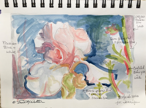
Here's an example of my color mixing instincts being right on target. I wanted to be certain to mix the correct greyed purple for the shadow side of the pink iris petals. The first combination I tried were Cadmium Red and Prussian Blue and they were exactly what I was looking for. Adding Benzidrine Yellow made it possible to mix a light green and the right shade of orange and peach.
I love it when a palette comes together so easily and with only three colors plus white. It feels like an elegant solution.
I was feeling very
uncertain about which paints to mix for an evening winter scene with
pine trees, so I created this little grid to solve my problem.
The top row has the colors I was fairly certain I wanted to use. The second row mixes all those colors with Cobalt blue and Titanium white. The third row mixes all the top row colors with Pthalogreen and Titanium white.
Having these colors to refer to was really helpful in making my final painting.
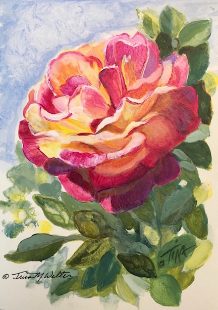
Here it is, an example of me diving head-first into making a painting without a "sketchbook first" test. This photo doesn't really capture it, but I originally painted the shadow colors over the bottom rose petal and leaves way too dark and I was really bummed when I realized what I had done.
No one will notice now, but I can tell you I spent a lot of time repainting with lighter colors and glazing over those areas with thin color washes to lighten up that dark section. Acrylic paints are so forgiving!
I hope these few examples have demonstrated how fun and helpful solving creative problems in a sketchbook can be.
Happy Creating!
>^-^<
Tina
p.s.
For those of you wondering what happened with my eyes, the good news is the medicine helped and by May my right eye was better. Hurrah. Then in July, the same flock of floaters showed up in my left eye! Sheez! At least I knew what it was and was able to start the same treatment quickly for my left eye.
After dealing with too many other bizarre health issues all spring and summer to mention here, I was finally diagnosed with Hashimoto's Thyroiditis in August. There may be some connection to that auto-immune disease affecting my eyes. I am hopeful that now I am getting treatment for that, my eyes will be healthier too.


No comments:
Post a Comment