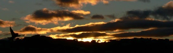
Bird & Sunrise photo

Bird & Sunrise photo
Because "someday" is today!

Wednesday, September 30, 2026

Celebrating Love with Golden Roses


Like roses in September, blooming late in the season, but oh, still so fragrant and glorious!
"Amy's Roses"

 A year ago, my oldest niece was going to be married in September. I dearly wanted to attend, but it wasn't possible so I asked if she would like a painting as a gift instead.  

She had sold her home and was missing the variety of beautiful roses that were growing in her former yard, she sent me this great photo and asked if they could be the subject for the painting. 

The roses blooming around our door hold the sweetest memories in their hearts.


Of course! This is just the type of reference photo I adore, a clear direction of sun light, accurate color, wonderful deep shadows and bright highlights. A good painting depends on all of these elements to be successful.


The world can look completely different, depending on which way we turn the canvas.

I wasn't able to begin work on her painting until this summer, the first step was deciding which direction the 20x24 inch canvas was going to hang. 

Beginning in July, I made these two smaller rough painting sketches above which also helped in choosing the final painting's color palette.


The world can look completely different, depending on which way we turn the camera.

A helpful tip, use a photo editing software to "cut and paste" elements to test out your design ideas. I used Pixelmator to "cut" the roses out from the original photo and then moved them around to figure out where I wanted them and then painted the sketches above from these new photo collage references.


The basic architecture of an artwork begins with a drawing.

My niece thought the horizontal version would look best in her home. I started with drawing a large grid on the 20x24 inch canvas and then made a pencil drawing using the photo collage as reference.

Emphasizing the pencil line drawing with layer of yellow ochre acrylic paint helps to keep the drawing more visible as I add more paint.


An interesting background makes a better story.

Next step, painting a base layer of permanent violet dark, this gets the white of the canvas covered quickly, plus I think it's a nice complimentary color to all of the yellow in the roses.


 All the main actors are here, let the story begin.

First full layer of paint, my goal is to get everything roughly in place with all the right values of light and dark. This also helps with design choices, I decided to put a bud back in the middle after I had taken it out while painting this step.


Each layer refines the story, back to front and back again!
 

Once everything is in place, I start working "back to front" by refining the background, leaves and then the roses. The challenge of this step is to get just the right amount of detail in the background, but not too much to take attention away from the roses, they are the stars of the show after all.


A fresh place to start again is a wonderful gift.

Helpful tip number two. When painting with acrylics, I've discovered that using white gesso to adjust shapes or lighten up an area is incredibly helpful. I used to try to make those adjustments with regular titanium white paint, but it is too sheer, gesso works so much better. 

For example, you can see the reshaping of the rose on the top upper left. Once I get the shape how I want it, I paint over the gesso with regular acrylic paint.  I also used gesso to make the highlights on the large rose and the rose on the right more bright. That's why the white looks a little odd in the two photos above.


Roses in September, a surprise to remember better days ahead.

Final details, getting the shadow and highlights just right on the large rose, shaping the details on the center bud correctly and improving the glow on the right side yellow rose, all the fussy little bits.  It's worth all the work to feel that satisfaction when everything finally settles into visual balance. 


The trick is to NOT get lost in the details!
 

I'm really happy with this painting, I met one of my goals of keeping my brushwork simple. I didn't over paint all the details surrounding the main roses, it's such a temptation for me to do that! Examples: the bud and leaves on the left, the simple blocked in colors of the leaves in the middle, the roses in the distance on the right.

Another goal was to capture that glow of sunlight weaving it's way through the roses and leaves and I feel like I succeeded. 

I also wanted this painting to be especially beautiful to celebrate a happy marriage that was years in the making, like roses in September blooming late in the season, but oh, still so fragrant and glorious!

Happy creating.

>^-^<

Tina 


Friday, July 31, 2026

A Different Kind of Painting Inspiration


Light shining through the tall grasses in the evening is fractured. ©2026 Tina M.Welter 


"Fractured" Reminds me of sunset light shining through tall grasses.

Last January I saw that Nicholas Wilton's free course called the"Creative Awakening Challenge" was going to be offered in February.

My art making plate was already dangerously full last winter, but this class was exactly what I had been looking for. I had been searching for awhile for another way to approach my art making and Nicholas promised that his 20 minute a day "Bloom" practice could really transform the way I made my art.

I had never allowed myself to paint a sad emotion before.
I had never allowed myself to paint this type of sadness before, it helped me.
 
The class was only for 25 days and when I read that we would be making paintings too and not just listening and observing, I squeezed a little more space onto that overflowing plate and signed up.  

The essence of spring, colors emerging from the mud. ©2026 Tina M.Welter
"Feelings of Hope" I felt compelled to start with pink and green.
 
Essentially, Nicholas was teaching us how to tap into our own feelings as inspiration for creativity. This may sound very odd to many of you, but this was never a topic discussed in my time at art school. 
 
Design, Value, Color theory, drawing skills, all the essential building blocks were covered but never anything about how to use emotion as inspiration, this was very new territory for me. I suppose they just expect that you already know how to do this, but I honestly didn't, of course I learned how in the sense of using color and design to reflect a mood, yes, but not tapping into what kind of marks and color choices reflect me.

I persisted on painting even on a day I felt like crap. ©2026 Tina M.Welter
"Headache" I tried to capture how awful I felt that day.


Imagine using NO photo references, just sitting with an emotion, choosing a color and putting it down on the paper however you want. Then choosing how to respond to that color and continuing for 20 minutes or longer if you wish, but only 20 minutes were required. 

The pressure of how much work was stacking up was getting to me. ©2026 Tina M.Welter

"Feeling Stressed" The work load was overwhelming me.


It was fascinating over those 25 days to see what colors I chose, what marks I loved making. I had no idea how much I loved cadmium orange as an exclamation mark of color, or how just the movement of scribbling with a colored pencil could feel so good and then the satisfaction of spreading thick acrylic paint over it all with a palette knife.  I could use any materials I wanted, I used acrylic metallic inks that I rarely use, it was so much fun!  

A blue city skyline in the fog, orange birds circle above the sadness. ©2026 Tina M.Welter
"Feeling a Little Blue" I love this painting so much.

I chose to make small paintings on paper, some of them amazed me with their power or beauty, others were not that great, but it didn't matter. The point was to practice gaining confidence in connecting to my own inner north star.

These paintings are the first seven I made in order day by day so you can see how varied the images were. I certainly wasn't sure what I was doing at first, but I did figure out a format eventually. For me, 5 x 7 inches was a good paper size and after the first four, I changed from painting in my sketchbook to heavier 185lb watercolor paper.

This may be a reflection of my usual painting style. ©2026 Tina M.Welter

"Constrained and Contained" An image from a dream that morning. 


All of this exploration involved making abstract art and after 25 days of trying this type of creating, I was interested in figuring out how to take what I learned and combine it with my usual style of realism, but I will save that post for another time, so until then, challenge yourself to try a different type of inspiration for making your art, you might surprise yourself.

Happy Creating! 

>^-^< 

Tina 

 p.s. If you are interested in learning more about Nicholas Wilton, his website is:www.art2life.com  This link sends you to the Sunday Bloom tab where he posts weekly insights about art making.

He also has a YouTube channel called Art2Life