Bird & Sunrise photo

Bird & Sunrise photo
Because "someday" is today!

Saturday, November 30, 2019

The Perfect Pair for Fall

One last entry for the this year's series on painting with only a primary color and their secondary as the color palette. I have to say, this last pair of blue and orange turned out to be my favorite.

Palette colors, Ultramarine Blue, Cadmium Orange and Titanium White.

I chose Ultramarine blue and Cadmium orange and found that they were very versatile when mixed together. The addition of Titanium white resulted in a wide palette of useful colors.

Palette colors, Ultramarine Blue, Cadmium Orange and Titanium White mixed samples.


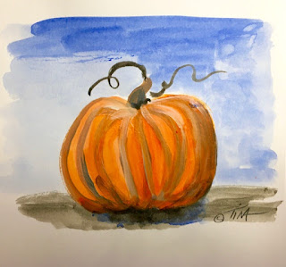
A couple of ideas immediately came to mind to sketch out using these colors. Pumpkins, of course.


Pumpkin Sketch, Ultramarine Blue and Cadmium Orange ©2019 Tina M.Welter

A landscape inspired by memories of the pinion and scrub oak trees of New Mexico.

Landscape Sketch, Ultramarine Blue and Cadmium Orange ©2019 Tina M.Welter

The blue tones also made me think of a wintery sunset on the Oregon coast. I searched through my photo reference and found the perfect image from when we stayed at a condo at Otter rock, December 2016.

December View from Otter Rock condo ©2016 Tina M.Welter

Using a very light pencil lines, I made a basic grid in thirds on my 5x7 watercolor paper and made a few light sketch lines of the clouds. When painting with acrylics, it's good to remember that heavy pencil lines can become "trapped" under the paint where they are not easily erased.


5x7 watercolor paper with light grid lines photo by Tina M.Welter

Working light to dark, I used lighter tones to sketch in the basic shapes and colors and also set the horizon line at the bottom third of the painting.


View From Otter Rock painting step one ©2019 Tina M.Welter

Next, I used darker tones to add drama and contrast.

View From Otter Rock painting step two ©2019 Tina M.Welter

Last, I added more details using the lightest tones to shape the clouds and waves. I also strengthened the pure blue and orange colors at the horizon. That was fun!

View From Otter Rock painting step three ©2019 Tina M.Welter

I think the simplest thing to remember from this experiment of mixing primary colors and their secondary color is that you will always get the most interesting shades of grey. That might not sound impressive, but when painting it's often what is going on in the shadows that really make the highlights shine and gives a sense of warmth and depth to a subject. I really don't need black very often, if at all. Put that tube of Mars Black down and try mixing those wonderful dark colors yourself.

Happy Creating!

>^-^<
Tina 

Saturday, August 31, 2019

Rose Jam

Many people were interested in my attempt to make rose jam, so I will take a little side road away from drawing and painting and focus on the art of making food instead.

My Rose Jam Experiment, Photo ©2019 Tina M.Welter
My Rose Jam Experiment, summer 2019

First of all, I did make some changes to the recipe that was in this YouTube link I referenced in my last post. It was too much sugar for my taste! I know you need enough sugar for jams to be safe to store, but there was also added lemon juice so I hoped that would be enough citric acid to do the job instead. I decided to be extra safe and keep my jar of jam in the fridge, just in case. The way I made the recipe, it only yielded one 8 ounce jar.

Here's how I made my jam:

Gather 12 large rose heads, trim and gently rinse in water and drain.

A tip on gathering the roses. The white bits where the rose petals attach to the center are supposed to be trimmed off. The recipe I followed said they make the jam bitter. Don't trim these off each petal individually, it's crazy making! :P  Grasp the entire rose head and trim the white bits off all at once.

Put your clean rose petals in a bowl and add
2 Tbsp of sugar 
1/4 tsp of citric acid OR 1 Tbsp of bottled lemon juice.
Do not use fresh lemon juice, the citric acid levels are too random to be safe. See note below***

Mix the petals and sugar and citric acid together gently with your hands until the rose petals wilt and reduce. Cover the bowl tightly or put them in a resealable plastic bag and let them rest in the fridge for a day or two, but not much longer or they may go brown.

On jam making day:

Sterilize 8 oz. canning jar and lid.

Bring to boil
1 and 3/4 cup water 
Add prepared rose petals from the fridge.
Cook about 10-11 minutes or until rose petals don't "squeak" when you chew one. Be careful not to over cook them.

Petals will look faded and pale. With a slotted spoon, remove them from the water and set aside.

To the water, add
1 and 1/3rd cup sugar...the original recipe called for TRIPLE  that amount. :O  Adjust to suit your taste.
Cook about 10 minutes more, stirring often. Test syrup on a plate by dripping small amounts and letting it cool to check it's consistency.

When it is honey like, re-add the rose petals and bring back to boil.

Add
1/2 tsp. of citric acid OR 2 Tbsp lemon juice and cook for a minute or two more. The rose petals will turn red again. It's really cool to see.

Check consistency and turn off heat. Allow the jam to be a little thinner than you want, it will thicken more as it cools.

Originally, I left the rose petals in the jam, but I discovered I didn't like the texture. Eventually I re-heated the jam and strained the petals out from the syrup. My syrup was rather thin since I didn't use so much sugar. Next time I'll try using 2 cups of sugar. I may use the petals in a cake or something...I'm not sure what yet.

The syrup is really great on yogurt and ice-cream. I also like to add it to carbonated water for an interesting summer fizzy drink.

***
Here's the FYI I referenced about substituting bottled lemon juice for citric acid...

"Canned foods need to contain a certain amount of acidity or sugar to prevent food-borne illnesses, such as botulism.
Because the acidity of fresh lemon juice varies, it's best to use canned or bottled lemon juice in canning; it has a consistent acidity level.
 Use 2 tablespoons of lemon juice for each 1/2 teaspoon of crystalline citric acid, which is enough for a quart of canned tomatoes."


https://www.livestrong.com/article/520416-how-to

Happy creating!

>^-^<

Tina
p.s. 
The roses I used were blooming in front of our apartment. No pesticides have been used on them since we have lived here.

June Roses photo ©2018 TinaM.Welter

Sunday, June 30, 2019

Preserving the Moment

I wait all year for the roses. I want to admire all the varied colors, marvel at the intricate petal layers and soak in the lovely scent. I was so excited when we first saw the home we rented in 2017 had two types of beautiful roses growing around the house!

Pink Roses in Bud Vase, photo ©2019 Tina M.Welter
Roses from the backyard.


This year I'm going to add the sense of taste to that list and I hope it is another way to preserve all that fleeting beauty a little bit longer. Yes, I've watched those cooking shows where adding too much rose flavor to food can result in a soap-like disaster, :P but I recently watched a YouTube video on how to make rose jam and I am definitely going to give it a try. I have cleaned and trimmed rose petals waiting in my fridge as I type this. Here's the link if you are interested. How to Make Rose Jam
 
"Time Over Beauty" pencil and digital drawing of four pink roses ©2019 Tina M.Welter
Time Over Beauty

 This spring I had the opportunity to sketch out some designs for a book cover. I wanted to convey the idea of beauty in all the stages of life. Having observed rose blossoms bud, bloom and fade, often with all three stages happening at once on one stem, I feel they are one of the most naturally perfect illustrations of this concept.
 
"Young and Old" photo of four red roses ©2019 Tina M.Welter
Roses from the front yard.


Even though individual rose blooms may not last long, a rose plant can live much longer. I  hadn't really considered how long until I read about the "Thousand Year Rose" growing on a Catholic cathedral in Germany. 

The Rose of Hildesheim climbs on the wall of Hildesheim Cathedral, Wikipedia
The Rose of Hildesheim

 A long stemmed tea rose plant might live an average of 35-50 years and some antique roses for over 100 years, which is respectable, but the rose that grows on the walls of the Hildesheim Cathedral in Germany is verified to have been growing there for at least 700 years! 

Species: Rosa canina Family: Rosaceae Image No. 3, Wikipedia

It's a rosa canina, one of the simpler five petaled roses, but a rose still the same. It's an interesting story encompassing a king and surviving a world war if you would like to read it for yourself. Rose of Hildesheim

Perhaps they are stretching the story a bit for the "Thousand Year" title, but it is still a charming thought that someone living centuries ago may have stopped and admired this same rose. 

Happy creating and remember to stop and smell or taste the roses!

>^-^<
Tina

Tuesday, April 30, 2019

The Beauty of Translating Photos to Paintings

My favorite combination of elements is finally here, warmer weather plus longer daylight hours equals flowers to photograph! Here are some of this year's spring photographs from our backyard that served as the inspiration for three springtime paintings. 

First of all, crocus and daffodils, those bravest of early flowers daring to lift delicate blossoms out into the cold air.


Photo of first flowers to bloom this year, crocus and mini-daffodils ©2019 Tina M.Welter


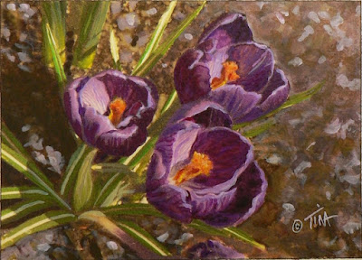
Solid purple crocus blooms, photo ©2019 Tina M.Welter


Small 5x7 inch purple crocus painting ©2019 Tina M.Welter
"Little Gems" painting

 I followed their example and dared to try a different technique, printing my photo of the dark purple crocus onto watercolor paper instead of drawing it. I discovered that the moisture in my paint made the printer ink melt away and I would lose my place. It was ok to try, the color values were easy to match, but I think I will stick with drawing in the future because my pencil lines stay put!

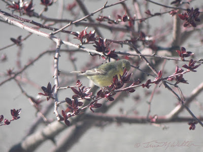
In the front yard, female Western Tanagers stopped to snack on the crab-apple tree buds. I know now that these little birds will only stop by for a day or two so I don't hesitate to take a photo of them if I can. I felt really lucky this year to have these little birds visit on a sunny morning with no wind.

Female Western Tanager stops by for a snack of crab apple buds, photo ©2019 Tina M.Welter


Small 5x7 inch acrylic painting of a female Western Tanager ©2019 Tina M.Welter
"Golden Visitor" painting
One of the beauties of painting is being able to emphasize parts of the subject you like. For example, I could highlight the colors of the bird more in my painting than was captured in the photo.

The tall daffodil corner doubled this year with two lovely blooms per bulb instead last year's one bloom each.

Four tall single bloom daffodils, photo ©2019 Tina M.Welter


Small acrylic painting of three daffodils, ©2019 Tina M.Welter
"Heralds of Spring" painting
 Tall and stately, with their natural trumpet shape suggesting  that they are announcing it's officially springtime, I thought they were perfect subjects to paint for an Easter card.

A new landlord arrived this spring too and unfortunately, he wanted all of my flowers moved away from the house. :(

Flower bed with all my spring flower bulbs removed, photo ©2019 Tina M.Welter


Over several long days digging, I managed to get them all into containers, making my own Tina's Flower Ark on the patio. The next challenge will be figuring out how to arrange them into a smaller garden area. 

My rescued flowers in containers on the patio, photo ©2019 Tina M.Welter

One surprising silver lining did occur from moving all the flowers. I had only seen one faded bloom on this iris bed two years ago. I took two thirds of the bed apart in March, but ended up leaving the remaining third to remove later. I was so surprised when these iris formed dark purple buds and started blooming in April!

The last third of the iris bed remaining, photo ©2019 Tina M.Welter


Surprisingly early blooming purple iris I had to move in April, photo ©2019 Tina M.Welter

Here they are, still blooming even after moving them into this temporary pot made from a potting soil bag. Talk about blooming where you are planted! I learned that the iris bed had been too full of roots and needed to have some removed so that the plants would bloom again. So many good life lessons from an elegant iris plant!

Happy creating,

>^-^< 
Tina

Thursday, February 28, 2019

Exploring, Art Nouveau Style

Triple challenge for February! Design a birthday card in Art Nouveau style featuring a yellow and purple color scheme...


Art Nouveau inspired kitten and hearts painting. ©2019 Tina M.Welter
"Little Bear Hug" 5x7 inches, acrylic on paper ©2019

What in the world would persuade me to attempt such a challenge? First of all, I'm learning that having limitations can be a great opportunity. Limitations push us to think more creatively by shaking us out of our usual way of making art. 

When my dear friend Gayle challenged her blog readers last month to try painting in an art style which inspires us, I knew exactly what I wanted to try. Pick Your Passion - The Full Circle Studio

I've admired the Art Nouveau movement for over 30 years. Pronounced [noo] + [voh] it simply means "new art" which is kind of funny since it seems like old art to us now, but I digress. This wonderfully decorative style flourished from around 1890 to 1910 and featured repetitive motifs, curved lines and celebrated nature. Favorite subjects were flowers, plants, dragonflies and the female form. If you have marveled at the famous stained glass lamps designed by the many artists employed at Louis Comfort Tiffany's glass-works, then you are acquainted with an American interpretation of this style. 

I suppose it is no surprise that an art form focused on flowers and curving lines would resonate with me, but it is one thing to appreciate something and quite another to figure out how to make it yourself. Of course I went straight to the artwork of the master himself, Alphonse Mucha, to see what I could learn. Scroll all the way down the page at the link above and you will see a small selection of his wonderful artwork.

Poster of Sara Bernhardt as Gismonda, 1895 Alphonse Mucha - public domain
 Gismonda poster 1895 


In 1890, Mucha began supporting himself as an illustrator in Paris. His dream as an artist was to create epic historical paintings, but illustrating for magazines paid the bills. An amazing opportunity knocked on his door in December 1894 when he was asked to create a poster on a super short deadline for Sara Bernhardt. The publisher wanted it to appear on the streets of Paris on January 1, 1895. Alphonse designed the poster above and it created a sensation, which pleased Miss Bernhardt so much that it lead to a nice six year contract for Mucha.

What I think is brilliant about this poster is how effectively it uses design to convey a hierarchy of information. What key information do we get at a glance? The name of the play, the actress and the theater where she is appearing. "Gismonda, Bernhardt, at the Theatre Renaissance" All the important facts, boom, done. Designers today would say that is an obvious visual strategy, but I don't think it was common to design that way back then.

If we have a few moments to look closer, we can gather even more information. The mosaic tiles at the top of the poster as well as the dress Miss Bernhardt is wearing suggests Byzantine style. The play is set in 1450 Athens, at the very end of the Byzantine era. The cross behind her head and the palm branch she holds reference Christian religious beliefs that are an important part in the play. Every visual element has something to communicate.

I also noticed the simplicity of the palette. Variations on the primary color blue with it's secondary compliment, orange. These choices may have had to do with printing cost limitations, I honestly don't know, but they certainly add to the visual style. 

Sara Bernhardt in Gismonde costume, 1896 photo by Theobold Chartran - public domain
1896 photo of Sara Bernhardt by Theobold Chartran


The inspiration for my Art Nouveau artwork came from my cousin Mary who adores her cats. She sent me this photo with the tag line "HAVE A HUG! And two hearts for you!! (Little Bear's and mine!)" 

Blackish brown kitten cuddled up contendedly with her owner.
"Little Bear" photo ©2019  Mary Goring

 Mary's birthday was coming up in February, so I wanted to send a hug back. I hoped to convey my message as clearly as Mucha did with his poster. I kept this in mind as I arranged the key design elements and squeezed in as many heart motifs as I comfortably could into the drawing. How many do you count? ;D

"Little Bear Hug" pencil drawing in my sketchbook ©2019 Tina M.Welter
"Little Bear Hug" drawing ©2019

Dark outlining of main design elements is another common feature of Art Nouveau, as well as the distinctive typography.  I was inspired by this one found on Allfont.net. Link here.
 

Typeface Art Nouveau-Bistro ©2006 Gophmann A.L.,All rights reserved.
"Art Nouveau Bistro"©2006 A.L.Gophmann


For my limited palette, I chose primary yellow and it's secondary compliment, purple. The purple was created by mixing quinacridone magenta and pthaloblue. Combined with the yellow, it made the perfect warm brown for the kitten's fur.


Color palette: cadmium yellow light, quinacridone magenta, and pthaloblue.
Color palette.

I was going to be really strict about only using yellow and purple, but this mostly yellow & purple color themed illustration by Mucha influenced me to add another secondary color, green.


JOB cigarettes poster 1898 Alphonse Mucha

 I mixed my green from the same three palette colors I was already using. Cadmium yellow and pthaloblue makes a nice bright green which I thought needed a little touch of quinacridone magenta to grey that brightness down a bit.


Color Palette, figuring out the right shade of green.
Color Palette, mixing the right green.

I'm not certain if the way I used the green is as pleasing as Mucha's, but it certainly achieved my goal of making the yellow word "Hug" stand out. I actually wanted the letters to be in gold, which was another cool element often used in Art Nouveau style, but my gold paint didn't look right and I had to change the lettering back to plain yellow. 

All in all, I am happy with the way the artwork turned out. I really like the underlying design and I would like to move the colors around a little and paint it again. My friend Gayle is going to use it in her next blog and my dear cousin absolutely loved it, and that is the best praise of all.

I highly recommend making something in an art style that inspires you, what you discover on that journey may be a delightful surprise.

Happy creating!

>^-^<

Tina