As an art student, I wasn't always excited about making still life paintings. We did several of them in school, but I didn't feel compelled to make any more after I graduated.
Lately though, I am appreciating the wisdom in regularly practicing this style of art work.
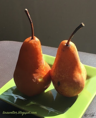
I recently set up a simple still life of two Bosc pears, my goal was to practice blocking in color more efficiently.
 |
| "The Kiss" |
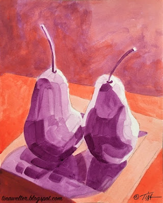
In support of this goal, I decided to make a drawing from my photo in digital form on my computer to pre-block out the colors. I thought this would make them easier to see and help me make better color value decisions.
 |
| "Digital Kiss" |
Everything was going smoothly, the 8x10 drawing and complementary color under painting came together nicely and I thought once I had those dark and light values in place, I could just charge ahead with the final color. Imagine my surprise when I suddenly felt stuck!
 |
| "Complementary Kiss" |
My color blocking plan had been too successful, I could see so many colors in the shadows of my digital sketch that I wasn't certain how to mix them to get all those subtle shifts!
I usually only use a limited palette to mix my colors so that the painting feels cohesive.
The
bright oranges, yellows and greens where the sunlight was hitting the
objects were not a problem, I wasn't
certain how to mix that wide range of browns that varied from tones of
green, deep orange to red violet from a limited palette.
 |
| "Digital Kiss" it's all in the details. |
Mixing colors is usually the part of painting I love the most, it was weird to feel so stuck.
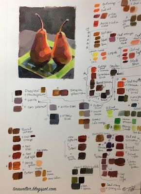
So before putting another brushstroke on my still life, I went to my tried and true anxiety calming back-up, testing out color mixes in my sketchbook.
 |
| Anxiety reliever. |
Six hours of mixing and painting later, I finally had some answers.
My great light-bulb moment came when I finally figured out how to mix a wonderful range of related of browns by adding a little blue to cadmium red light or cadmium orange.
I was surprised that even using different blues still increased the color range without looking out of place.
 |
| Hearts and stars marking my favorite mixes. |
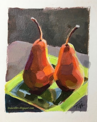
That little 2.75 x 3.50 inch color study took so much work, but I feel like I can paint the larger 8x10 with a lot more confidence now, since I've mapped out how the color temperature and value changes as it wraps around the pears and across the plate.
Painting such a subtle shift in colors in the shadows added so much interest and richness, I really loved the effect. I know I will be thinking more about what is going on in the shadows of the next paintings I make.
 |
| "Little Kiss" |
Here's to the wisdom of going back to practice the basics.
Happy Creating!
>^-^< Tina
