I set a goal to paint with more concepts in mind, and for the month of January I considered new beginnings. This got me thinking about doorways and the anticipation or dread of going into unknown territory.
I liked the "Waiting" painting so much because it sent me back through our travels in Greece and the many doorways and cats that we saw there. I wanted to explore more of those themes.
"In the Shadows" was inspired by our trip to an abandoned silk factory. I wanted to capture the warmth of the red bricks exposed in the heart of the walls in contrast to the cold concrete. I also wanted to have some of the sense of mystery of "what is in the next room".
"Safe Passage" reflects the sense of hope I feel looking forward to the coming year after being in a twilight of worry for the last few months. A golden cat, for me, represents a good messenger and guide.
"Fortune Teller" is the desire we feel in wanting to know the future, but we can only see such a small part of what is ahead of us. All the constellations of the zodiac are there, but can they really tell us anything?
"Fire and Ice", the leaves caught in the winter ice by our spring and "Sheer Gold", the one amber iris I had bloom this summer are part of those beautiful moments that I just love to capture and share. I hope you will enjoy them too.
PS: I entered "In the Shadows" in the Saachi Gallery Showdown 3, a free online gallery for any artist. If you would like the fun of being an Art Critic, click on the link in my "also like"list and then enter my name in the "Search for" box. When you click to vote, you get to sign up for free on their site and then vote away! Have fun! (You get to vote for me vs. another artist, and then for all the others you want--feel the power!) The winning artists get $500.00 and the publicity.
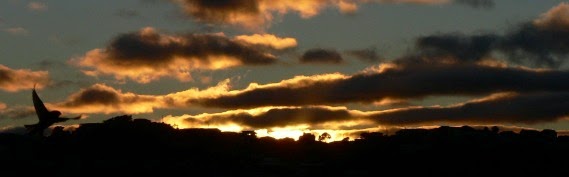
Bird & Sunrise photo
Because "someday" is today!
Saturday, January 29, 2011

Monday, December 20, 2010
Humpty Dumpty Had a Great Fall
I had a great half-marathon in August, and then everything seems to have "gone off the wall" since then. First, work slowed down to a quarter of what it had been all year. Of course, I had to have a root canal in October, very expensive. Then my Mom had two strokes in November. I was lucky to be able to spend three weeks with her since I didn't have any work. While driving the 700 miles back from my parents, my transmission decides to start slipping, also very expensive. Then to top it all, another tooth filling decides to fail resulting in, you guessed it, a crown. Unbelievable.
There is some promise of work in January and February, but with warnings that things may be a bit slower. All this has made me really look at being more in control of my own work. I need to set more definite goals with deadlines for completion. I am considering seriously putting my work on E-bay. That will require that I produce more work. I have been trying out the tiny 2.5" x 3.5" artist trading card format. I like that I can complete a painting in an afternoon instead of days. I think my images are just as good if not better than some that are selling.
I am posting my first three super tiny paintings, which are canvas on tiny wood frames. I would love your feed back, dear readers, if you are still out there. I think I should get $30.00 each, what do you think?
Jeff's Corner: When life hands you lemons, throw them at someone!
There is some promise of work in January and February, but with warnings that things may be a bit slower. All this has made me really look at being more in control of my own work. I need to set more definite goals with deadlines for completion. I am considering seriously putting my work on E-bay. That will require that I produce more work. I have been trying out the tiny 2.5" x 3.5" artist trading card format. I like that I can complete a painting in an afternoon instead of days. I think my images are just as good if not better than some that are selling.
I am posting my first three super tiny paintings, which are canvas on tiny wood frames. I would love your feed back, dear readers, if you are still out there. I think I should get $30.00 each, what do you think?
Jeff's Corner: When life hands you lemons, throw them at someone!
Wednesday, September 22, 2010
Late Bloomers
 |
| Small and beautiful. |
I planted my sunflowers later than I wanted to this year. Actually, I have never planted them up here before, but I wanted to see how they would do, even if they got a late start. They did come up, and after learning that I had to protect the seedlings from the birds, who ate about five of them, I managed to get nine plants growing.
As summer has ended, three of them are blooming and I keep warning the others that the frost is coming soon. The classic tall "Silver Stripe" are the ones that are not open yet, even though their bloom heads are formed. The smallest, "Music Box", which is only about 16 inches tall has three blooms on one stock, is already open and so pretty.

Sunday, July 4, 2010
Shades of Grey
I am enticed by all the flower catalogs that come in the mail and I do my best to resist buying anything. I know all to well that not many plants will survive the weather or the animals here on the mountainside. But last fall, I couldn't resist the "Reblooming Irises" offered by Brecks. I was anxious all spring to see what flowers would appear. So far, only two of the six plants have bloomed. The earliest was completely white and so pretty. I have to admit, I was hoping for something with more color, since painting white flowers is still intimidating to me. Anything "white" is basically every color but white because of the light reflections and shadows. I took a lot of photos, hoping to get something I felt inspired to paint.
I hesitated over the challenge, but decided to dig in. I experimented with mixing ivory black, yellow ochre and white to get a nice warm grey, as suggested by Helen Van Wyk. This looked pretty good, but when I added some alizarin crimson to get cool shadows, it just seemed a bit pink. The principle is to add cool violets to yellows to get nice shadows. My next attempt I tried dioxazine purple instead of the alizarin crimson and that seemed better. Although, when I was near completion I had the feeling that it just looked too purple and basically awful. Jeff confirmed the too much purple part, so I took heart and added back some more yellow ochre and burnt sienna, which is in the yellow family.
This is the odd thing about painting. Often, it will look like such a failure because it doesn't match what I had in mind. Sometimes if I will just take a break and come back with the idea of judging what is there, not what I think should be there, the painting will magically transform from a complete mess in my mind to something that is not that bad. I definitely had that happen this time and only within a few minutes. I was disappointed because I thought it was so ugly I wasn't going to be able to put it on the blog. When I decided to just judge at it as itself, it suddenly looked much better. It does look different than I imagined, but I will leave it up to you to judge!
I hesitated over the challenge, but decided to dig in. I experimented with mixing ivory black, yellow ochre and white to get a nice warm grey, as suggested by Helen Van Wyk. This looked pretty good, but when I added some alizarin crimson to get cool shadows, it just seemed a bit pink. The principle is to add cool violets to yellows to get nice shadows. My next attempt I tried dioxazine purple instead of the alizarin crimson and that seemed better. Although, when I was near completion I had the feeling that it just looked too purple and basically awful. Jeff confirmed the too much purple part, so I took heart and added back some more yellow ochre and burnt sienna, which is in the yellow family.
This is the odd thing about painting. Often, it will look like such a failure because it doesn't match what I had in mind. Sometimes if I will just take a break and come back with the idea of judging what is there, not what I think should be there, the painting will magically transform from a complete mess in my mind to something that is not that bad. I definitely had that happen this time and only within a few minutes. I was disappointed because I thought it was so ugly I wasn't going to be able to put it on the blog. When I decided to just judge at it as itself, it suddenly looked much better. It does look different than I imagined, but I will leave it up to you to judge!
Sunday, June 13, 2010
Alla Prima
In the spirit of trying different painting techniques, I wanted to try "alla prima" which is an Italian phrase that means "at the outset" or as we would say, "all at once". No underpainting, no preliminary drawing, just putting down the "shapes, tones and colors in one opaque application", as Helen Van Wyk describes it.
I had tried this before with oil paints and ended up with a mess. This time, I chose a subject I have painted before, a pink columbine and I followed Helen's directions exactly. First, prime the canvas gray so it is better to judge the color on. Sketch the placement of the image using paint. Put in the main body tones of the subject. (Not the extreme lights or darks.) Know where you light is coming from and paint the background from light to dark accordingly. Surprisingly, the dark side is where the light is coming from. Add light tones. Know where your focal point is and don't detract from it with extra fussy details elsewhere in the painting. Add dark tones and then the final highlights. Be sure you have layered and overlapped your shapes so that things in the foreground look like they belong there. Piece of cake...
Five hours later I had a pretty good little painting. I was hoping for two hours since my canvas was only 4" x 5", but size doesn't seem to matter when you are learning.
I will now share the amazing answer of what happens when you mix Alizarin Crimson and Viridian Green. I was sure I would get some weird brown, but it was the loveliest shade of purple gray. The color mixing principle I was using was to get the shadow tone of a pink flower by adding it's color complement, green. You can see this color on the pink petals of the columbine. I love learning new things that surprise me and I think I will try this style of painting again.
Jeff's Corner: What? Size doesn't matter??!!
I had tried this before with oil paints and ended up with a mess. This time, I chose a subject I have painted before, a pink columbine and I followed Helen's directions exactly. First, prime the canvas gray so it is better to judge the color on. Sketch the placement of the image using paint. Put in the main body tones of the subject. (Not the extreme lights or darks.) Know where you light is coming from and paint the background from light to dark accordingly. Surprisingly, the dark side is where the light is coming from. Add light tones. Know where your focal point is and don't detract from it with extra fussy details elsewhere in the painting. Add dark tones and then the final highlights. Be sure you have layered and overlapped your shapes so that things in the foreground look like they belong there. Piece of cake...
Five hours later I had a pretty good little painting. I was hoping for two hours since my canvas was only 4" x 5", but size doesn't seem to matter when you are learning.
I will now share the amazing answer of what happens when you mix Alizarin Crimson and Viridian Green. I was sure I would get some weird brown, but it was the loveliest shade of purple gray. The color mixing principle I was using was to get the shadow tone of a pink flower by adding it's color complement, green. You can see this color on the pink petals of the columbine. I love learning new things that surprise me and I think I will try this style of painting again.
Jeff's Corner: What? Size doesn't matter??!!
Tuesday, May 25, 2010
Trying A Different Path
We have had a very wet and cold spring here at 8,500 ft. Amidst the gray and sometimes snowy days, the brave daffodils showed their pretty faces and I felt the definite itch to paint them. I decided to try a different approach and try to capture the concept of their boldness to bloom in such bad weather without my usual careful drawing and reference photos.
I chose an 8 x 10 canvas and decided to use acrylic paints because I wanted the quick drying time, so I could change the painting more easily as I painted. I struggled with getting the look of seeing the flowers through a wet window and in getting the sense of form to the flowers.
After some thought, I felt I needed a refresher course in basic value study. I found my copy of Helen Van Wyck's book on painting flowers and and went to work on a tiny 2 and 1/2 x 3 inch canvas to study on. She is so good at explaining body tone, body shadow, cast shadow, reflected light and highlights. I had forgotten her great color mixing ideas. Mainly adding the complement to get lively shadows and highlights. A little Alizarin Crimson added to the Cadmium Yellow made my dull shadows look so much more alive.
Feeling more confident, I decided to try another tiny canvas with oils. I didn't do a refined drawing, but I did get a bit stuck and had to get one of my photos out to get the placement of the shadows right. Even Helen was painting from actual flower arrangements, so it is good to have reference. I just want to learn how to not need it so much, and that will just have to take practice.
Does anyone have any guesses what fabulous color you get when you combine Alizarin Crimson with Viridian Green? I will share the amazing answer with you in the next Blog post!
Jeff Corner: My guess is Alizaridian!
I chose an 8 x 10 canvas and decided to use acrylic paints because I wanted the quick drying time, so I could change the painting more easily as I painted. I struggled with getting the look of seeing the flowers through a wet window and in getting the sense of form to the flowers.
After some thought, I felt I needed a refresher course in basic value study. I found my copy of Helen Van Wyck's book on painting flowers and and went to work on a tiny 2 and 1/2 x 3 inch canvas to study on. She is so good at explaining body tone, body shadow, cast shadow, reflected light and highlights. I had forgotten her great color mixing ideas. Mainly adding the complement to get lively shadows and highlights. A little Alizarin Crimson added to the Cadmium Yellow made my dull shadows look so much more alive.
Feeling more confident, I decided to try another tiny canvas with oils. I didn't do a refined drawing, but I did get a bit stuck and had to get one of my photos out to get the placement of the shadows right. Even Helen was painting from actual flower arrangements, so it is good to have reference. I just want to learn how to not need it so much, and that will just have to take practice.
Does anyone have any guesses what fabulous color you get when you combine Alizarin Crimson with Viridian Green? I will share the amazing answer with you in the next Blog post!
Jeff Corner: My guess is Alizaridian!
Sunday, April 25, 2010
Illumination
When we were visiting the church of St. Nicholas in Demre, I thought some of the decorative work in the stone and frescoes reminded me of Celtic designs. I had learned about the famous Book of Kells when I studied art history in college. The intricate Celtic knotwork combined with Christian iconography was very memorable to me. I had even tried my hand at creating some of my own Celtic designs a few years ago. I didn't expect to see artwork that reminded me of that style in Turkey.
I haven't discovered the exact connection, but I did read that the tradition of ornamenting books was something that passed down from Egyptians, to Greeks, Romans, Byzantines and then of course Constantine, who made Christianity legal in 325 A.D. in Turkey. By the early fifth century, the religion had spread to Ireland. The Book of Kells was decorated by Columban monks sometime in the late eighth or ninth century. They may have been located in Iona, a small island in the inner Hebrides, off the western coast of Scotland. This island was known as a center for Celtic Christianity.
I don't know if the decorative work I saw in Turkey had any connection to the later work by the Celtic monks, but they certainly took the style to a new and extremely elegant art form.
Jeff's Corner: St. Nicholas knows if you've been "knotty" or nice!
 |
| Beautiful! |
 | ||
| Ink on paper, © Tina M Welter 2005 |
 |
| I chose these to show the design elements simplified. |
 |
| Church of St. Nicholas, Demre |
 |
| Church of St. Nicholas, Demre |
 |
| Church of St. Nicholas, Demre |
 |
| Church of St. Nicholas, Demre |
I don't know if the decorative work I saw in Turkey had any connection to the later work by the Celtic monks, but they certainly took the style to a new and extremely elegant art form.
Jeff's Corner: St. Nicholas knows if you've been "knotty" or nice!
Subscribe to:
Posts (Atom)