 |
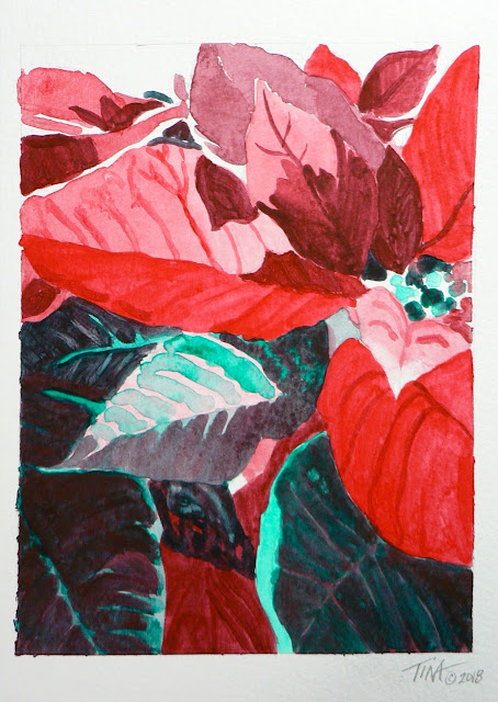
| "Red and Green Only" poinsettia |
The guide said that Napthol Red Light mixed with Pthalo-Green would make black. I was curious. I had those two acrylic colors in my paintbox, plus Napthol Crimson. I mixed them both with the Pthalo-Green to see what the color difference might be. It's subtle, but I could tell the Napthol Crimson was a bit towards the cooler blue side. I decided to use the Napthol Red Light since it's warmer tones were more like the poinsettia leaves I wanted to paint.
I have to admit, it was hard for me to make a painting with just those two colors because I could see yellow and other warm browns in my reference photo. I normally paint what I see, so I had to fight against my instinct to add yellow or white to the mix! I pushed myself to stick with only red and green and the result was the poinsettia leaves painting above. It's kind of an odd painting, but also interesting at the same time. The missing primary yellow color seems to have created a puzzle my brain wants to keep solving. :D
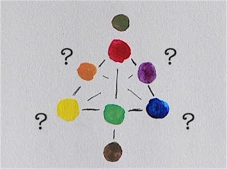
I decided to try exercise number four listed in the mix guide, using the specific "organic" colors suggested of Hansa Yellow, Quinacridone Magenta and Pthalo-Blue. Note: "organic" in this sense means color pigments created in a lab using the principles of organic chemistry. These are not colors derived from minerals or ores found in nature.
I only had the Pthalo-Blue color as acrylic paint, but found the other two colors in an old set of watercolors and they worked just fine. The important part is that these three colors were all organic pigments in a water soluble form.
You can see that the result was a gorgeous bright red and vivid green. Great, now what happens when I mix these two colors together plus a little white? The result was an interesting range of dull greens and earth brown tones. What could I make with these?
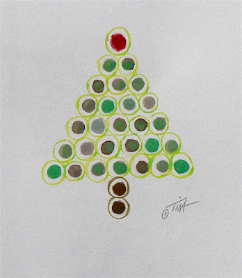
I arranged them as a christmas tree...
Hmmm, what could I paint using these colors? The light purplish grey color made me think of angel wings and the dark red brown would make nice hair. So far, so good, but eventually I realized I had to add yellow to make the fair skin tone I wanted and the halo of course. Close, but not purely red and green only.
What did I learn? It is possible to make a decent painting with only a primary color and it's secondary complement. Even a generic red and green will make a good brown and adding white will provide even more options. I could do a lot with those limitations. Choose your subject wisely though, I feel I got away with painting a poinsettia since it is already mostly green and red. With the angel, I seriously felt compelled to add another primary color, yellow, to give some warmth and enough contrast to balance out a really cold palette. I suppose I could have tried a very pale pink or green for a skin tone, my angel certainly would have looked "unearthly" all right!
After this experiment, I do feel inspired to test out the other primary colors and their complements. What paintings could I make with just yellow and purple or blue and orange? Hmmm...
Happy creating!
>^-^<
Tina


No comments:
Post a Comment