Bird & Sunrise photo

Bird & Sunrise photo
Because "someday" is today!

Friday, September 30, 2022

Striking it Rich, hello Yellow!


Yellow sapphire painting using only yellow and white paint.©2022 Tina M.Welter
Yellow Sapphire painting

Since I started an in-depth color by color exploration of the paints in my paintbox back in January of 2021, I've found it's quite a challenge to figure out a subject I can paint using only one color family. I bent the rules a bit this summer when I reveled in the color green while painting trees and grass, but I did not stick to the one color family rule. 

Thirteen different yellow acrylic paints from my paint box plus white.
Thirteen different yellows plus white.

 I was able to use all my blues to make a believable night-time landscape, but I've found that painting nature believably generally requires at least a minimum of two colors, often the primary and it's complimentary color are necessary, except when it comes to recreating gems. So far, I've been able use this single color gem solution twice, once with purple and now happily with yellow.

Seven varieties of yellow I used to create the "Yellow Sapphire" painting. ©2022 Tina M.Welter
The seven yellow paints I used to make my gem.
 

I wasn't certain at first if I could get some of the greenish yellow tones I would need, but combining burnt umber with a cool cadmium yellow light and some white was the answer. One of the best pieces of color mixing advice I ever received was to include burnt umber, which normally looks like a dark cool brown, in the yellow family.

Detail: burnt umber and gold variations plus the thirteen types of yellow in my paintbox. ©2022 Tina M.Welter
Detail: burnt umber and gold variations.
 

I've learned so much doing these color swatch studies and find that I refer to them again and again when choosing colors for a painting. This time I learned that the two different brands of burnt umber I own look very different on paper, Liquitex brand is much cooler and the less expensive Daler-Rowney is much warmer. Also, I didn't know that adding white to the iridescent gold colors would make such pretty opaque cream colors. The shiny reflective quality goes away, but that cream color could be handy.

It takes a little extra time and effort, but I highly recommend going on this useful color exploration journey.

Happy Creating!

>^-^<

Tina

Links to my other single color family deep dives:
Into the Deep Purple

Shades of Blue landscape 

Wednesday, August 31, 2022

A Walk In the Park

We feel very lucky to live in a neighborhood that has a nice large park within a few blocks of our apartment. There is a baseball diamond and a soccer field, but my favorite feature is the groups of trees planted around the edges of the park. 

Photo of sketch and final painting together. ©2022 Tina M.Welter
The Beginning and the End
 

 I have always been a great admirer of trees. As a young child I imagined the large ones growing on our farm had personalities, mostly friendly, but some seemed so old and ancient I often felt a bit anxious if I walked too close by them! All worries vanished at the end of the day though, when tucked in bed and listening to the soothing conversation of their rustling leaves at night, then it was only sounds of comfort and home.

Beginning a painting by blocking in the background colors. ©2022 Tina M.Welter
In the beginning...
 

 On one of our early morning walks around the park this summer, I had another one of those "I must paint this moment" inspirations. I came home and sketched out a drawing from the photo I took, I liked it so much I could envision a whole series of  "A Walk Around the Park" paintings.

Almost every painting goes through an ugly stage. ©2022 Tina M.Welter
Underlying structures often look strange.
 

Life being life though, a previous commitment to finish a set of illustrations that are due this fall didn't leave me much time for personal painting projects.

Building up the layers of green on my acrylic painting. ©2022 Tina M.Welter
Putting more layers of color on those bones.
 

I was determined to not let this sketch end up on the "projects that are never going to happen" pile, so I rearranged schedules and crammed in some precious painting hours. The laundry is still waiting...

Painting of green summer trees in the park almost finished. ©2022 Tina M.Welter.
Almost there!
 

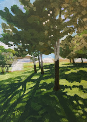
In honor of the last days of summer and all the lovely green world that inspires me, I'm happy to share with you "A Walk in the Park."

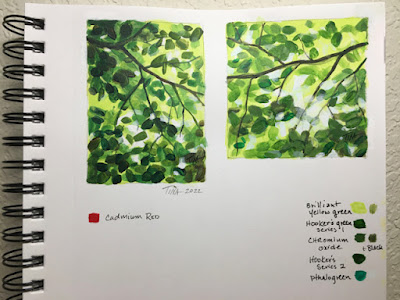
Painting of early morning sun through summer trees at my local park. ©2022 Tina M.Welter
Shadows and light dancing!
 

This scene still makes my heart sing, even as a rushed, imperfect artwork interpretation of that lovely summer morning.

Don't let go of those moments that inspire you!

Happy Creating >^-^< 

Tina


Sunday, July 31, 2022

Learning to Love Landscapes


Summer morning light casting shadows from trees. Acrylic painting ©2022 Tina M.Welter

Unlike many artists, I rarely felt the desire to paint landscapes, I'm actually not certain why. I've taken many photographs of wonderful views but haven't very often felt that irresistible pull to put paint to canvas to capture it. 

I have painted a few okay landscapes over the years, but also a couple attempts in the past led me to decide that landscape painting was just not my thing. A particular sunrise sky with clouds comes to mind...ugh, I never got that thing right!

Photo of green and yellow fields and blue sky. ©2021 Alan Manning

 Last fall, my brother asked me to paint a landscape for him from this photo. With only one point perspective, no buildings and no trees, I felt I could manage it although the clouds did make me a bit nervous.

Color sketch of summer fields and sky. ©2021 Tina M.Welter

 After making my usual color sketch to figure out the palette and the basic layout I was encouraged. Plus it helped me see where I could improve the painting.

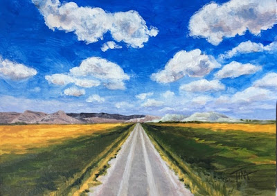
One point perspective painting of road, summer fields and sky. ©2021 Tina M.Welter
"Happy Travels"

The final painting came out pretty nice. I still wasn't itching to paint more landscapes, but it was a great feeling to know my skills have improved over the years and it was possible for me to paint this simple one successfully.


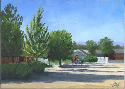
Summer trees and shadows in the lot across the road. Photo ©2022 Tina M.Welter

 June of 2022, I had the strangest thing happen. This early morning view out of my kitchen window captivated me. It was the pattern of shadows and the way the light was making the green tree leaves glow. I finally felt the call of the landscape, I absolutely had to paint it!

Value study drawing in pencil of trees and shadows. ©2022 Tina M.Welter

This year, instead of going straight to color sketches, I have been making simple value studies of all my subjects first. I am finding they are a great tool to simplify and get to the heart of what is working in a composition before adding color. When the black and white sketch still feels interesting, I know I am onto something good!

Summer morning light casting shadows from trees. Acrylic painting ©2022 Tina M.Welter
"View from My Kitchen Window"
I have also been watching several landscape painting classes on YouTube, specifically Mastering Composition by Ian Roberts. After watching his How to Use Color Temperature video, I followed his instructions and boom, it actually felt like a bit like magic as this great little painting came together for me. 


I was feeling so encouraged, I decided to offer to paint a landscape for my sister. She sent me two of her favorite vistas and told me I could choose which one I wanted to paint.

Red rock cliffs and snow capped mountains in Southern Utah. Photo ©2022 Evelyn Waldron
Landscape one.

Red rock cliffs, snow capped mountain and yucca bush in Southern Utah. Photo ©2022 Evelyn Waldron
Landscape two.
      

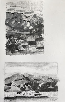
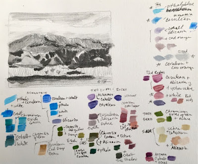
Two value studies in pencil and wash. ©2022 Tina M.Welter
 Hmmm, which one to choose! I was having a really hard time deciding between them and the value studies helped me clarify what elements I felt were resonating with me and that made it easier to decide what direction to go.

Of course this involved plenty of color palette testing too.

Landscape value study and palette test. ©2022 Tina M.Welter


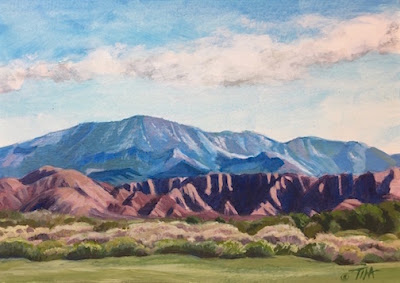
Acrylic painting of sage, red rock cliffs and snow capped mountain in Southern Utah. ©2022 Tina M.Welter
"View from Green Springs Drive"

 My value sketches were pretty rough, but the essence of that wonderful dark and light contrast on the red cliffs still came through as the focal point of the painting. I'm really pleased with the outcome and yes, I think I may be learning to love painting landscapes. I've already had a few more calling to me...

Definitely a reminder to keep that creative ear open, you might hear an unexpected Muse! 

Happy creating!

>^-^<

Tina
 

Ian Roberts Mastering Composition

How to use Color Temperature

Another favorite YouTube Teacher:

Paint Coach

Seven Reasons Students Struggle Painting Landscapes

Tuesday, May 31, 2022

Focusing on Green - Steps for Dealing with Emotional Overwhelm.


Painting sketch of light through green leaves. ©2022 Tina M.Welter
Spring Green mini sketch.

I only have a very small garden space, but it is a much loved oasis of calm for me.
 

Sunlight through iris leaves, photo©2022 Tina M.Welter
Iris

 Artists often have the ability of being very empathetic people which is a great gift to have, but the downside of being an empathetic person is that it is hard not to take in the suffering of others in such a way that you can't function yourself.

Close up of a stripey nasturtium leaf. Photo©2022 Tina M.Welter
Nasturtium

Knowing this about myself, I already try to limit social media and news time, but sometimes even with those limitations I still find myself absorbing and getting emotionally wrapped up in the loss and pain going on in the world.


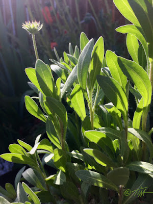
Glowing sunset light through Gaillardia leaves. Photo©2022 Tina M.Welter
Gaillardia - Blanket Flower

 I'm used to feeling sad about things I can't control, but after several awful events these last couple of weeks I was finding it extra difficult. I felt so overwhelmed, angry and powerless that those emotions were consuming my thoughts day and night.


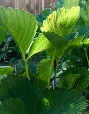
Sunset light through strawberry leaves. Photo ©2022 Tina M.Welter
Strawberry


 I realize it seems illogical and a waste of energy to feel so bad when I'm not being directly hurt myself, so it was actually a relief when I happened to see a recent article from the Los Angeles Times that addressed this issue.

Here is the actual list I wrote down for myself after reading what the featured therapists had to say.

  1. Pay attention to physical and emotional warning signs that you need to take a break.  Notice sensations of outrage, terror, overwhelm, despondency or numbness. 
  2. You must stop and process these feelings. Don't flood yourself with new images and coverage.
  3. Digest the stressful build up of these emotions by any type of healthy movement, writing, talking to people you trust. (For me, a good solid cry also helps.)
  4. Take action in positive ways that are within your reach.
  5. Do something kind and good where you are.
  6. Start small. 

 Since now I know I am not the only person that may be struggling, I decided that sharing what I learned along with featuring some photos from my little green oasis would be one small positive thing I could do.

Sketchbook, sunlight through leaves.©2022 Tina M.Welter
My Sketchbook

When I feel distressed it's actually harder for me to make art. My mind bombards me with thoughts that art making is pointless and self-indulgent and does very little to improve this brutal world. 

After processing some of those heavy emotions I could silence some of that negativity and focus on creating again. I like how these little sketches featuring sunlight through green leaves turned out. I would like to make a larger version to go on my wall as a reminder of how the green world calmly goes about growing a little at a time. 

Even small changes towards good make a difference.

>^-^<

Tina

p.s. Here is a link to the full article if you would like to read it.

Los Angeles Times - Coping with secondary trauma.


Saturday, April 30, 2022

A Tale of Two Paintings - Which one would you choose?


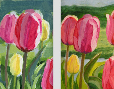
Comparing two paintings of pink and yellow tulips, ©2022 Tina M.Welter
Loose versus Detailed.
 

I often make color sketches of a subject before I make a final painting.

Comparing sketchbook painting and final painting of pink and yellow tulips. ©2022 Tina M.Welter
Sketchbook and Final Painting.


Overall, I liked how the final painting turned out, but when I was photographing it in hopes of getting it printed as a greeting card, I wasn't quite satisfied. 

I decided to take a good close-up photo of my sketchbook and compare them.

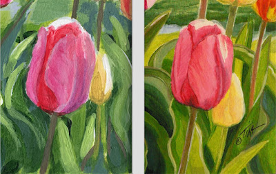
Comparing pink tulip sketch with final painting.©2022 Tina M.Welter
Soft edges versus lovely color variations.

Even though I loved the way I caught the subtle glow of colors on the final painting, I was completely drawn to the sense of flower-like softness in the sketchbook painting.

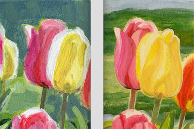
Comparing pink and yellow tulip painting detail.©2022 Tina M.Welter
Impression versus more Realistic

 I do like the realistic, detailed way I painted the tulip and leaves but I have been bothered for awhile with a sense of stiffness that I don't like in my paintings. 

Comparing paintings of pink and yellow tulips.©2022 Tina M.Welter
Great brushstrokes versus accurate tulip shapes.

  I've struggled with finding a way to address this problem and now perhaps these tiny paintings have given me a road map to get me going in the right direction.

The question will be if I can learn to let go of painting some of those wonderful details in a larger format! I dearly love painting the details.


So, which one did you like best? I did choose one to be printed and will let you know how it turned out.


Happy Creating!

>^-^<

Tina

Thursday, March 31, 2022

Remember the Pink Tulip

Single pink tulip miniature painting ©2022 Tina M.Welter
Miniature painting - acrylic on paper.
 

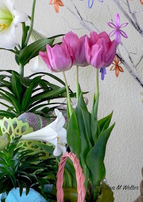
Back in spring of 2019 we bought one of those cute potted tulips at the grocery store. Since I have had pretty good luck saving bulbs from previous spring planters, I looked forward to adding these pretty pinky-purple tulips into my garden.

Pink tulips and Easter lilies photo ©2019 Tina M.Welter
April 2019

After the greenery died back, I carefully tucked the bulbs in a mesh bag and boxed them up to rest in a cool dark space until fall.

I was really disappointed months later to find all the bulbs had withered away except two, and one of those didn't look too healthy. I went ahead and planted that one bulb in my garden wondering if it would even survive. 

The next spring, I was glad to see it shoot up some green leaves but then I was disappointed because no bloom appeared and last year I forgot to even look for it!  The daffodils I had planted nearby had doubled in number and I think that is why I never saw it. 

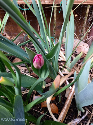
This spring I was taking photos of those same daffodils and surprise, I was beyond delighted to find that little tulip had finally sent up a bloom!

March 28, 2022 Early pink tulip photo ©Tina M.Welter
March 28, 2022
 

This little flower made my day and reminded me of something very important. 

March 29, 2022 Early pink tulip bud, photo ©Tina M.Welter
March 29, 2022
 

Sometimes it seems like all the effort I am putting into learning how to do this art marketing feels overwhelming. It takes effort to set up new habits, new online strategies and I feel like I am barely making any progress. 


March 30, 2022 All pink, early single tulip photo ©Tina M.Welter
March 30, 2022
 

I decided that when I find myself feeling down about how slowly I am accomplishing my plans, I'm going to remind myself to "remember the pink tulip." 

It didn't look like anything was happening for years, but obviously there was a lot going on under the surface. It simply takes time and continued effort to grow anything worthwhile.

March 30, 2022 Single pink tulip bloom, photo ©Tina M.Welter
March 30, 2022 - 15 minutes later.

This little lovely was worth the wait.


Happy Creating!

>^-^<

Tina


Monday, February 28, 2022

Finding the Focal Points


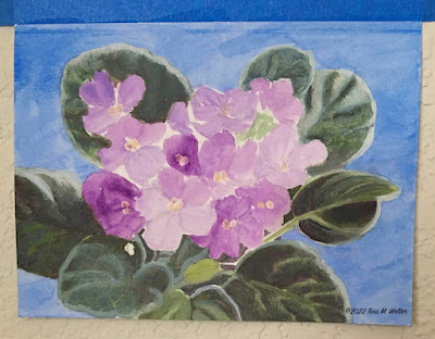
African violets, lavender purple

After spending the month of January researching about how to start a successful art business online, I found myself completely overwhelmed by all the advice and information! Especially after watching several "free" workshops and listening to art marketing podcasts, my anxiety level about attempting this had reached the keeping me up at night stage! Is this why cats stare off into space, their kitty minds are overwhelmed? If so, I can relate.

In an effort to organize this mental mess, I decided to try applying the same step by step strategies I use to focus my mind when making a painting. 

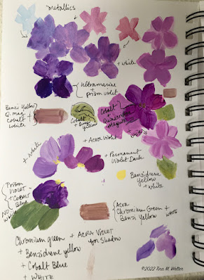
Sketchbook drawings, color tests for African Violet painting.

Step 1. Gathering ideas. This it is what I do first for a painting. I find the photos I want to work from, color test my paint choices, make pencil sketches and take notes on what I learn. 

+It's a good way to start, but obviously I needed to start creating some peace and order in the marketing research.

Sketch in acrylic paint of purple African violets ©2022 Tina M.Welter
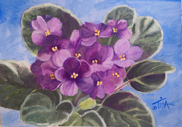
Step 2. Sketch out ideas. Usually that means making a loose pencil sketch and then testing out the paint color palette I decided on in the information gathering phase. 

+Figuring out an equivalent for marketing art is a bit trickier, but I think the step 2 here is to decide on an idea for a series of paintings to sell and start making them. 

Beginning color washes for African violet painting.

Step 3. Plan a foundation. I put down the first washes of color, doing this gives the painting a structure to build on. 

+I think the equivalent is setting up a plan of where and when people can regularly see my paintings and my painting process.
Layering color back to front, African violet painting.

Step 4. Build on the foundation. Working from back to front, I painted the background and then the leaves, getting all those details in place before adding the flowers.

+It is key to have dependable structures in place for people to buy my paintings.

African violet painting, blocking the the light and dark flower shapes.

Step 5. Get all the key pieces in place. Now is the time to block in the light and dark shapes for the flowers.

+Find and connect with people who are interested in the art I am making.

African violet painting, trying out metallic paints on the blossoms.

Step 6. Be open to taking a few risks. I took a little risk by trying out a wash of metallic paint on the flower petals, a technique I haven't used very often, but I think is very appropriate on these flowers.

+Inviting people into my creative space to share more about me and why I make the art I do. For me personally, this feels incredibly risky and scary!

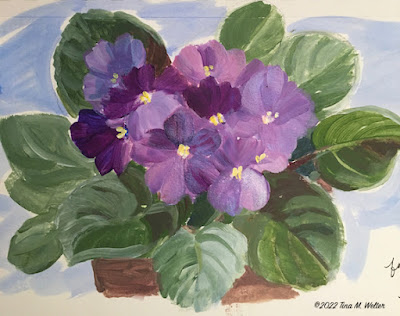
African violet painting finished after a unifying wash of color.

Step 7. Final touches. In this case, a thin wash of Quinacridone magenta over the flowers which brightened them up and brought all the hues together.

+Test out all the marketing steps by actually doing them, then keep refining until everything works together smoothly. 

+The "unifying wash" is my hope that sharing the beautiful little "aha" moments I observe in the world will bring joy to other people.

Even though I have the most awful anxious feeling in the pit of my stomach as I write this, I'm going to sit with my uncomfortable emotions and press on.

 Happy Creating! (and marketing?!?)

>^-^<

Tina 

p.s.  I illustrated this blog with steps from a painting I made for my brother's birthday in January. He requested African violets because they remind him of our dear mother. She had a real knack of growing these pretty little plants and usually had several of them blooming all over the house.

Monday, January 31, 2022

Why Do I Resist Marketing My Art?

Black Cat hiding under peach sheets, digital art ©2015 Tina M.Welter
                                                  The Safety Zone ©2015 Tina M.Welter

This question has been rolling around like a pair of dice in my mind for some time now. Recently I tossed those dice out onto the table by flipping that question on it's head and asking myself... 

What is the benefit of not marketing?

Yahtzee! The answers came tumbling out and lined up to make one word, protection.

I'm protecting myself. 

My top 3 monsters.

Dealing with people I don't know. I get why some cats hide under the bed when a stranger comes over, you don't have any idea what odd thing they will say or weird expectation they might have of you. Unfortunately sitting up on the highest cupboard and observing them for shady behavior is not considered good form as an actual human person.

All the anxiety I experience when packing art to ship. Is this enough bubble wrap? Did I get a strong enough box? What will I do if this package gets lost or stolen by porch pirates! Packing tape that fights back like a snakey demon that would rather stick anywhere and to anything but the dang box. Plus, all the storing of said packing materials. No more closet space, how about the back of the car? Yes, that is where some of it is stored right now.

Worst of all, silence.  All the work and effort of creating the art, plus doing all the social media and getting it where people can see it and nothing. I fear that nothing will happen, no sales, not even a mean comment to let me know someone at least had a reaction. It's heartbreaking to work so hard for so little return. Actually, I dread mean comments, avoiding real human trolls is another reason for me to want to stay hidden, yikes!

So, why am I admitting to all this? Many years ago I had serious anxiety over creating paintings, that was the issue I was exploring and sharing in the 'Fraidy Cat newsletter. I've realized lately that I no longer have that anxiety! All the step by step frame works I created for myself and kept practicing all these years actually worked! Ta-freaking-Da, today I am officially documenting one huge Artist Life Experiment Success! 

Which leads me to the next big question, can I find solutions for these "marketing my art" fears too?

'Fraidy Cat is seriously thinking about coming down from the top cupboard and going on the prowl.

I'll keep you posted, I definitely want and sincerely appreciate your support.

Happy creating! (and marketing?!?)

>^-^<

Tina