Bird & Sunrise photo

Bird & Sunrise photo
Because "someday" is today!

Sunday, April 30, 2023

Going from Weird to Wow!!


Weird to wow, what a difference!
What a journey!


I signed up to take a free painting class from Chris Fornataro, an artist who I admire and follow on YouTube.

The emphasis of the class was practicing how to use large value shapes as a foundation for better paintings. I don't usually paint by following another artist step by step, so this was definitely going to be an interesting hands on look into his process. 

The beginning of the first lesson, a still life, was a little strange looking...

Wow, that pimento is extremely large.
Is that a huge pimento?
 

We began with painting the subject by only representing the largest basic shapes of light and dark. Jeff told me he thought I was painting a giant pimento olive, not a very promising start!

What I did like was watching how efficient Chris was in mixing his colors using a limited palette, this painting only used ultramarine blue, cadmium red, cadmium yellow and titanium white.   

For example, he would start with the basic color, mixing blue and red for the purple background and then adding a little of the yellow to "de-saturate" the purple to make it less vivid and more natural looking. He did the same thing for the apple, blue and yellow to make a medium green and then a bit of red to tone it down a bit. 

Chris also emphasized how we can simplify mixing color by focusing on the primary colors and asking ourselves, does this mix need more blue, more red, more yellow?


Second round of shapes, lesson example.
 

Next, we painted smaller shapes onto those larger mid-tone light and dark sections using the same color mixes, but adjusting them by adding some white or yellow to lighten or some mixed purple to darken the colors or add shadow.


What a difference refining layers can make.
Snack time!
 

As I added more refining shape layers, I was so relieved to watch the painting begin to take form. The class was taught using oil paints which stay "wet" and are easy to mix for a long time. I didn't know if I could make his process work with acrylic paint, which even with extenders, dries very quickly. I was very happy and excited to try another subject after I ended up with this first result.

The second assignment was a landscape. Here is the reference photo we were given to work from.

Not my idea of a good photo.
Beach photo © Chris Fornataro
 

I was rather disappointed when I saw this photo, it was not my idea of an inspiring subject. I would never pick a photo with lighting that it would make trees look like a huge block of uniform green. The cast shadow across the beach and into the water was nice, but still!!

The first blocking in of the large mid-tone value shapes was not great to look at either. Some of the students called it the dinosaur stage, I thought mine looked like a duck with big hair!


Weird, weird shapes man.
Hello Lochness, I think I found your monster!

I could understand what he was trying to teach though, seeing the large blocks of color and value to build a good foundation for the painting first, then adding smaller value shapes on top to create form. I intended to follow exactly what the instructor was asking us to do, hoping that some how I could eventually make it come out alright.


Sometimes more is better.
The secret is all in the layers!

Adding the second layer with the smaller value shapes did help. It took me a lot longer to get the acrylic color mixed and in the right places, but I could see the finish line now.

I could imagine myself here afterall.
I could imagine myself here after all!

The final little details brought it all together and it was a logical way to paint, going from large shapes to small. I am curious how it would have looked if I had used oil paints instead. I suspect it would have been faster! It took me a lot of extra time to remix and blend my fast drying acrylic paint.

Overall, it was a good class and I would recommend him as a teacher. It wasn't anything I didn't know, but it was valuable practice and I gained some insights into mixing color that I'm going to use going forward with my own work. Sometimes it is so worth while to see the world through some one else's eyes.

Happy creating! 

>^-^< Tina

Saturday, March 4, 2023

Lost in the Shadows


Sweet pixel love at harvest time.

  As an art student, I wasn't always excited about making still life paintings. We did several of them in school, but I didn't feel compelled to make any more after I graduated. 

Lately though, I am appreciating the wisdom in regularly practicing this style of art work. 

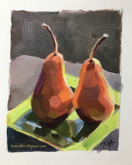
I recently set up a simple still life of two Bosc pears, my goal was to practice blocking in color more efficiently.


Sweet love at harvest time.
"The Kiss"

 In support of this goal, I decided to make a drawing from my photo in digital form on my computer to pre-block out the colors. I thought this would make them easier to see and help me make better color value decisions.


Sweet pixel love at harvest time.
"Digital Kiss"

 Everything was going smoothly, the 8x10 drawing and complementary color under painting came together nicely and I thought once I had those dark and light values in place, I could just charge ahead with the final color. Imagine my surprise when I suddenly felt stuck! 


Opposites attract, sweet love at harvest time.
"Complementary Kiss"


  My color blocking plan had been too successful, I could see so many colors in the shadows of my digital sketch that I wasn't certain how to mix them to get all those subtle shifts! 

I usually only use a limited palette to mix my colors so that the painting feels cohesive. 

 The bright oranges, yellows and greens where the sunlight was hitting the objects were not a problem, I wasn't certain how to mix that wide range of  browns that varied from tones of green, deep orange to red violet from a limited palette.

 
Focused in on sweet pixel love at harvest time.
"Digital Kiss" it's all in the details.

 Mixing colors is usually the part of painting I love the most, it was weird to feel so stuck. 

So before putting another brushstroke on my still life, I went to my tried and true anxiety calming back-up, testing out color mixes in my sketchbook.


Sweet anxiety relief mapped out in tiny colored squares..
Anxiety reliever.


  Six hours of mixing and painting later, I finally had some answers.  

My great light-bulb moment came when I finally figured out how to mix a wonderful range of related of browns by adding a little blue to cadmium red light or cadmium orange.

I was surprised that even using different blues still increased the color range without looking out of place.


Sweet Georgia, I figured out Brown!
Hearts and stars marking my favorite mixes.

  That little 2.75 x 3.50 inch color study took so much work, but I feel like I can paint the larger 8x10 with a lot more confidence now, since I've mapped out how the color temperature and value changes as it wraps around the pears and across the plate. 

Painting such a subtle shift in colors in the shadows added so much interest and richness, I really loved the effect.  I know I will be thinking more about what is going on in the shadows of the next paintings I make.


A little sweet love at harvest time.
"Little Kiss"


Here's to the wisdom of going back to practice the basics. 


Happy Creating! 

>^-^< Tina


Tuesday, January 31, 2023

Transformation


Painting over time compilation.
Transformation

I've had in mind for several years now to make a poinsettia painting to hang up for the holiday season, the last week of December I finally decided to give it a try. I have a favorite photo of mine from January 2013, the winter we spent in Dresden, Germany. Yes, that is my suitcase in the photo.

Brilliant color lingering on... January 26, 2013
 

I chose a 20x20 inch canvas and several days later I had a pretty good painting, but I wasn't happy with the shadow color behind the poinsettia. I had tried various color mixes, but the result kept feeling so drab and flat, it really bothered me.

Brilliant colors lingering on after the season has past.
"After Party"

I was so annoyed that I used some flat white gesso and just covered up all that grey. It looked better to me but I didn't want to leave bare gesso like that, plus I didn't like that I couldn't solve this problem!


Brilliant colors lingering on after the season is gone.
"After Party in White"
 

Looking for ideas, I watched some acrylic painting videos on YouTube. I finally found inspiration from the artist Ali Kay, she always makes a vivid underpainting in a complementary color, so I decided to give her strategy a try...

Brilliant colors lingering on after the season is gone.
"After Party on Fire"
 

 Wowza! Very fiery, but I was pleased that my overall design still looked good even in orange.


Brilliant colors lingering on after the season is gone.
"After Party in Purple"


I really liked how the purple grey I painted the background was warmed by that intense orange underneath. Plus, I left the brush strokes more visible to add some lively energy to the scene.  I liked the warmth so much, I thought I would try some more!


Brilliant colors lingering on after the season is gone.
"After Party - Awkward Moment!"

Yikes! This was a very unappealing step and I moved on as quickly as I could from this seriously awkward stage.


Brilliant colors lingering on after the season is gone.
"After Party in Progress"
  

This time, I'm not certain the orange changed the blue table that much and I felt a bit discouraged that I had wasted my time! 

After a break, I reminded myself that while repainting the table I had reshaped the bottom leaves and by adding more of the bright green where the sun light was bouncing off the leaves it improved the illusion of depth.

The painting isn't quite done yet, but I wanted to share how learning from other artists and taking a creative risk can get you unstuck on a project.

Happy creating!

>^-^<

Tina

Ali Kay's wonderful "Holiday Lights" paint along video. This is the first painting video I watched of hers that inspired me to try a different solution to my painting problem. Thanks Ali Kay!

Friday, September 30, 2022

Striking it Rich, hello Yellow!


Yellow sapphire painting using only yellow and white paint.©2022 Tina M.Welter
Yellow Sapphire painting

Since I started an in-depth color by color exploration of the paints in my paintbox back in January of 2021, I've found it's quite a challenge to figure out a subject I can paint using only one color family. I bent the rules a bit this summer when I reveled in the color green while painting trees and grass, but I did not stick to the one color family rule. 

Thirteen different yellow acrylic paints from my paint box plus white.
Thirteen different yellows plus white.

 I was able to use all my blues to make a believable night-time landscape, but I've found that painting nature believably generally requires at least a minimum of two colors, often the primary and it's complimentary color are necessary, except when it comes to recreating gems. So far, I've been able use this single color gem solution twice, once with purple and now happily with yellow.

Seven varieties of yellow I used to create the "Yellow Sapphire" painting. ©2022 Tina M.Welter
The seven yellow paints I used to make my gem.
 

I wasn't certain at first if I could get some of the greenish yellow tones I would need, but combining burnt umber with a cool cadmium yellow light and some white was the answer. One of the best pieces of color mixing advice I ever received was to include burnt umber, which normally looks like a dark cool brown, in the yellow family.

Detail: burnt umber and gold variations plus the thirteen types of yellow in my paintbox. ©2022 Tina M.Welter
Detail: burnt umber and gold variations.
 

I've learned so much doing these color swatch studies and find that I refer to them again and again when choosing colors for a painting. This time I learned that the two different brands of burnt umber I own look very different on paper, Liquitex brand is much cooler and the less expensive Daler-Rowney is much warmer. Also, I didn't know that adding white to the iridescent gold colors would make such pretty opaque cream colors. The shiny reflective quality goes away, but that cream color could be handy.

It takes a little extra time and effort, but I highly recommend going on this useful color exploration journey.

Happy Creating!

>^-^<

Tina

Links to my other single color family deep dives:
Into the Deep Purple

Shades of Blue landscape 

Wednesday, August 31, 2022

A Walk In the Park

We feel very lucky to live in a neighborhood that has a nice large park within a few blocks of our apartment. There is a baseball diamond and a soccer field, but my favorite feature is the groups of trees planted around the edges of the park. 

Photo of sketch and final painting together. ©2022 Tina M.Welter
The Beginning and the End
 

 I have always been a great admirer of trees. As a young child I imagined the large ones growing on our farm had personalities, mostly friendly, but some seemed so old and ancient I often felt a bit anxious if I walked too close by them! All worries vanished at the end of the day though, when tucked in bed and listening to the soothing conversation of their rustling leaves at night, then it was only sounds of comfort and home.

Beginning a painting by blocking in the background colors. ©2022 Tina M.Welter
In the beginning...
 

 On one of our early morning walks around the park this summer, I had another one of those "I must paint this moment" inspirations. I came home and sketched out a drawing from the photo I took, I liked it so much I could envision a whole series of  "A Walk Around the Park" paintings.

Almost every painting goes through an ugly stage. ©2022 Tina M.Welter
Underlying structures often look strange.
 

Life being life though, a previous commitment to finish a set of illustrations that are due this fall didn't leave me much time for personal painting projects.

Building up the layers of green on my acrylic painting. ©2022 Tina M.Welter
Putting more layers of color on those bones.
 

I was determined to not let this sketch end up on the "projects that are never going to happen" pile, so I rearranged schedules and crammed in some precious painting hours. The laundry is still waiting...

Painting of green summer trees in the park almost finished. ©2022 Tina M.Welter.
Almost there!
 

In honor of the last days of summer and all the lovely green world that inspires me, I'm happy to share with you "A Walk in the Park."

Painting of early morning sun through summer trees at my local park. ©2022 Tina M.Welter
Shadows and light dancing!
 

This scene still makes my heart sing, even as a rushed, imperfect artwork interpretation of that lovely summer morning.

Don't let go of those moments that inspire you!

Happy Creating >^-^< 

Tina


Sunday, July 31, 2022

Learning to Love Landscapes


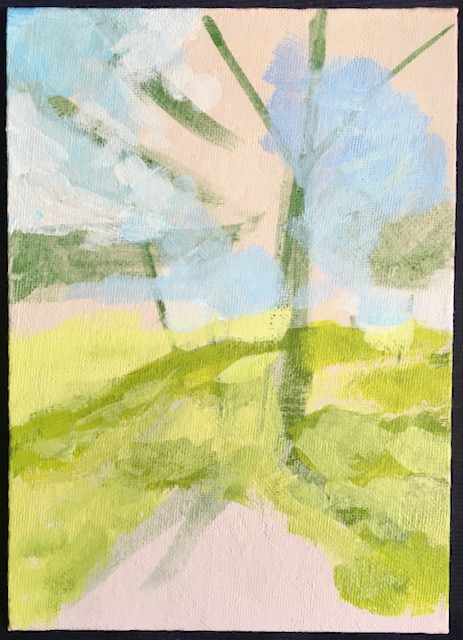
Summer morning light casting shadows from trees. Acrylic painting ©2022 Tina M.Welter

Unlike many artists, I rarely felt the desire to paint landscapes, I'm actually not certain why. I've taken many photographs of wonderful views but haven't very often felt that irresistible pull to put paint to canvas to capture it. 

I have painted a few okay landscapes over the years, but also a couple attempts in the past led me to decide that landscape painting was just not my thing. A particular sunrise sky with clouds comes to mind...ugh, I never got that thing right!

Photo of green and yellow fields and blue sky. ©2021 Alan Manning

 Last fall, my brother asked me to paint a landscape for him from this photo. With only one point perspective, no buildings and no trees, I felt I could manage it although the clouds did make me a bit nervous.

Color sketch of summer fields and sky. ©2021 Tina M.Welter

 After making my usual color sketch to figure out the palette and the basic layout I was encouraged. Plus it helped me see where I could improve the painting.

One point perspective painting of road, summer fields and sky. ©2021 Tina M.Welter
"Happy Travels"

The final painting came out pretty nice. I still wasn't itching to paint more landscapes, but it was a great feeling to know my skills have improved over the years and it was possible for me to paint this simple one successfully.


Summer trees and shadows in the lot across the road. Photo ©2022 Tina M.Welter

 June of 2022, I had the strangest thing happen. This early morning view out of my kitchen window captivated me. It was the pattern of shadows and the way the light was making the green tree leaves glow. I finally felt the call of the landscape, I absolutely had to paint it!

Value study drawing in pencil of trees and shadows. ©2022 Tina M.Welter

This year, instead of going straight to color sketches, I have been making simple value studies of all my subjects first. I am finding they are a great tool to simplify and get to the heart of what is working in a composition before adding color. When the black and white sketch still feels interesting, I know I am onto something good!

Summer morning light casting shadows from trees. Acrylic painting ©2022 Tina M.Welter
"View from My Kitchen Window"
I have also been watching several landscape painting classes on YouTube, specifically Mastering Composition by Ian Roberts. After watching his How to Use Color Temperature video, I followed his instructions and boom, it actually felt like a bit like magic as this great little painting came together for me. 


I was feeling so encouraged, I decided to offer to paint a landscape for my sister. She sent me two of her favorite vistas and told me I could choose which one I wanted to paint.

Red rock cliffs and snow capped mountains in Southern Utah. Photo ©2022 Evelyn Waldron
Landscape one.

Red rock cliffs, snow capped mountain and yucca bush in Southern Utah. Photo ©2022 Evelyn Waldron
Landscape two.
      

Two value studies in pencil and wash. ©2022 Tina M.Welter
 Hmmm, which one to choose! I was having a really hard time deciding between them and the value studies helped me clarify what elements I felt were resonating with me and that made it easier to decide what direction to go.

Of course this involved plenty of color palette testing too.

Landscape value study and palette test. ©2022 Tina M.Welter


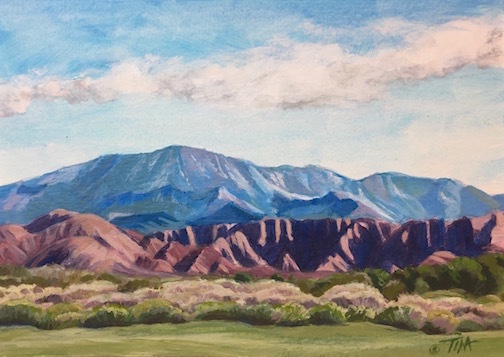
Acrylic painting of sage, red rock cliffs and snow capped mountain in Southern Utah. ©2022 Tina M.Welter
"View from Green Springs Drive"

 My value sketches were pretty rough, but the essence of that wonderful dark and light contrast on the red cliffs still came through as the focal point of the painting. I'm really pleased with the outcome and yes, I think I may be learning to love painting landscapes. I've already had a few more calling to me...

Definitely a reminder to keep that creative ear open, you might hear an unexpected Muse! 

Happy creating!

>^-^<

Tina
 

Ian Roberts Mastering Composition

How to use Color Temperature

Another favorite YouTube Teacher:

Paint Coach

Seven Reasons Students Struggle Painting Landscapes

Tuesday, May 31, 2022

Focusing on Green - Steps for Dealing with Emotional Overwhelm.


Painting sketch of light through green leaves. ©2022 Tina M.Welter
Spring Green mini sketch.

I only have a very small garden space, but it is a much loved oasis of calm for me.
 

Sunlight through iris leaves, photo©2022 Tina M.Welter
Iris

 Artists often have the ability of being very empathetic people which is a great gift to have, but the downside of being an empathetic person is that it is hard not to take in the suffering of others in such a way that you can't function yourself.

Close up of a stripey nasturtium leaf. Photo©2022 Tina M.Welter
Nasturtium

Knowing this about myself, I already try to limit social media and news time, but sometimes even with those limitations I still find myself absorbing and getting emotionally wrapped up in the loss and pain going on in the world.


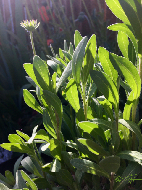
Glowing sunset light through Gaillardia leaves. Photo©2022 Tina M.Welter
Gaillardia - Blanket Flower

 I'm used to feeling sad about things I can't control, but after several awful events these last couple of weeks I was finding it extra difficult. I felt so overwhelmed, angry and powerless that those emotions were consuming my thoughts day and night.


Sunset light through strawberry leaves. Photo ©2022 Tina M.Welter
Strawberry


 I realize it seems illogical and a waste of energy to feel so bad when I'm not being directly hurt myself, so it was actually a relief when I happened to see a recent article from the Los Angeles Times that addressed this issue.

Here is the actual list I wrote down for myself after reading what the featured therapists had to say.

  1. Pay attention to physical and emotional warning signs that you need to take a break.  Notice sensations of outrage, terror, overwhelm, despondency or numbness. 
  2. You must stop and process these feelings. Don't flood yourself with new images and coverage.
  3. Digest the stressful build up of these emotions by any type of healthy movement, writing, talking to people you trust. (For me, a good solid cry also helps.)
  4. Take action in positive ways that are within your reach.
  5. Do something kind and good where you are.
  6. Start small. 

 Since now I know I am not the only person that may be struggling, I decided that sharing what I learned along with featuring some photos from my little green oasis would be one small positive thing I could do.

Sketchbook, sunlight through leaves.©2022 Tina M.Welter
My Sketchbook

When I feel distressed it's actually harder for me to make art. My mind bombards me with thoughts that art making is pointless and self-indulgent and does very little to improve this brutal world. 

After processing some of those heavy emotions I could silence some of that negativity and focus on creating again. I like how these little sketches featuring sunlight through green leaves turned out. I would like to make a larger version to go on my wall as a reminder of how the green world calmly goes about growing a little at a time. 

Even small changes towards good make a difference.

>^-^<

Tina

p.s. Here is a link to the full article if you would like to read it.

Los Angeles Times - Coping with secondary trauma.