Bird & Sunrise photo

Bird & Sunrise photo
Because "someday" is today!

Thursday, March 31, 2022

Remember the Pink Tulip

Single pink tulip miniature painting ©2022 Tina M.Welter
Miniature painting - acrylic on paper.
 

Back in spring of 2019 we bought one of those cute potted tulips at the grocery store. Since I have had pretty good luck saving bulbs from previous spring planters, I looked forward to adding these pretty pinky-purple tulips into my garden.

Pink tulips and Easter lilies photo ©2019 Tina M.Welter
April 2019

After the greenery died back, I carefully tucked the bulbs in a mesh bag and boxed them up to rest in a cool dark space until fall.

I was really disappointed months later to find all the bulbs had withered away except two, and one of those didn't look too healthy. I went ahead and planted that one bulb in my garden wondering if it would even survive. 

The next spring, I was glad to see it shoot up some green leaves but then I was disappointed because no bloom appeared and last year I forgot to even look for it!  The daffodils I had planted nearby had doubled in number and I think that is why I never saw it. 

This spring I was taking photos of those same daffodils and surprise, I was beyond delighted to find that little tulip had finally sent up a bloom!

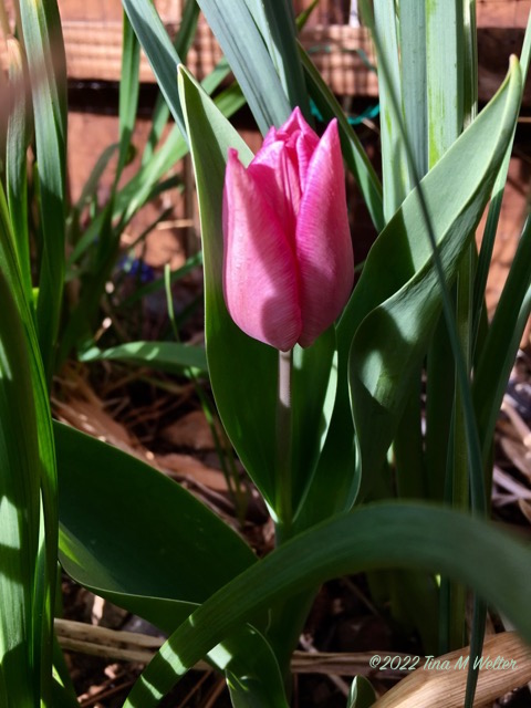
March 28, 2022 Early pink tulip photo ©Tina M.Welter
March 28, 2022
 

This little flower made my day and reminded me of something very important. 

March 29, 2022 Early pink tulip bud, photo ©Tina M.Welter
March 29, 2022
 

Sometimes it seems like all the effort I am putting into learning how to do this art marketing feels overwhelming. It takes effort to set up new habits, new online strategies and I feel like I am barely making any progress. 


March 30, 2022 All pink, early single tulip photo ©Tina M.Welter
March 30, 2022
 

I decided that when I find myself feeling down about how slowly I am accomplishing my plans, I'm going to remind myself to "remember the pink tulip." 

It didn't look like anything was happening for years, but obviously there was a lot going on under the surface. It simply takes time and continued effort to grow anything worthwhile.

March 30, 2022 Single pink tulip bloom, photo ©Tina M.Welter
March 30, 2022 - 15 minutes later.

This little lovely was worth the wait.


Happy Creating!

>^-^<

Tina


Monday, February 28, 2022

Finding the Focal Points


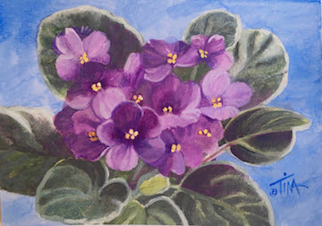
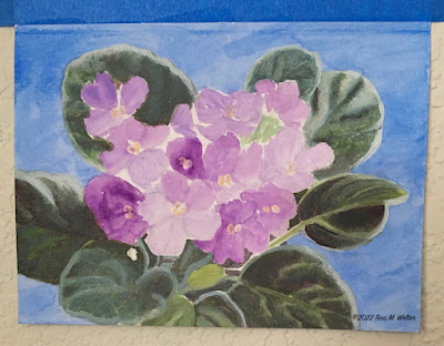
African violets, lavender purple

After spending the month of January researching about how to start a successful art business online, I found myself completely overwhelmed by all the advice and information! Especially after watching several "free" workshops and listening to art marketing podcasts, my anxiety level about attempting this had reached the keeping me up at night stage! Is this why cats stare off into space, their kitty minds are overwhelmed? If so, I can relate.

In an effort to organize this mental mess, I decided to try applying the same step by step strategies I use to focus my mind when making a painting. 

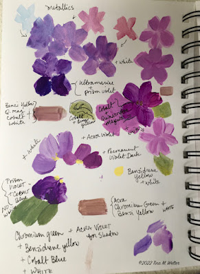
Sketchbook drawings, color tests for African Violet painting.

Step 1. Gathering ideas. This it is what I do first for a painting. I find the photos I want to work from, color test my paint choices, make pencil sketches and take notes on what I learn. 

+It's a good way to start, but obviously I needed to start creating some peace and order in the marketing research.

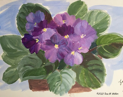
Sketch in acrylic paint of purple African violets ©2022 Tina M.Welter

Step 2. Sketch out ideas. Usually that means making a loose pencil sketch and then testing out the paint color palette I decided on in the information gathering phase. 

+Figuring out an equivalent for marketing art is a bit trickier, but I think the step 2 here is to decide on an idea for a series of paintings to sell and start making them. 

Beginning color washes for African violet painting.

Step 3. Plan a foundation. I put down the first washes of color, doing this gives the painting a structure to build on. 

+I think the equivalent is setting up a plan of where and when people can regularly see my paintings and my painting process.

Layering color back to front, African violet painting.

Step 4. Build on the foundation. Working from back to front, I painted the background and then the leaves, getting all those details in place before adding the flowers.

+It is key to have dependable structures in place for people to buy my paintings.

African violet painting, blocking the the light and dark flower shapes.

Step 5. Get all the key pieces in place. Now is the time to block in the light and dark shapes for the flowers.

+Find and connect with people who are interested in the art I am making.

African violet painting, trying out metallic paints on the blossoms.

Step 6. Be open to taking a few risks. I took a little risk by trying out a wash of metallic paint on the flower petals, a technique I haven't used very often, but I think is very appropriate on these flowers.

+Inviting people into my creative space to share more about me and why I make the art I do. For me personally, this feels incredibly risky and scary!

African violet painting finished after a unifying wash of color.

Step 7. Final touches. In this case, a thin wash of Quinacridone magenta over the flowers which brightened them up and brought all the hues together.

+Test out all the marketing steps by actually doing them, then keep refining until everything works together smoothly. 

+The "unifying wash" is my hope that sharing the beautiful little "aha" moments I observe in the world will bring joy to other people.

Even though I have the most awful anxious feeling in the pit of my stomach as I write this, I'm going to sit with my uncomfortable emotions and press on.

 Happy Creating! (and marketing?!?)

>^-^<

Tina 

p.s.  I illustrated this blog with steps from a painting I made for my brother's birthday in January. He requested African violets because they remind him of our dear mother. She had a real knack of growing these pretty little plants and usually had several of them blooming all over the house.

Monday, January 31, 2022

Why Do I Resist Marketing My Art?

Black Cat hiding under peach sheets, digital art ©2015 Tina M.Welter
                                                  The Safety Zone ©2015 Tina M.Welter

This question has been rolling around like a pair of dice in my mind for some time now. Recently I tossed those dice out onto the table by flipping that question on it's head and asking myself... 

What is the benefit of not marketing?

Yahtzee! The answers came tumbling out and lined up to make one word, protection.

I'm protecting myself. 

My top 3 monsters.

Dealing with people I don't know. I get why some cats hide under the bed when a stranger comes over, you don't have any idea what odd thing they will say or weird expectation they might have of you. Unfortunately sitting up on the highest cupboard and observing them for shady behavior is not considered good form as an actual human person.

All the anxiety I experience when packing art to ship. Is this enough bubble wrap? Did I get a strong enough box? What will I do if this package gets lost or stolen by porch pirates! Packing tape that fights back like a snakey demon that would rather stick anywhere and to anything but the dang box. Plus, all the storing of said packing materials. No more closet space, how about the back of the car? Yes, that is where some of it is stored right now.

Worst of all, silence.  All the work and effort of creating the art, plus doing all the social media and getting it where people can see it and nothing. I fear that nothing will happen, no sales, not even a mean comment to let me know someone at least had a reaction. It's heartbreaking to work so hard for so little return. Actually, I dread mean comments, avoiding real human trolls is another reason for me to want to stay hidden, yikes!

So, why am I admitting to all this? Many years ago I had serious anxiety over creating paintings, that was the issue I was exploring and sharing in the 'Fraidy Cat newsletter. I've realized lately that I no longer have that anxiety! All the step by step frame works I created for myself and kept practicing all these years actually worked! Ta-freaking-Da, today I am officially documenting one huge Artist Life Experiment Success! 

Which leads me to the next big question, can I find solutions for these "marketing my art" fears too?

'Fraidy Cat is seriously thinking about coming down from the top cupboard and going on the prowl.

I'll keep you posted, I definitely want and sincerely appreciate your support.

Happy creating! (and marketing?!?)

>^-^<

Tina


Friday, March 26, 2021

Into the Deep Purple

Acrylic painting of purple amethyst stone ©2021 Tina M.Welter
Amethyst Heart

 Even though it is my favorite color, I don't have a lot of tubes of purple paint in my paint box simply because it is a "secondary color" and it is often easy to mix a wide range of lovely shades from red and blue.

I do have a couple pre-mixed purple paints that I consider absolutely essential though, Dioxizine purple and Acra Violet. Dioxizine purple is a wonderfully deep, sheer purple, it mixes well with other colors and adds shadowy depth. I especially like it for painting dark purple irises. Acra Violet, is an incredibly versatile red purple that can add so much vibrancy to a range of flowers from red, pink and purple.

Purple paint mixed with white, color test ©2021 Tina M.Welter
Arranging my purple paints from cool to warm.

Since I am exploring what the paints in my paintbox can do, I wanted to test out mixing my red and blues to see what kind of variety of purples were possible. I had to start with classifying my reds from cool to warmest so I would know where to start. I already tested out all the blues, see the "Shades of Blue" blog post from January. Again, I learned you can't judge a color by it's paint tube, some reds I thought were more cool were actually more warm, and visa-versa. After I painted a swatch of color onto paper, it was much easier to classify once I could see the colors next to each other.

Red paint arranged cool to warm, color test. ©2021 Tina M.Welter
Re-arranging my red paints from cool to warm.


Blue paint plus white, arranged cool to warm. ©2021 Tina M.Welter
My blue paints arranged cool to warm.

After I sorted my red colors, I mixed my coolest red and coolest blue, then warmest red and warmest blue to see what kind of range of purples I had. The biggest surprise for me was my two warmest colors yielded a dark gray that wasn't very purple at all! Good to know.

Comparing the extremes, coolest to warmest. ©2021 Tina M.Welter
Comparing the extremes, coolest and warmest.

 Some of the my favorite purples were mixed from the middle range of warm red+blue or cool red+blue, not the extremes at either end.

Nice purple mixes, somewhere in the middle. ©2021 Tina M.Welter
Nice purple mixes, somewhere in the middle.

Next was the painting challenge, what subject could possibly suit this wide range of purples? Eventually I decided on an amethyst stone, which seemed very appropriate since it is often considered a traditional birthstone for February.

Amethyst Heart acrylic painting, first layer of paint.
Amethyst Heart, first layers of paint.

 Although I was really happy that I was able to use almost all the shades of purple I mixed, including that surprising gray, I really felt like the painting could use more work. Adjusting the values would make it more unified and improve the illusion of a sparkling cut stone. I wrote this blog at the end of February and hoped to post it for that month, but I had to make a decision. Do I post the painting as is and on time, or do I improve the painting to how I envisioned it and post in March? What do you think? First heart above, finished heart below.

Amethyst heart acrylic painting, various shades of purple paint.
Amethyst Heart, finished!

I heard an interesting point of view recently from a person I admire, YouTube's Sci-Show host and creator, Hank Green. He said he is able to accomplish so many creative projects because he focuses on getting them to 80 percent perfect and then doesn't worry about that last 20 if it isn't necessary. He is right, that last 20 percent can take a surprising amount of time and may not even improve things that much!

At first I thought I could move forward and post a painting that I felt was at 80 percent, but eventually I chose not to. Even though I think the initial painting did illustrate what I was trying to accomplish, I honestly really wanted that last 20 percent!

Now I'm glad I waited because the finished painting makes me very happy when I look at it. I hope you will enjoy this sparkly purple heart in March as much as I do.

Happy creating!

>^-^<

Tina


Full page view of my notebook with color tests. ©2021 Tina M.Welter
Full page view of my color tests, 8.5 x 5.5 inch notebook.


Sunday, January 31, 2021

Shades of Blue

Painting of a snow scene using only blue paint.
Snow Bear contemplates the Blue.


 I have several tubes of acrylic paints in my paint box and they are a motley crew! Paint I bought in college, Jeff’s acrylic collection was added to mine when we got married, paint that was inherited from a friend of Jeff’s parents, and a selection I purchased when I was reading Helen Van Wyck’s wonderful book on color mixing.

I made a New Year’s art resolution: to have a better understanding of what tools I actually have in my tool kit. The first step I learned from Marie Kondo, get everything out and look at it!

Acrylic paint tubes arranged in a color wheel.
All the colors arranged in a color wheel.

Black,white,gold,silver and irridescent paint.
Black, white, gold and silver in a separate category.


Looking at the color on the tubes is only part of the story, the next step is to put the paint on paper in it's full strength, then mix with increasing amounts of white and let them tell me something about their personality.

Beginning with Blue

Color swatches of various blue paint.
Initial guess at the color arrangement.
 

I arranged the blue tubes in how I thought they would fit on the color wheel, ranging from the most purple/red to the most green/yellow.

I included three sets of the same colors, three ultramarine blue and two cerulean blue from different manufacturers and two cobalt blue tubes that varied in price. I was curious how much difference there be between the low cost vs. higher priced paint.

Twelve color swatches of blue.
Twelve Blues and White

 I definitely learned a few things I didn’t expect! The Golden brand ultramarine was a shade more lavender than the Liquitex ultramarine. The Daler-Rowney went the lightest lavender when I added the same amount of white. The Liquitex was the most sheer and least opaque of the three.

Ultramarine color comparison.

 The Golden brand Cerulean had a lot more staining strength than the Windsor & Newton, which was much more sheer.

Cerulean color comparison
 The less expensive Daler-Rowny cobalt blue was more opaque and seemed to have some white tint in it compared to the more expensive M.Graham paint. You do get what you pay for.

Cobalt blue comparison

Anthraquinone Blue had a lot more in common with the Prussian blue. I had read that I could swap it out for ultramarine! I don't see how, it is a much more greyed down denim blue than I expected. It's a beautiful color, but I don't see how it would behave the same as ultramarine when mixing it with other colors for a painting.

Anthraquinone and Prussian blue comparison.
 

I also learned that my initial arrangement of the paint tubes wasn’t correct when I actually got the paint on paper. Phthaloblue is the blue that leans the most towards green/yellow, not cerulean.

Pie chart view of cool to warm blues.
Swap the phthalo and the cerulean!


Phthalo by the green where it belongs.
Phthaloblue finds the right place.

The last thing I was curious about was to see if I could create a whole painting just using all my blue paint and white. The result was the "Snow Bear in Shades of Blue" painting posted at the first of this entry, I used all twelve blues and I think it turned out pretty good.

I learned a lot from this experiment and it was fun. I would encourage anyone to get out what paint you have become more acquainted with it’s character and personality a little better.

Happy Creating!

Tina

Tip: I learned that drawing a straight line with some equal sized squares makes the color comparison easier to see, plus it just looks nicer.


Sketchbook page with blue color swatch comparisons.
My full sketchbook page.


P.S. Yes, the snow bear does exist. I built him in celebration of finally getting some more snow! I did use artistic license and remove all the houses in our neighborhood to improve his view of the mountains.

Snow bear sculpture.


Thursday, December 31, 2020

Oh, Christmas Tree!

"December Evening" ©2020 Tina M.Welter 5x7 inches acrylic on paper.
"December Evening"
 

One positive aspect of dealing with a pandemic is that it pushes people to be creative in connecting with each other.

In November, one of my friends asked if I would try teaching a short mini-class on painting using the App, Marco Polo. Instead of sending texts, this app allows people to leave videos for each other. I've often wondered what it would be like to teach a painting class, so I decided to give it a try.

Tiny Christmas tree sketch, 2x2.5 inches, acrylic on paper, ©2020 Tina M.Welter
Tiny Sketch, 2 x 2.5 inches

I chose a lighted Christmas tree outside with a twilight sky as our subject. Simple, right? Just one triangle shape with a dark background and some lights, how hard could it be…and so began my innocent journey into the thick of the woods.

Tiny Christmas tree sketch, 1.5 x 2.25 inches, acrylic on paper, ©2020 Tina M.Welter
Tiny Sketch 1.5 x 2.25 inches

 I’ve never actually broken down my painting methods into steps so that someone else could follow me before, and I soon found that taking apart what I do was quite the challenge.

Figuring out the palette is often my first and favorite step, but this time I also had to think about palette colors that would be really common to find and versatile for beginning painters to use. 


Palette, Cadmium Red, Yellow, Ultramarine Blue , Titanium White ©2020 Tina M.Welter
 Cadmium Red, Cadmium Yellow, Ultramarine Blue, Titanium White

I painted a couple of sketches using the basic colors of Cadmium Red, Cadmium Yellow, Ultramarine blue, and Titanium White. Then I went on-line and looked for paint sets that would include those colors, but many used Cobalt blue instead of Ultramarine blue and the red and yellow were listed as “primary” colors.  Goodness, what should to tell people to buy?

December Evening painting sketch, 5x7 acrylic,©2020 Tina M.Welter
Painting Sketch, 5x7 inches, using Cobalt blue.

This led me to make more sketch paintings using Cobalt blue to see if it that color would work instead. Soon I found myself down a whole color theory rabbit-hole, testing out “color bias” combinations of warm red, yellow and blue compared to using a set of cool red, yellow and blue. This topic deserves a whole blog post of it’s own.

Warm biased colors, Cadmium Red, Cadmium Yellow and Phthaloblue ©2020 TinaM.Welter
Warm biased palette.
 
Cool biased palette, Alizarin Crimson, Cadmium Yellow, Ultramarine Blue ©2020 TinaM.Welter
Cool biased palette.
 

My biggest concern being that my initial palette choice was wrong and would make painting harder for other people because I used a “cool” blue with a “warm” red and yellow. Seriously, this kept me up at night and I wasn’t happy until I had tested all the options. It turned out that I still liked that initial palette best after all, even if it didn’t follow the “color bias” theory. Well, that is creativity, sometimes breaking the rules makes the best art.

Pine Tree Basics, 5x7 inches, pencil drawing ©2020 Tina M.Welter
Pine Tree Basics

Next, was breaking down the drawing. One friend said she could barely draw a circle, so I told her not to worry because we would be making triangles! I measured and marked every shape so that I could explain how to get the tree and it’s branches placed correctly.

Since we were only using red, yellow and blue, I made one video on color mixing. I was amazed that it took 40 minutes to explain and my poor iPhone got really hot doing all that recording!

Then, it was the painting steps. Goodness, I think I made three or four sketch paintings to make certain I could explain and show everything in order. Yes, I wrote the steps down, I needed those reminders for when I actually made the final video.

Three pine tree sketches, figuring out the steps, ©2020 Tina M.Welter
Figuring out the steps!

As a side note, I believe that some of the quick, tiny sketches I threw together are much better paintings than the larger sketches I spent a lot of time making. It is annoying to me that I have a hard time capturing that spontaneity in larger artwork.

Tiny Christmas tree sketch,  1 x 1.5 inches, acrylic on paper, ©2020 TinaM.Welter
Tiny Sketch, 1 x 1.5 inches
 

I did feel the pressure when making the final painting on camera, it was an odd feeling to be watched while doing something that has always been a solo project. Overall, I'm pleased with how the video and painting turned out, although the next day I could see the blue shadows should have been darker on the snow. So far, I have resisted the urge to repaint that section. 

I've certainly gained an appreciation for all the extra work those artists I grew up watching on t.v. must have done to make painting on camera look so easy. A respectful bow to Bob Ross, Bill Alexander and Helen Van Wyck!

Happy Creating!
>^-^<

Tina

Monday, August 31, 2020

Summer Sketchbook Tour

Summertime and the flowers are blooming! Perfect for inspiration, sketching and testing out ideas. Often I will have other creative friends comment that doing my detailed type of sketching process takes too much time. 

They are partly right and I used to skip over it myself because it is incredibly tempting to just start putting those wonderful colors down on paper or canvas. Admittedly, I still skip sketching sometimes if I'm pressed for time or feeling particularly confident, but I know full well there may be consequences in the form of frustration, wasted art materials and lost time trying to fix mistakes. 

Even a simple palette color test is worth the time because of that nice feeling of certainly going forward, plus I think they are fun to do.

Here are some of my color sketches from this year and what I learned from making them...

Sunflower Sketch ©2020 Tina M.Welter

Yellow flowers are my nemesis, for some reason I always struggle with getting the right shadow color to get the sense of light shining through their petals. I thought a simple palette of Benzidrine Yellow, Cadmium Orange, Burnt Sienna and Cobalt Blue would provide enough shadow depth, but the flower still looked flat. In essence I had several "yellows" and a blue, and it took adding a "red," Alizarin Crimson to finally get the deep warm brown I was looking for.


Pink Roses Sketch ©2020 TinaM.Welter
 

Figuring out what color combination I like the best is another way I use my sketchbook.

Did I want to use Napthol Red to make the peachy tones in the pink roses or would I be happier with mixing Permanent Rose and Cadmium Yellow? 

I circled the Green Gold, Sap Green and Prussian Blue after I decided they were my favorite mix for the leaves. This sketch also helped me notice that the greens were a bit cold and I would need to mix them with some Permenant Rose to warm them up a bit.


Dark Angel Iris Sketch ©2020 TinaM.Welter
 

My goal here was to practice painting a really dark purple iris. I thought I knew what colors would get the result I wanted, but I was rather disappointed with the lack of depth and the whole thing felt too cool. I knew adding yellow to warm things up would only make the colors gray, so I turned the page and tried again...


Dark Iris Sketch ll ©2020 TinaM.Welter


 I searched on-line for a little bit of help and had a genuine "aha" moment when I saw the suggestion to mix the purples with Burnt Sienna! Of course, a warm deep yellow/red that was a perfect solution!


Pink Iris Sketch ©2020 Tina M.Welter
 

Here's an example of my color mixing instincts being right on target. I wanted to be certain to mix the correct greyed purple for the shadow side of the pink iris petals. The first combination I tried were Cadmium Red and Prussian Blue and they were exactly what I was looking for. Adding Benzidrine Yellow made it possible to mix a light green and the right shade of orange and peach. 

I love it when a palette comes together so easily and with only three colors plus white. It feels like an elegant solution.


Winter Pines Sketch ©2020 TinaM.Welter
 

I was feeling very uncertain about which paints to mix for an evening winter scene with pine trees, so I created this little grid to solve my problem.

The top row has the colors I was fairly certain I wanted to use. The second row mixes all those colors with Cobalt blue and Titanium white. The third row mixes all the top row colors with Pthalogreen and Titanium white.

Having these colors to refer to was really helpful in making my final painting.


"Neon Lights" darker ©2020 TinaM.Welter


Here it is, an example of me diving head-first into making a painting without a "sketchbook first" test. This photo doesn't really capture it, but I originally painted the shadow colors over the bottom rose petal and leaves way too dark and I was really bummed when I realized what I had done.


"Neon Lights" lighter ©2020 TinaM.Welter
 

No one will notice now, but I can tell you I spent a lot of time repainting with lighter colors and glazing over those areas with thin color washes to lighten up that dark section. Acrylic paints are so forgiving!

I hope these few examples have demonstrated how fun and helpful solving creative problems in a sketchbook can be.


Happy Creating!

>^-^<

Tina

p.s.

For those of you wondering what happened with my eyes, the good news is the medicine helped and by May my right eye was better. Hurrah. Then in July, the same flock of floaters showed up in my left eye! Sheez! At least I knew what it was and was able to start the same treatment quickly for my left eye. 

After dealing with too many other bizarre health issues all spring and summer to mention here, I was finally diagnosed with Hashimoto's Thyroiditis in August. There may be some connection to that auto-immune disease affecting my eyes. I am hopeful that now I am getting treatment for that, my eyes will be healthier too.