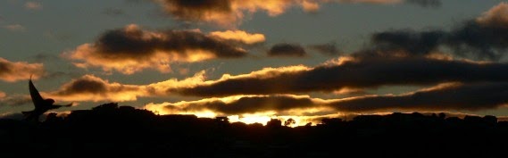
Bird & Sunrise photo

Bird & Sunrise photo
Because "someday" is today!

Thursday, May 31, 2012

The Keeper

7" x 5" oil on "Gessobord" copyright  2012 Tina M. Welter
"The Keeper" 7"x 5" oil on "Gessobord" c. 2012

Soccer is a really big deal here in Europe.  Where ever there is a little open space,  you will see many people playing soccer informally here.   Being next to the Donau Park, we can see several games going on simultaneously.   One of my favorite teams was a group of Orthodox Jewish boys playing the game complete with black hats and prayer shawls flying. 

On one of our photographic expeditions,  I found the best goalkeeper of all.  I can only imagine the lively game that ended with this result.  Yes, there was a little open plaza in front of this church in a block thick with buildings.

I used the same palette of colors that I used in the painting "Wait for it", but I leaned more to the warm tones and added some Burnt Umber to the mix.  I am always amazed at how much you can do with basically red, (Alizarin crimson) yellow (Ocher), blue (Manganese) and some black and white.

No Soccer players yet...

Thursday, May 10, 2012

Simplify and Focus.

photo credit- Jeff Welter
St. Stephan's Cathedral - photo by Jeff Welter
At the very center of Vienna is the St. Stephan's Cathedral.  Construction for this church began in the 1300's, but it sits on the site of two even older structures built for worship.  Before the Christians, it was the site of a pagan Roman temple.  Some of the oldest remains can be seen underground in the U-Bahn station nearby. 

7" x 5" oil on "Gessobord copyright 2012 Tina M. Welter
"Wait for It" 7" x 5" oil on "Gessobord" c. 2012
Walking around this intricate Gothic style church, it was hard to get a decent picture because it is so large and there is so much detail.  I did like the Gargoyle dog waterspouts and I took a few pictures because I thought I could see a few pigeons perched way up there on those stone dogs.

I was so delighted when I got home where I could enlarge the photos on the computer and found some fun images.  It pays when there is too much detail to simplify!   Even with a very limited close-up view, it still took quite a bit of time for me to get those details right.   I chose a simple palette for this painting: Manganese blue, Yellow Ochre, and    Alizarin Crimson--plus black and white.

Thursday, April 26, 2012

Trying to Capture a Mermaid

5"x 7" oil on "Gessobord" copyright 2012 Tina M. Welter
"Mermaid" 5"x 7"oil on "Gessobord" c. 2012 TMW
 I optimistically thought it would only take me a week to finish my second attempt at the Mermaid.  She wasn't so easy to catch.

 After looking at the palette choices for the first painting, I felt the ultramarine blue was just too cold.  I did some more exploring and mixing and found that the manganese blue mixed with yellow ocher made the nicest warm green I was looking for.  You  can see the new palette with my favorite mixes circled.  That was the fun easy part.

Manganese blue, Burnt Sienna, Yellow Ochre & Alizarin Crimson
Burnt Sienna, Manganese Blue, Yellow Ochre & Alizarin Crimson.
I really struggled with getting the balance of the colors on the Mermaid and the background and the face in the shadows to all work together.  I repainted things several times, lots of layers.  Something that looked good one day didn't the next.  Also my lack of experience with painting people, I redid eyes and lips, I don't know how many times.  I wanted her to look more alive than the original statue, but also still otherworldly.

 Overall, I think the painting works and I am ready to call it a tie.  I agree with the old sailors, beware of mermaids, they are tricky creatures!


Wednesday, April 11, 2012

Try and Try Again

First color choices.
First palette color choices for "Mermaid"
I decided to focus on the wonderful sculpture that is everywhere here in Vienna as my next painting subjects. After painting my self-portrait, I realized I could use some time on the human figure. I tend to avoid painting people, but I think it is time I face some of that fear. At least sculptures can sit for you for hours.

My first subject that interested me was a fountain I took a picture of at night. Challenging to paint the human face with the light source coming from beneath it, but I liked the eerie, unusual feeling that I think is appropriate for a mermaid.

Vertical 7" x 5" oil on "Gessobord" copyright 2012 Tina M. Welter
"Mermaid" first try...
My first attempt was pretty good on color and light, but I didn't like the composition. Too much dark, empty space on the bottom of the painting. I realized after I got the basic color in place that I was going to have to start over again. Sigh. I am glad that the second try as a horizontal painting already looks better, even in the grey under-painting stage. Now, if I can keep from getting too "busy" with the background...continued next week.

Wednesday, April 4, 2012

Seven Swans a Swimming...

5"x 7" oil on "Gessobord" copyright 2012 Tina M. Welter
"Encounter" 5"x 7" oil on "Gessobord" c. 2012 TMW
This view only shows the central portion built in 1675.

The swans love to swim here.I have reached my goal of six swan paintings, plus one! I am pleased to have succeeded and I feel like the paintings have been improving each time.

My favorite part of this painting is the interaction between the swans. Relationships keep life interesting, happy and sometimes frustrating.

I feel that way with painting. I used the same palette choices as "Island of Calm", but this painting still has it's own unique look. Part of the fear and fun of painting is not knowing exactly what the result of your choices will be. It does take determination to keep moving forward when a painting appears to be a failure. I don't like that part, but like any relationship, I try to trust that it is just part of the growing process.

Wednesday, March 28, 2012

The Beauty of Repetition

7"x 5" oil on "Gessobord" copyright 2012, Tina M. Welter
"Promenade" 7"x 5" oil on "Gessobord" c. 2012
For the sixth painting in my swan series, I decided to return to the English Garden and paint the same pair of swans that influenced "Swan Brocade". I wanted to try refining my palette to see if I could get some better colors.

Less is More.
Less is More.
My four colors were: orange, light yellow, ultramarine blue and yellow green, plus black and white as needed. The result is that I finally got the deep greens, gold reflections and shade of grey in the water I wanted.

I had an "Aha" moment today about life and repetition. Anything we want to really learn from losing weight to keeping a house clean involves consistent repetition. It's a good principle for getting success!

Wednesday, March 21, 2012

Under the Surface

5"x 7" oil on "Gessobord", copyright 2012 Tina M. Welter
"Island of Calm" 5"x 7" oil on "Gessobord" c. 2012 TMW

Is anyone getting tired of paintings of swans....?  I have found out that doing a series can lead to some feelings of boredom, but I am determined to finish what I started.  The good part about repetition is that I get to try different techniques to solve the same problem.

I like this painting because it illustrates that wonderful illusion of "making it look easy", when all sorts of work and paddling is going on under the surface.  Swans are masters of this.

Claude Monet, 1874
"Bridge at Argenteuil"  Claude Monet, 1874

 I hope someday my paintings will reach that place where they look effortless.  I saw a boat in Claude Monet's "Bridge at Argenteuil" 1874, that was composed of three lovely brush strokes.  I can only imagine all the practice that led to that moment.  Meanwhile I will keep splashing away until I get there.